DeepSeek V4.1 Flash 1017
by DeepSeekReasoningClean
Running live in a sandboxed frame. Click inside it before using the keyboard.
How it went
- Total time
- 3 min 43 s
- Cost
- $0.0047
- Output tokens
- 30,648
- Spent thinking
- 24,420 tokens
- Speed
- 137.9 tok/s
- Console errors
- 0
- First token after
- 1.3 s
- First visible text after
- 3 min 13 s
- Prompt tokens
- 549
- Code size
- 15.4 KB
- Finish reason
- stop
- Served by
- Sail Research
- Model id
deepseek/deepseek-v4.1-flash-1017- Reasoning sent
{"effort":"low"}- Max output
- 64,000 tokens
- Generated
- Nov 11, 2026
What it was asked
The prompt
Create a standalone SVG illustration of a fox sitting on a hill, looking at the moon on a starry night, with a few subtle animations. Requirements: - Output a single valid .svg file (```svg code block) with a viewBox of 0 0 800 600. - Hand-written shapes and paths only: no embedded raster images, no external references, no JavaScript. - The fox must be clearly recognizable (pointy ears, snout, bushy tail with a white tip). - Include the moon with a soft glow, many stars, the hill and some background elements (trees, distant hills). - Use a coherent color palette and at least one gradient. - Animations (SMIL or CSS inside the SVG), all looping seamlessly: stars twinkling, the fox's tail swaying gently, and a shooting star crossing the sky every 4 seconds (the first one within 2 seconds).
System prompt, sent with every prompt
You are generating a self-contained web demo. It will be rendered automatically in a sandboxed iframe and compared side by side with the output of other AI models given the exact same task.

Output rules:
- Reply with exactly ONE fenced code block containing the complete file: ```html (or ```svg when the task asks for an SVG). No text before or after the code block.
- Everything must be inline: CSS in <style>, JavaScript in <script>. No external files, images, fonts or network requests, except the CDN URLs explicitly allowed by the task.
- Do not use localStorage, sessionStorage, cookies, IndexedDB, alert(), confirm(), prompt() or window.open(): they are blocked in the sandbox and will throw.
- The page must look right in a 1280×800 viewport and adapt gracefully down to 375px wide. No horizontal scrollbar.
- Something meaningful must be visible on first paint: a screenshot is taken automatically about 3 seconds after load, without any interaction.
- Everything that makes the demo interesting must be visible within the first seconds: nothing hidden behind a high score, a later level or a long play session.
- Games must start in a self-playing demo mode (a simple AI plays) behind a "Click or press a key to start" message, so the game can be judged in action without playing.
- The iframe only receives keyboard events after the user clicks it: if the demo uses the keyboard, display a clear "Click or press a key to start" message.
- The code must run with zero errors in the console of the latest Chrome.
Code run-1.svg · 315 lines
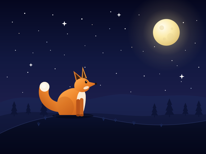
<svg xmlns="http://www.w3.org/2000/svg" viewBox="0 0 800 600" width="100%" height="100%" preserveAspectRatio="xMidYMid meet">
  <title>Fox on a Hill Under the Moon</title>
  <style>
    html, body { margin: 0; padding: 0; height: 100%; background: #05071f; }
    svg {
      display: block; width: 100%; height: 100%;
      background: linear-gradient(180deg, #05071f 0%, #111840 40%, #1e1f4d 75%, #2b2355 100%);
    }
    .st { animation: twinkle 3.4s ease-in-out infinite; }
    @keyframes twinkle {
      0%, 100% { opacity: 0.15; }
      50%      { opacity: 1; }
    }
    .sparkle { animation: twinkleBig 4.6s ease-in-out infinite; }
    @keyframes twinkleBig {
      0%, 100% { opacity: 0.1; }
      45%      { opacity: 1; }
    }
    .glow {
      animation: glowPulse 6.5s ease-in-out infinite;
      transform-box: fill-box;
      transform-origin: center;
    }
    @keyframes glowPulse {
      0%, 100% { opacity: 0.75; transform: scale(1); }
      50%      { opacity: 1;    transform: scale(1.05); }
    }
    .shooter {
      animation: shoot 4s linear infinite;
      animation-delay: 0.7s;
      opacity: 0;
    }
    @keyframes shoot {
      0%   { transform: translate(0px, 0px);       opacity: 0; }
      3%   {                                      opacity: 1; }
      13%  { transform: translate(340px, 155px);  opacity: 1; }
      17%  { transform: translate(430px, 196px);  opacity: 0; }
      100% { transform: translate(430px, 196px);  opacity: 0; }
    }
  </style>

  <defs>
    <linearGradient id="skyGrad" x1="0" y1="0" x2="0" y2="1">
      <stop offset="0%"   stop-color="#05071f"/>
      <stop offset="38%"  stop-color="#111840"/>
      <stop offset="72%"  stop-color="#1e1f4d"/>
      <stop offset="100%" stop-color="#2b2355"/>
    </linearGradient>

    <radialGradient id="moonGlowGrad" cx="50%" cy="50%" r="50%">
      <stop offset="0%"   stop-color="#fff6c9" stop-opacity="0.85"/>
      <stop offset="28%"  stop-color="#ffe9a0" stop-opacity="0.32"/>
      <stop offset="60%"  stop-color="#ffd98a" stop-opacity="0.10"/>
      <stop offset="100%" stop-color="#ffd98a" stop-opacity="0"/>
    </radialGradient>

    <radialGradient id="moonGrad" cx="36%" cy="30%" r="74%">
      <stop offset="0%"   stop-color="#fffdf3"/>
      <stop offset="52%"  stop-color="#fbeaa8"/>
      <stop offset="100%" stop-color="#e0c477"/>
    </radialGradient>

    <linearGradient id="furGrad" x1="10%" y1="0%" x2="90%" y2="100%">
      <stop offset="0%"   stop-color="#ffb055"/>
      <stop offset="45%"  stop-color="#f0892e"/>
      <stop offset="100%" stop-color="#c85a17"/>
    </linearGradient>

    <linearGradient id="tailGrad" x1="0%" y1="100%" x2="100%" y2="0%">
      <stop offset="0%"   stop-color="#c05a18"/>
      <stop offset="55%"  stop-color="#f0892e"/>
      <stop offset="100%" stop-color="#ffb463"/>
    </linearGradient>

    <linearGradient id="hillFarGrad" x1="0" y1="0" x2="0" y2="1">
      <stop offset="0%"   stop-color="#1b2453"/>
      <stop offset="100%" stop-color="#151c42"/>
    </linearGradient>

    <linearGradient id="hillMidGrad" x1="0" y1="0" x2="0" y2="1">
      <stop offset="0%"   stop-color="#131a40"/>
      <stop offset="100%" stop-color="#0d1332"/>
    </linearGradient>

    <linearGradient id="hillFrontGrad" x1="0" y1="0" x2="0" y2="1">
      <stop offset="0%"   stop-color="#0b1233"/>
      <stop offset="45%"  stop-color="#070c22"/>
      <stop offset="100%" stop-color="#04061a"/>
    </linearGradient>

    <linearGradient id="trailGrad" x1="0" y1="0" x2="1" y2="0">
      <stop offset="0%"   stop-color="#a9d6ff" stop-opacity="0"/>
      <stop offset="55%"  stop-color="#cfe6ff" stop-opacity="0.7"/>
      <stop offset="100%" stop-color="#ffffff" stop-opacity="1"/>
    </linearGradient>

    <path id="foxBody" d="M -52 0 C -70 -32 -64 -76 -30 -94
                           C -8 -106 8 -108 16 -100
                           C 38 -108 50 -94 50 -70
                           C 50 -40 42 -12 36 0 Z"/>

    <clipPath id="bodyClip">
      <use href="#foxBody"/>
    </clipPath>

    <g id="pine">
      <path d="M 0 -80 L 13 -48 L 7 -48 L 19 -20 L 11 -20 L 23 0
               L -23 0 L -11 -20 L -19 -20 L -7 -48 L -13 -48 Z"/>
      <rect x="-3" y="-2" width="6" height="14"/>
    </g>
  </defs>

  <!-- ================= SKY ================= -->
  <rect x="0" y="0" width="800" height="600" fill="url(#skyGrad)"/>

  <!-- ================= STARS ================= -->
  <g fill="#ffffff">
    <circle class="st" cx="48"  cy="86"  r="1.6" style="animation-duration:2.9s;animation-delay:-0.4s"/>
    <circle class="st" cx="96"  cy="52"  r="2.1" style="animation-duration:3.6s;animation-delay:-1.7s"/>
    <circle class="st" cx="150" cy="120" r="1.3" style="animation-duration:3.1s;animation-delay:-2.2s"/>
    <circle class="st" cx="205" cy="58"  r="1.8" style="animation-duration:4.0s;animation-delay:-0.9s"/>
    <circle class="st" cx="262" cy="132" r="1.4" style="animation-duration:2.7s;animation-delay:-1.2s"/>
    <circle class="st" cx="318" cy="74"  r="2.3" style="animation-duration:3.8s;animation-delay:-2.9s"/>
    <circle class="st" cx="372" cy="140" r="1.5" style="animation-duration:3.2s;animation-delay:-0.6s"/>
    <circle class="st" cx="430" cy="46"  r="1.7" style="animation-duration:2.8s;animation-delay:-1.9s"/>
    <circle class="st" cx="486" cy="112" r="1.9" style="animation-duration:4.2s;animation-delay:-3.1s"/>
    <circle class="st" cx="540" cy="58"  r="1.4" style="animation-duration:3.0s;animation-delay:-1.4s"/>
    <circle class="st" cx="600" cy="182" r="1.5" style="animation-duration:3.5s;animation-delay:-0.2s"/>
    <circle class="st" cx="668" cy="236" r="1.6" style="animation-duration:2.6s;animation-delay:-1.1s"/>
    <circle class="st" cx="712" cy="88"  r="2.0" style="animation-duration:3.9s;animation-delay:-2.4s"/>
    <circle class="st" cx="758" cy="168" r="1.4" style="animation-duration:3.1s;animation-delay:-1.6s"/>
    <circle class="st" cx="772" cy="262" r="1.7" style="animation-duration:2.9s;animation-delay:-0.8s"/>
    <circle class="st" cx="704" cy="318" r="1.3" style="animation-duration:3.7s;animation-delay:-2.1s"/>
    <circle class="st" cx="642" cy="352" r="1.5" style="animation-duration:3.3s;animation-delay:-1.3s"/>
    <circle class="st" cx="560" cy="296" r="1.8" style="animation-duration:4.4s;animation-delay:-0.5s"/>
    <circle class="st" cx="508" cy="358" r="1.3" style="animation-duration:2.7s;animation-delay:-2.6s"/>
    <circle class="st" cx="452" cy="286" r="1.6" style="animation-duration:3.4s;animation-delay:-1.8s"/>
    <circle class="st" cx="390" cy="332" r="1.4" style="animation-duration:3.0s;animation-delay:-0.3s"/>
    <circle class="st" cx="330" cy="262" r="1.7" style="animation-duration:3.8s;animation-delay:-2.2s"/>
    <circle class="st" cx="272" cy="338" r="1.4" style="animation-duration:2.8s;animation-delay:-1.5s"/>
    <circle class="st" cx="214" cy="268" r="1.6" style="animation-duration:4.1s;animation-delay:-0.7s"/>
    <circle class="st" cx="160" cy="336" r="1.3" style="animation-duration:3.2s;animation-delay:-2.8s"/>
    <circle class="st" cx="108" cy="282" r="1.8" style="animation-duration:3.6s;animation-delay:-1.0s"/>
    <circle class="st" cx="60"  cy="196" r="1.5" style="animation-duration:2.9s;animation-delay:-2.3s"/>
    <circle class="st" cx="128" cy="206" r="1.2" style="animation-duration:3.5s;animation-delay:-1.9s"/>
    <circle class="st" cx="196" cy="196" r="1.3" style="animation-duration:2.6s;animation-delay:-0.9s"/>
    <circle class="st" cx="250" cy="214" r="1.2" style="animation-duration:3.9s;animation-delay:-3.0s"/>
    <circle class="st" cx="330" cy="178" r="1.1" style="animation-duration:3.1s;animation-delay:-1.4s"/>
    <circle class="st" cx="400" cy="206" r="1.3" style="animation-duration:2.8s;animation-delay:-2.0s"/>
    <circle class="st" cx="470" cy="196" r="1.2" style="animation-duration:3.7s;animation-delay:-0.6s"/>
    <circle class="st" cx="556" cy="200" r="1.2" style="animation-duration:3.3s;animation-delay:-2.5s"/>
    <circle class="st" cx="720" cy="196" r="1.2" style="animation-duration:3.0s;animation-delay:-1.2s"/>
    <circle class="st" cx="764" cy="80"  r="1.3" style="animation-duration:4.0s;animation-delay:-2.7s"/>
    <circle class="st" cx="28"  cy="300" r="1.4" style="animation-duration:3.4s;animation-delay:-1.7s"/>
    <circle class="st" cx="88"  cy="360" r="1.2" style="animation-duration:2.9s;animation-delay:-0.4s"/>
    <circle class="st" cx="620" cy="288" r="1.1" style="animation-duration:3.6s;animation-delay:-2.2s"/>
    <circle class="st" cx="688" cy="256" r="1.2" style="animation-duration:3.2s;animation-delay:-1.1s"/>
  </g>

  <g fill="#cfe0ff">
    <circle class="st" cx="182" cy="164" r="1.5" style="animation-duration:4.3s;animation-delay:-2.0s"/>
    <circle class="st" cx="426" cy="112" r="1.4" style="animation-duration:3.1s;animation-delay:-0.8s"/>
    <circle class="st" cx="596" cy="120" r="1.3" style="animation-duration:3.7s;animation-delay:-2.9s"/>
    <circle class="st" cx="300" cy="360" r="1.4" style="animation-duration:2.8s;animation-delay:-1.6s"/>
    <circle class="st" cx="742" cy="344" r="1.5" style="animation-duration:4.0s;animation-delay:-0.5s"/>
  </g>

  <g fill="#ffe9c9">
    <circle class="st" cx="74"  cy="130" r="1.4" style="animation-duration:3.5s;animation-delay:-2.4s"/>
    <circle class="st" cx="358" cy="96"  r="1.3" style="animation-duration:2.9s;animation-delay:-1.3s"/>
    <circle class="st" cx="512" cy="184" r="1.4" style="animation-duration:3.8s;animation-delay:-0.9s"/>
  </g>

  <!-- twinkling sparkles -->
  <g fill="#ffffff">
    <path class="sparkle" style="animation-duration:4.8s;animation-delay:-1.2s"
          d="M 250 82 L 252.4 89.6 L 260 92 L 252.4 94.4 L 250 102 L 247.6 94.4 L 240 92 L 247.6 89.6 Z"/>
    <path class="sparkle" style="animation-duration:5.6s;animation-delay:-3.4s"
          d="M 462 50 L 464 56 L 470 58 L 464 60 L 462 66 L 460 60 L 454 58 L 460 56 Z"/>
    <path class="sparkle" style="animation-duration:5.2s;animation-delay:-2.1s"
          d="M 706 288 L 708.4 295.6 L 716 298 L 708.4 300.4 L 706 308 L 703.6 300.4 L 696 298 L 703.6 295.6 Z"/>
    <path class="sparkle" style="animation-duration:6.0s;animation-delay:-0.6s"
          d="M 120 246 L 121.8 251.2 L 127 253 L 121.8 254.8 L 120 260 L 118.2 254.8 L 113 253 L 118.2 251.2 Z"/>
  </g>

  <!-- ================= MOON ================= -->
  <circle class="glow" cx="646" cy="126" r="152" fill="url(#moonGlowGrad)"/>
  <circle cx="646" cy="126" r="52" fill="url(#moonGrad)"/>
  <circle cx="628" cy="108" r="9"  fill="#e6d193" opacity="0.45"/>
  <circle cx="662" cy="142" r="13" fill="#e6d193" opacity="0.32"/>
  <circle cx="638" cy="152" r="6"  fill="#e6d193" opacity="0.38"/>
  <circle cx="668" cy="112" r="5"  fill="#e6d193" opacity="0.35"/>

  <!-- ================= SHOOTING STAR ================= -->
  <g transform="translate(120,70)">
    <g class="shooter">
      <line x1="0" y1="0" x2="-104" y2="-38" stroke="url(#trailGrad)" stroke-width="3.2" stroke-linecap="round"/>
      <circle cx="0" cy="0" r="7"   fill="#ffffff" opacity="0.16"/>
      <circle cx="0" cy="0" r="2.9" fill="#ffffff"/>
    </g>
  </g>

  <!-- ================= DISTANT HILLS ================= -->
  <path d="M 0 400 C 90 360 170 390 260 395
           C 350 400 420 355 520 370
           C 610 383 700 360 800 380
           L 800 600 L 0 600 Z" fill="url(#hillFarGrad)"/>

  <path d="M 0 452 C 110 420 210 448 320 442
           C 430 436 520 462 630 448
           C 710 438 770 452 800 445
           L 800 600 L 0 600 Z" fill="url(#hillMidGrad)"/>

  <!-- distant pine trees -->
  <g fill="#0d1436">
    <use href="#pine" transform="translate(55,446) scale(0.65)"/>
    <use href="#pine" transform="translate(110,441) scale(0.5)"/>
    <use href="#pine" transform="translate(170,447) scale(0.75)"/>
    <use href="#pine" transform="translate(600,450) scale(0.6)"/>
    <use href="#pine" transform="translate(658,447) scale(0.8)"/>
    <use href="#pine" transform="translate(720,444) scale(0.55)"/>
    <use href="#pine" transform="translate(772,447) scale(0.7)"/>
  </g>

  <!-- ================= FOREGROUND HILL ================= -->
  <path d="M 0 520 C 120 460 260 430 400 460
           C 520 486 640 500 800 470
           L 800 600 L 0 600 Z" fill="url(#hillFrontGrad)"/>

  <!-- moonlit crest line -->
  <path d="M 0 520 C 120 460 260 430 400 460
           C 520 486 640 500 800 470"
        fill="none" stroke="#3a4a86" stroke-width="2" opacity="0.45"/>

  <!-- grass tufts -->
  <g stroke="#1b2a5c" stroke-width="2" stroke-linecap="round" fill="none" opacity="0.85">
    <path d="M 176 466 l -5 -12 M 176 466 l 0 -14 M 176 466 l 5 -11"/>
    <path d="M 214 456 l -4 -10 M 214 456 l 1 -12 M 214 456 l 5 -9"/>
    <path d="M 402 470 l -5 -12 M 402 470 l 0 -14 M 402 470 l 5 -11"/>
    <path d="M 448 474 l -4 -10 M 448 474 l 1 -12 M 448 474 l 5 -9"/>
    <path d="M 150 490 l -5 -12 M 150 490 l 0 -14 M 150 490 l 5 -11"/>
    <path d="M 520 486 l -5 -12 M 520 486 l 0 -14 M 520 486 l 5 -11"/>
    <path d="M 626 494 l -4 -10 M 626 494 l 1 -12 M 626 494 l 5 -9"/>
  </g>

  <!-- ================= FOX ================= -->
  <g transform="translate(283,448)">

    <!-- ground shadow -->
    <ellipse cx="0" cy="3" rx="80" ry="11" fill="#03050f" opacity="0.5"/>

    <!-- bushy tail (swaying) -->
    <g>
      <animateTransform attributeName="transform" type="rotate"
                        values="-3.5 -34 -30; 4.5 -34 -30; -3.5 -34 -30"
                        keyTimes="0; 0.5; 1"
                        calcMode="spline"
                        keySplines="0.45 0 0.55 1; 0.45 0 0.55 1"
                        dur="3.6s" repeatCount="indefinite"/>
      <path d="M -34 -30 C -92 -26 -124 -66 -110 -110"
            fill="none" stroke="url(#tailGrad)" stroke-width="38" stroke-linecap="round"/>
      <circle cx="-110" cy="-110" r="19" fill="#fdf3e3"/>
      <circle cx="-113" cy="-113" r="9" fill="#ffffff" opacity="0.55"/>
    </g>

    <!-- body -->
    <use href="#foxBody" fill="url(#furGrad)"/>

    <!-- body markings -->
    <g clip-path="url(#bodyClip)">
      <ellipse cx="-32" cy="-30" rx="36" ry="42" fill="#b04f14" opacity="0.28"/>
      <ellipse cx="36"  cy="-54" rx="21" ry="42" fill="#fdf3e3" opacity="0.92"/>
      <ellipse cx="30"  cy="-16" rx="15" ry="24" fill="#fdf3e3" opacity="0.6"/>
    </g>

    <!-- front legs -->
    <rect x="13" y="-62" width="15" height="66" rx="7.5" fill="#b8531a"/>
    <rect x="27" y="-66" width="14" height="70" rx="7"   fill="#c8621e"/>
    <ellipse cx="20.5" cy="1" rx="8" ry="4.5" fill="#8f3d10"/>
    <ellipse cx="34"   cy="1" rx="8" ry="4.5" fill="#9a4413"/>

    <!-- head -->
    <g transform="rotate(-11 30 -112)">

      <!-- back ear -->
      <path d="M 16 -132 L 14 -176 L 42 -142 Z" fill="#d9772a"/>
      <path d="M 20 -136 L 19 -166 L 35 -143 Z" fill="#2f1a12" opacity="0.9"/>

      <!-- front ear -->
      <path d="M 40 -142 L 52 -186 L 60 -138 Z" fill="#f59a3c"/>
      <path d="M 44 -142 L 51 -174 L 56 -140 Z" fill="#2f1a12" opacity="0.9"/>

      <!-- head + snout -->
      <path d="M 6 -104
               C 2 -128 18 -144 40 -142
               C 56 -140 64 -130 66 -122
               L 94 -110
               L 64 -102
               C 60 -92 48 -86 34 -88
               C 18 -90 6 -104 6 -104 Z"
            fill="url(#furGrad)"/>

      <!-- muzzle highlight -->
      <ellipse cx="50" cy="-102" rx="11" ry="5.5" fill="#fdf3e3" opacity="0.85" transform="rotate(-8 50 -102)"/>

      <!-- eye -->
      <ellipse cx="54" cy="-124" rx="4.4" ry="5.4" fill="#20120a"/>
      <circle cx="55.6" cy="-126" r="1.5" fill="#ffffff" opacity="0.9"/>

      <!-- nose -->
      <circle cx="90" cy="-110" r="4" fill="#20120a"/>
    </g>
  </g>

</svg>
Reasoning trace (24,420 tokens)
Let me write a detailed SVG illustration with viewBox 0 0 800 600.

Elements:
- Night sky gradient (deep blue to purple).
- Moon with glow (radial gradient, filter blur).
- Stars: many small circles with twinkle animation (opacity, radius).
- Shooting star: a line/group animating across the sky, every 4 seconds, first within 2 seconds. Use `begin="0.5s; shoot.end+2.5s"`? Simpler: use CSS animation with duration 4s, delay 1s, and animation only visible briefly. Actually requirement: "crossing the sky every 4 seconds (the first one within 2 seconds)". CSS animation with iteration 4s, delay e.g. 0.8s, and the visible motion during first ~1s of each cycle, opacity 0 rest.

Use SMIL to be safe: animateTransform with begin="0.5s" dur="4s" repeatCount="indefinite" on a diagonal path... SMIL animateMotion along a path with dur 4s and keyPoints to make it quick then pause? Easier with CSS keyframes.

CSS keyframes for shooting star:
```
@keyframes shoot {
  0% { transform: translate(0,0); opacity: 0; }
  2% { opacity: 1; }
  15% { opacity: 1; }
  18% { opacity: 0; }
  100% { opacity: 0; transform: translate(360px, 220px); }
}
```
Hmm, transform on SVG element with CSS works in Chrome. Use translate percentages? Use px units in user units — for SVG, CSS transform translate with px works in user units. Yes.

Duration 4s, delay 0.6s, infinite. The motion happens 0-18% = 0.72s of travel, then invisible rest. Good.

Maybe two shooting stars offset. Keep it simple: one.

- Hills: back hills darker, foreground hill.
- Fox: sitting, side/three-quarter view, facing right toward the moon? Let's place moon top-right and fox on hill left-center facing right.

Fox design: sitting silhouette with orange gradient body, white chest/tail tip, dark legs. Pointy ears with dark inner. Snout pointed.

Let me draw fox at around x=300, y=400 (hill top ~y=420).

Fox shape: sitting fox facing right. Body: a rounded teardrop. Head at top-right with pointed snout. Ears triangles.

Let me define coordinate system for a fox group, then translate.

Fox group local coords, origin at base (feet) at (0,0), facing +x.

Body: sitting, haunch circle radius ~45 centered (-10, -50). Chest/torso leaning up to head at (20, -130).

Path for body:
M -55 -10 Q -60 -70 -20 -95 Q 10 -115 25 -120 L 30 -95 Q 0 -60 -5 -10 Z ... hmm messy.

Let me do a simpler approach: build fox from overlapping shapes:

1. Tail: a big curve behind, to the left, sweeping up with white tip. Path with quadratic curves.
2. Body: ellipse-ish blob.
3. Head: circle-ish with snout triangle.
4. Ears: two triangles.
5. Front legs: two rounded rectangles.

Fox sitting: haunch is a large circle at bottom, chest narrower going up.

Local coords with ground at y=0:
- Haunch: ellipse cx=-15 cy=-45 rx=52 ry=48.
- Chest/upper body: path from haunch up to head. Head center around (30,-135)? That's tall. Let's scale: fox height ~150 units. In 800x600, fox should be maybe 160 tall. Good.

Actually let's design the fox at height 150 then place it.

Head: circle cx=35 cy=-120 r=30. Snout: triangle from (50,-130) to (95,-112) to (48,-100) — pointed snout to right. Nose at (95,-112).

Ears: triangle left ear: points (12,-140) (20,-180) (42,-148). Right ear: (40,-146) (58,-178) (68,-140). Hmm ears on top of head (head cy=-120, r=30, top at -150). So ears from y=-145 up to -185.

Ear inner: smaller dark triangles.

Tail: from haunch (-50,-30) sweeping left and up:
M -45 -20 C -90 -20 -120 -60 -110 -100 C -100 -135 -70 -140 -55 -125 ... then white tip at the end. Better: draw tail as a thick shape with tapered end, white tip as separate shape.

Tail path:
M -40 -15
C -95 -10, -130 -50, -120 -95
C -113 -128, -85 -140, -68 -128
C -88 -110, -98 -75, -70 -55
C -55 -45, -42 -38, -40 -15 Z

Hmm, this is a crescent-ish tail. The white tip at the top end near (-90,-135).

Sway animation: rotate the tail group around a pivot near its base (-40,-20) with small angle oscillation.

Let me just make tail as a thick stroked path? No — a filled shape is better.

Simpler tail: use a path with stroke-linecap round:
path d="M -40 -25 C -100 -20 -125 -70 -100 -115" stroke="url(#fur)" stroke-width="34" fill="none" stroke-linecap="round". That gives a nice bushy curve. Then white tip: a smaller circle at the end point (-100,-115) radius 17 in white, or a short thick stroke segment at the end in white with width 30.

Tail tip: circle at (-100,-115) r=18 fill white — but the stroke end is round at width 34, so circle r=17 white over it. Good enough and looks bushy.

Actually a cone shape tapering: use stroke-width 34 at base and 26 at tip — can't with stroke. Use two overlapping strokes. Fine, circle works.

Sway: rotate group about (-40,-25) with animateTransform rotate values "-4;4;-4" dur 3.2s.

Front legs: two rounded rects at (10,-40) to (20,0) etc. In sitting pose, front legs straight down at front of chest. Chest around x=20..35. Legs at x=15..25 and x=30..40, from y=-55 to y=0.

Let's simplify: front legs as one shape:
rect x=8 y=-60 width=16 height=60 rx=8 fill darker orange, and rect x=28 y=-62 width=15 height=62 rx=7.

Hmm but chest white. Add white chest patch: ellipse cx=22 cy=-75 rx=22 ry=30 rotated slightly.

Let's not over-engineer; the silhouette matters most.

Let me lay out the fox group with a translate(300, 430) and scale maybe 0.9.

Hill: foreground hill top around y=430 at fox position, curving. Hill path: M 0 600 L 0 470 Q 200 400 400 440 T 800 430 L 800 600 Z. Something like that. Fox sits at (300,430) — need hill top at x=300 to be y≈430. Let's define hill path:

M -20 620 L -20 500 C 150 420, 320 430, 480 470 C 620 505, 720 480, 820 470 L 820 620 Z

At x=300 the curve is around... C 150 420, 320 430, 480 470 from (-20,500): at t=0.5, point ≈ (0.125*(-20)+0.375*150+0.375*320+0.125*480, 0.125*500+0.375*420+0.375*430+0.125*470) = (-2.5+56.25+120+60, 62.5+157.5+161.25+58.75) = (233.75, 440). So at x≈234, y≈440. Good, roughly.

Fox at translate(310, 445) with a slight scale. Base y=0 at ground; hill surface there ~y=440. Set translate(310,442).

Let me double check the hill at x=310: t≈0.6 → x = 0.064*(-20)+0.288*150+0.432*320+0.216*480 = -1.28+43.2+138.24+103.68 = 283.8, y = 0.064*500+0.288*420+0.432*430+0.216*470 = 32+120.96+185.76+101.52=440.2. Good. So ground y ≈ 440 at x≈284. Place fox at (300, 441).

Fox size: height ~185 including ears. That's fine within 600 height.

Moon: top-right at (620, 130), radius 55. Glow: radial gradient circle r=140 with fading, plus filter blur.

Stars: generate positions manually ~40 stars in the sky region above y=380, avoiding moon area maybe.

I'll write them out. Twinkle via CSS animation with different delays/durations.

Let me use CSS classes:
```
.star { animation: twinkle 3s ease-in-out infinite; }
```
and per-star style="animation-delay:-1.2s" or use attributes. Since I can't use JS, I'll set inline style attributes. Alternatively use SMIL <animate> in each star. That's verbose but fine. I'll write ~35 stars with inline animation-delay.

Actually to reduce verbosity, I can use a <g> with <use> ... defs star symbol and animate each. Hmm, opacity animating on the use. Simpler: write circles directly with style.

I'll generate stars in a few groups with different delays maybe. Let me just write them individually with style="animation-delay:-Xs; animation-duration: Ys".

Let's produce about 40 stars.

Also add a few bigger stars with 4-point sparkle shape.

Background trees: pine tree silhouettes on distant hills — dark shapes.

Distant hills: two layers, dark blue/purple.

Palette:
- Sky: #0b1030 → #1b2352 → #2a2350 (deep indigo to plum)
- Moon: #fdf6d8 with glow #ffe9a8
- Hills far: #1b2450, mid: #141a3d, foreground: #0a0e26 / with slight blue.
- Fox: #e8792b → #f79b3d gradient, dark legs #b8531c, white #fff6e8.

Let me build.

Structure:

```svg
<svg xmlns="http://www.w3.org/2000/svg" viewBox="0 0 800 600" width="800" height="600">
<defs>
  <linearGradient id="sky" x1="0" y1="0" x2="0" y2="1">
    <stop offset="0" stop-color="#050726"/>
    <stop offset="0.45" stop-color="#141a45"/>
    <stop offset="1" stop-color="#2c2456"/>
  </linearGradient>
  <radialGradient id="moonGlow" cx="0.5" cy="0.5" r="0.5">
    <stop offset="0" stop-color="#fff8cf" stop-opacity="0.85"/>
    <stop offset="0.25" stop-color="#ffe9a3" stop-opacity="0.35"/>
    <stop offset="1" stop-color="#ffd166" stop-opacity="0"/>
  </radialGradient>
  <radialGradient id="moonBody" cx="0.38" cy="0.35" r="0.75">
    <stop offset="0" stop-color="#fffdf0"/>
    <stop offset="0.7" stop-color="#fdefb8"/>
    <stop offset="1" stop-color="#e8d190"/>
  </radialGradient>
  <linearGradient id="fur" x1="0" y1="0" x2="1" y2="1">
    <stop offset="0" stop-color="#f9a03f"/>
    <stop offset="1" stop-color="#d9661f"/>
  </linearGradient>
  ...
</defs>
```

Careful: in SVG userSpace gradients default objectBoundingBox — fine.

Filter for soft glow: I could use feGaussianBlur on the moon glow circle. But radialGradient already handles glow. Use both maybe.

Now stars twinkle CSS:

```
@keyframes twinkle {
  0%, 100% { opacity: 0.25; }
  50% { opacity: 1; }
}
@keyframes twinkle2 { ... }
```

I'll use one keyframe and vary duration/delay.

For the shooting star:

```svg
<g class="shooter">
  <line x1="0" y1="0" x2="-90" y2="-34" stroke="url(#trail)" stroke-width="2.5" stroke-linecap="round"/>
  <circle cx="0" cy="0" r="2.6" fill="#fff"/>
</g>
```
With gradient along the line and CSS motion.

CSS:
```
.shooter { animation: shoot 4s linear infinite; animation-delay: 0.6s; opacity: 0; transform-box: fill-box? }
```
Better to put the group at a start position via transform attribute and animate translate with CSS. But CSS transform overrides the transform attribute... In SVG2/CSS, the `transform` presentation attribute is overridden by CSS transform. So set starting position via the CSS keyframes translate starting values.

Let's use: group positioned at (0,0) in a parent group with transform="translate(150,60)" ... but then the CSS transform on the child would be relative to the parent translate. That works! Parent `<g transform="translate(140,70) rotate(? )">`. Hmm but the child's CSS transform applies in its own coordinate system which is already translated by parent. Yes.

So:
```svg
<g transform="translate(140,80)">
  <g class="shooter"> ... </g>
</g>
```

Keyframes:
```
@keyframes shoot {
  0%   { transform: translate(0,0); opacity: 0; }
  3%   { opacity: 1; }
  14%  { transform: translate(420px, 190px); opacity: 1; }
  17%  { opacity: 0; }
  100% { transform: translate(420px,190px); opacity: 0; }
}
```
Wait — direction: shooting star goes down-right. Start at (140,80) → end at (560,270). That's in the sky above hills. Good. Duration 4s delay 0.6s. First becomes visible at 0.6s+0.12s ≈ 0.72s < 2s ✓.

Hmm, but transform translate in px inside SVG: Chrome supports it, translates in user units. Fine.

Also add a second shooting star with different timing? Requirement says every 4 seconds. One is fine. Maybe add a second one offset by 2s for visual richness — but that would make "every 4 seconds" still true, with 2s between... Might conflict. Keep one.

Trail gradient: linearGradient from white to transparent along the line direction. The line goes from (0,0) to (-90,-34) i.e., trailing behind. Use x1=0,y1=0,x2=1,y2=0 with gradient units objectBoundingBox — the bounding box is from (-90,-34) to (0,0). Direction of increasing x is from -90 to 0, i.e., from tail to head. So stop 0 transparent, stop 1 white.

```svg
<linearGradient id="trailGrad" x1="0" y1="0" x2="1" y2="0">
  <stop offset="0" stop-color="#b8d8ff" stop-opacity="0"/>
  <stop offset="1" stop-color="#ffffff" stop-opacity="0.95"/>
</linearGradient>
```

Now the moon glow with pulsing animation (subtle). Add second animation: moon glow opacity pulsing. That's extra but "a few subtle animations" — three required. I'll add moon glow pulse as a bonus (subtle).

Now let's write the fox carefully.

Fox group: `<g transform="translate(300,441)">` and maybe `scale(0.95)`. Let's design at base y=0.

Silhouette facing right:

Tail group:
```svg
<g class="tail">
  <path d="M -38 -28 C -96 -26 -128 -66 -112 -112" fill="none" stroke="url(#fur)" stroke-width="36" stroke-linecap="round"/>
  <circle cx="-112" cy="-112" r="18" fill="#fff6e8"/>
</g>
```
Wait stroke-width 36 means the stroke extends ±18 from the path, so the tip circle at the endpoint with r=18 matches. Good. But the tip white circle will look like a ball; add tapering by using a second thinner white stroke over the last portion:
Actually the classic look: bushy tail with white tip. A circle r=18 at the end is fine.

Hmm, but the tail with uniform 36 width looks like a thick worm. Let's make it tapered: draw the base stroke width 38 from start, and a second stroke... Alternatively use a filled path shape. Let me try a filled path with a taper:

```
M -30 -46
C -75 -60 -118 -30 -122 20  -- no
```

Let me think in terms of shape: tail goes from base near (-30,-30) out to the left and curls upward, ending around (-115,-105), thick at base (~40) and thick at tip region (~34), which is basically uniform. Real fox tails are thick along the whole length. Uniform thickness is acceptable for a stylized fox.

I'll do: stroke width 40, with a slight taper using two strokes: base stroke width 40 covering 70% of path, then tip stroke width 34. Too complex; just use 38 uniform with the round white tip.

Actually one improvement: make the tip white cover more, using a white stroke along the last part:
```svg
<path d="M -105 -95 C -112 -108 -116 -112 -118 -116" stroke="#fff6e8" stroke-width="34" stroke-linecap="round" fill="none"/>
```
Nah. Use circle r=19, and also an ellipse rotated. Keep circle.

Hmm, a circle r=18 vs stroke half-width 19 — will look integrated. Good.

Tail sway: `<animateTransform attributeName="transform" type="rotate" values="-3 -38 -28; 4 -38 -28; -3 -38 -28" dur="3.4s" repeatCount="indefinite" calcMode="spline" keySplines="0.45 0 0.55 1; 0.45 0 0.55 1" keyTimes="0;0.5;1"/>`

Use SMIL for tail (simple and reliable) or CSS. SMIL rotate works fine.

Body:
```svg
<path d="M -40 0
         C -52 -40 -38 -80 -8 -98
         C 10 -110 30 -112 40 -100
         C 52 -86 46 -60 30 -44
         C 18 -30 14 -12 14 0 Z" fill="url(#fur)"/>
```
Hmm, this looks like a sitting body: wide at bottom left (haunch) and narrowing to shoulders at top right. Head sits at around (30,-115).

Let me reconsider: for a sitting fox, the haunch is a big round mass at the bottom rear, the chest rises vertically at the front, head on top.

Coordinates: rear (left) at x=-55, front (right) at x=+35. Base y=0. Head center (25, -120).

Body path:
```
M -55 0
C -62 -35 -50 -72 -18 -88     (rear haunch up to back, reaching mid-back)
C 5 -100 25 -108 32 -122       (back going up to neck)
L 44 -100                       ...
```
This is getting complicated. Let's instead compose from primitives:

1. Haunch: `<ellipse cx="-16" cy="-46" rx="44" ry="46" fill="url(#fur)"/>` — big round rump.
2. Torso/chest: `<path d="M -10 -90 C 20 -95 42 -80 42 -50 L 42 0 L -10 0 Z"/>` roughly a vertical column at the front. Hmm.

Alternative simpler and cute: fox sitting seen from front-side, body is a single teardrop:

```
<path d="M -46 0
  C -54 -30 -48 -62 -22 -80
  C 0 -96 20 -104 28 -118
  C 40 -104 46 -74 44 -44
  C 42 -16 34 0 30 0 Z" fill="url(#fur)"/>
```
Hmm, worry about it looking like a blob. Overlapping shapes with different colors (white chest, dark legs) will sell it.

Let me try a different, cleaner approach: build the fox as a classic sitting side view using well-known proportions:

- Rear haunch: circle r=40 at (-18,-44).
- Front body/leg: a rounded shape from (-10,-90) down to (25,0).
- Head: rounded shape at (28,-118) with snout pointing right.
- Ears: two triangles.
- Tail: from (-50,-40) sweeping left/up.
- Front legs: two thin rounded rects at x 12 and 30 from y=-70 to 0.

I'll write the body as:
```svg
<path d="M -18 -88 C 8 -92 30 -80 34 -58 C 40 -30 36 -6 34 0 L 4 0 C 2 -14 -8 -22 -18 -30 Z" />
```
Meh.

OK, let me be decisive and draw with a smooth silhouette path, then verify visually in my head.

Full body silhouette (sitting fox, facing right, ground y=0):

Start at the bottom rear (x=-52,y=0), go up the back:
- Back curve up to the shoulder: control points making a convex left side.
- Shoulder at (~-2,-92)
- Neck to head: head is a separate shape overlapping.
- Right side: from shoulder down the chest, which bulges right at (~36,-55), then down to the front feet at (~30,0).
- Bottom: from (30,0) back to (-52,0).

Path:
```
M -52 0
C -66 -30 -60 -70 -30 -88
C -12 -99 0 -100 6 -96
L 12 -60
C 30 -62 42 -46 42 -28
C 42 -8 36 0 30 0
Z
```
Hmm, the "L 12 -60" creates a notch for the neck. Actually the head will overlap that region anyway.

Simplify:
```
M -52 0
C -68 -32 -62 -74 -28 -92
C -8 -102 6 -104 14 -98     // top of back / shoulder
C 34 -104 46 -92 46 -70      // chest bulge top
C 46 -40 38 -12 34 0
Z
```
Wait the path from (14,-98) curving to (46,-70) then down to (34,0) — that's the chest front. Then close from (34,0) to (-52,0) along the bottom. Good, that's a decent sitting body: wide at the bottom-left (haunch) and front chest at the right.

Actually the haunch should be the widest part at the bottom: at y=-30 the left edge x≈-62, at y=0 x=-52. Fine.

Head: place at (34,-118). Draw head as a path with a pointed snout pointing right and slightly down.

Head shape (facing right):
```
M 10 -100
C 12 -120 24 -132 38 -130
C 48 -129 56 -122 58 -116
L 88 -108        // snout tip
L 56 -96
C 52 -92 44 -88 34 -90
C 20 -94 10 -100 10 -100 Z
```
Hmm snout: The nose tip at (88,-108). Head top at y=-132, back of head at x=10. That's a head from x=10 to x=88, width 78, height ~44. With the head circle part being ~40 wide and the snout 38 long. Good proportions for a stylized fox.

Let me refine:
```
M 8 -104
C 6 -126 22 -140 40 -138
C 52 -136 60 -128 62 -120
L 92 -110
C 94 -108 94 -106 92 -105
L 60 -98
C 56 -88 44 -84 32 -88
C 16 -94 8 -104 8 -104 Z
```
Hmm the lower jaw line. Let's simplify:
- Upper line: from back-of-head (8,-104) curve up over the head to (40,-140) then to the snout base (60,-122) then straight to nose (92,-110).
- Lower line: from nose back to (58,-102), then curve to (34,-92), then back to (8,-104).

Path:
```
M 8 -104
C 4 -128 20 -142 40 -140
C 54 -138 62 -130 64 -122
L 92 -110
L 64 -104
C 60 -94 48 -88 34 -90
C 18 -92 8 -104 8 -104 Z
```
The nose tip is a point at (92,-110). Slightly pointy — good.

Add: nose black circle at (90,-110) r=4. Eye: small dark ellipse at (52,-124) rotated. White cheek/chin patch. Dark ear tips.

Ears: on top of head, around x 20-60, y -140 to -185.
Left ear (further): triangle (20,-134) (18,-176) (48,-142).
Right ear (nearer): triangle (44,-140) (58,-182) (72,-134).

Hmm head top at y=-140 (around x=40). Ears base should sit on the head top. Let's do:
Ear 1 (back): M 18 -132 L 14 -178 L 46 -140 Z
Ear 2 (front): M 44 -138 L 62 -180 L 74 -132 Z

Inner ears: smaller triangles in darker pink/brown.

Now, the head group can be rotated slightly for a "looking at the moon" pose — tilt up. Since the moon is up-right, the fox's snout points right and slightly up. My head points slightly down at the snout (nose y=-110 vs head top -140). Let's tilt head up ~8 degrees via rotate(-8, 40,-115).

Actually if the snout points right and slightly down, and the moon is up-right, better to tilt the snout up. Let me redefine snout to point up-right: nose at (94,-118) while head center (40,-118). Eh, then it's horizontal. Fine — rotate the head group by -10deg about (30,-110) to point up a bit. I'll just design it horizontal and rotate.

Legs: front legs descending from chest to ground at x≈20-32.
```svg
<rect x="14" y="-56" width="15" height="56" rx="7" fill="#c65a1c"/>
<rect x="30" y="-60" width="14" height="60" rx="7" fill="#d9661f"/>
```
Hmm the chest is at x up to 46. The legs at 14-44. OK. But the body path covers down to y=0 at x=34, so legs would be hidden. Make body bottom end at y=-10 and put legs visible. Actually the body path bottom from (-52,0) to (34,0) covers the whole bottom. Let me shorten body bottom: close at y=-8? Then the haunch bottom would be flat...

Simpler: draw the legs AFTER the body so they're on top, with a slightly darker shade, giving definition. And keep the body bottom at y=0 so the fox sits. The legs visible as darker shapes on the front of the chest.

Legs on top of body from y=-58 to y=+2 (slightly below to sit on ground). Colors: darker orange.

Also add paws white? Fox paws are dark. Keep dark.

Chest white patch: ellipse at (30,-70) rx=20 ry=26 rotate(-15). Fill #fff6e8 with opacity 0.95. Hmm, could look odd. Let's add a lighter fur patch: a path along the chest.

Actually white chest is a key fox feature. Let me put:
```svg
<path d="M 20 -84 C 36 -80 44 -64 42 -46 C 40 -30 34 -20 30 -14 C 24 -26 16 -40 14 -56 C 12 -70 14 -80 20 -84 Z" fill="#fdf3e3"/>
```
Eh. Simpler: an ellipse rotated, partially clipped by body... but clipping requires clipPath. Actually I can use clipPath on the body silhouette! That would be clean: define the body path, use it as clipPath, draw the white chest and other markings inside.

Let me do that: `<clipPath id="foxBodyClip"><path d="..."/></clipPath>` then `<g clip-path="url(#foxBodyClip)">` with white chest ellipse and darker belly shading.

Good idea. But I need the same path twice. Fine.

White chest marking: ellipse cx=34 cy=-58 rx=16 ry=32 fill #fdf3e3 — inside the body, along the chest front. Then also a white chin.

Also add a subtle darker shade at the rear: ellipse cx=-40 cy=-40 rx=20 ry=30 fill #c65a1c opacity .3.

Head details:
- Eye: ellipse at (52,-124) rx=4 ry=5 fill #2a1a10, with a tiny white highlight circle r=1.2.
- Nose: circle at (89,-110) r=4.5 fill #2a1a10.
- White muzzle: path under the nose: from (60,-106) to (90,-110) ... small white area. Use ellipse at (72,-108) rx=14 ry=8 rotate(-10) fill #fdf3e3 maybe clipped by head. Might look messy, skip or do subtle.

Let's keep: white chin patch ellipse cx=58 cy=-98 rx=14 ry=8 fill #fdf3e3 rotate(-12).

Since the head shape bottom is around y=-90 to -104 near x=34-60, an ellipse at (58,-98) may extend beyond. Use clip with the head path too? Could group head into a clip. Let's simplify and skip the chin patch, or make it small.

Alright, I'll include it with small size ry=6.

Now the ground and the sit: the fox sits on the hill at (300,441). Add a small shadow ellipse under the fox at (0,4) rx=70 ry=10 fill #000 opacity 0.18.

Wait — but the hill is drawn before the fox, so the shadow on the hill is fine.

Positioning check: fox height from y=-185 (ear tips) to 0, i.e., 185 tall; translated to y=441 → top at 256. Bottom at 441. Fine.

The moon at (640,120) r=52. Fox's snout points up-right toward the moon. Fox at x=300. Angle from fox head (300+92, 441-110) = (392, 331) to moon (640,120): dx=248, dy=-211 → angle ~-40°. That's steep. Rotating the head -10° won't match. Fine artistically — it's looking up toward the moon's general direction. Maybe rotate head -14°.

Hmm, actually if the head is rotated -14°, the snout tip goes up. Let's do the head group rotate(-12, 30, -110).

Careful with ears: they rotate too, fine.

Let me also verify ear tips don't get clipped: top of ear at y=-180, rotated slightly, in group translated to y=441 → 261. Fine.

Now stars. I'll list them with coordinates in the sky region (y from 20 to 380), avoiding heavy overlap with the moon (640,120,r 52) and its glow.

Let me write ~36 stars:

(x,y,r):
(60,60,1.6), (120,30,2.2), (180,90,1.4), (240,40,1.8), (300,110,1.5), (350,50,2.4),
(410,20,1.6), (470,80,1.9), (520,35,1.4), (560,140,1.7), (600,220,1.5), (700,40,2.0),
(740,110,1.5), (770,190,1.8), (720,250,1.4), (660,300,1.6), (600,340,1.3), (540,270,1.9),
(480,320,1.5), (420,260,1.7), (360,330,1.4), (300,280,1.8), (240,340,1.5), (180,300,1.6),
(120,250,1.4), (70,200,1.9), (40,140,1.5), (100,160,1.2), (200,180,1.3), (260,220,1.2),
(330,170,1.1), (450,150,1.3), (500,210,1.2), (620,60,1.3), (680,170,1.2), (760,300,1.4)

Plus a handful of larger sparkle stars (4-point) at 3-4 spots.

Also there's overlap with the moon glow at (640,120) r~150. Stars near there will be washed out — acceptable, or I keep them; the glow has some transparency. Let's avoid stars within ~90 of moon center: (620,60) is dist sqrt(400+3600)=63 → remove/move. (700,40): dist sqrt(3600+6400)=100 ok. (560,140): dist sqrt(6400+400)=82 → move to (545,170)? dist sqrt(9025+2500)=107 ok.

Fine, I'll adjust as I write.

Twinkle animation classes: I'll give each star `class="st"` and inline `style="animation-delay:-1.3s;animation-duration:2.8s"`.

CSS:
```css
.st { animation: tw 3s ease-in-out infinite; transform-origin: center; }
@keyframes tw { 0%,100%{opacity:.2} 50%{opacity:1} }
```
Note: many stars with same opacity phase but different delays look good.

For a nicer twinkle, also vary scale slightly — but transform on circle with transform-box issues. Skip, just opacity.

Background: distant hills.

Far hill 1: path M 0 420 C 100 360, 200 380, 300 400 C 400 420, 480 370, 560 390 C 640 410, 720 380, 800 400 L 800 600 L 0 600 Z fill #161d44 — but this would be behind the foreground hill. Since the foreground hill covers up to y≈440-470, the far hills are visible from ~y=380 to 440. OK.

Far hill 2 (closer): M 0 470 C 120 430, 220 460, 320 450 C 440 438, 520 470, 640 455 C 720 445, 760 460, 800 450 L 800 600 L 0 600 Z fill #101636.

Foreground hill: M 0 600 L 0 520 C 120 460, 260 430, 400 460 C 520 486, 640 500, 800 470 L 800 600 Z fill #0a0f2a with maybe a gradient to a slightly lighter top edge.

Hmm, the fox at (300,441) needs the hill surface at x=300 to be about y=441. Let's evaluate: M 0 520 → C 120 460, 260 430, 400 460: at t=0.7: x = 0.027*0 + 0.189*120 + 0.441*260 + 0.343*400 = 22.68 + 114.66 + 137.2 = 274.5; y = 0.027*520 + 0.189*460 + 0.441*430 + 0.343*460 = 14.04 + 86.94 + 189.63 + 157.78 = 448.4. At t=0.8: x = 0.008*0+0.096*120+0.384*260+0.512*400 = 11.52+99.84+204.8 = 316.2; y = 0.008*520+0.096*460+0.384*430+0.512*460 = 4.16+44.16+165.12+235.52=449.0.

Hmm so around x=300, y≈448. So place fox at y=448, and maybe move the hill a bit. Or place fox at (280, 448). Let's set fox translate(285, 447) and add the shadow ellipse ry to blend.

Actually the hill curves downward to the right there; fine.

But wait — with the foreground hill top at y≈448 at x=285 and the left edge at (0,520), the fox sits on a slope going up-left. That's fine, it's a hill.

Trees: pine silhouettes on the far hills at various x. Draw with a simple polygon stack or a path.

Pine tree path (at base y):
```
M x y L x+18 y-55 L x+32 y ...
```
Let me make a reusable symbol:
```svg
<g id="pine">
  <path d="M0 0 L-14 0 L-6 -18 L-12 -18 L-3 -38 L-9 -38 L0 -60 L9 -38 L3 -38 L12 -18 L6 -18 L14 0 Z" fill="#0a0f2a"/>
</g>
```
Hmm, that's a tree with stepped branches. Add a trunk rect. Let's define:

```svg
<symbol id="pine" viewBox="0 0 40 80">...
```
Symbols with `use` and viewBox are fine. But simpler: use `<g id="pine">` in defs and `<use href="#pine" transform="translate(x,y) scale(s)"/>`.

Pine shape in local coords with base at (0,0), height 80:
```
<path d="M0 -80 L14 -46 L8 -46 L20 -18 L12 -18 L24 0 L-24 0 L-12 -18 L-20 -18 L-8 -46 L-14 -46 Z"/>
```
Hmm, that's asymmetric. Let me do:
```
M 0 -80 L 13 -48 L 7 -48 L 19 -20 L 11 -20 L 23 0 L -23 0 L -11 -20 L -19 -20 L -7 -48 L -13 -48 Z
```
Check: starting at apex (0,-80), go down-right to (13,-48), then in to (7,-48), out to (19,-20), in to (11,-20), out to (23,0) — that's the bottom right of the lowest tier, then across the bottom to (-23,0), then up-left to (-11,-20), out to (-19,-20), in to (-7,-48), out to (-13,-48), back to apex. Yes! Symmetric-ish. Actually the left side should mirror: from (-23,0) we go to (-11,-20) then to (-19,-20) then to (-7,-48) then to (-13,-48) then to (0,-80). Mirrored correctly.

Then trunk: rect from (-3,0) to (3,10)? The tree base is at y=0, so trunk goes below. Let's put base at y=0 as the ground, trunk rect x=-3,y=-6,w=6,h=12 fill darker. Eh, just skip the trunk or draw after. I'll include a short trunk under: rect x="-3" y="0" width="6" height="10".

Place trees on the far hill line: y roughly 430-450, with scales 0.5-0.9, colors #0d1330 to #131a3e.

Positions: (60,455,0.7), (105,448,0.55), (150,452,0.8), (620,470,0.6), (700,478,0.75), (760,468,0.5), (540,472,0.6).

Hmm but foreground hill covers y>~450 in the middle. Trees at x=620,y=470 would be hidden by the foreground hill whose surface at x=620 is y≈? From (400,460) C 520 486, 640 500, 800 470: at x=620 roughly y≈495. So a tree at y=470 would be visible above the foreground hill 470 > 495? No—470 is above 495 (smaller y = higher). So the tree base at y=470 with the hill top at 495 means the tree base is above the hilltop — floating. Need tree base to be on or below the visible hilltop line... Trees should be placed with their base at the far hill surface, which is behind the foreground hill; if that surface is hidden, the tree appears to stand behind the hill (fine, base hidden). So tree base y should be ≥ hill top y at that x, i.e., below. Tree at (620, 470): the foreground hill at x=620 has surface at ~495, which is below 470. So the tree base at 470 is ABOVE the hill surface → tree floats in the sky.

I need to check the far hill surface at x=620: far hill 2 path: M 0 470 C 120 430, 220 460, 320 450 C 440 438, 520 470, 640 455 ... At x≈620 the far hill is around y≈458. So a tree base at (620, 458) would be on the far hill, but the foreground hill at x=620 top is ~495, so the tree base (458) is above 495 → the tree floats (visible entirely, base above the foreground hill line). That looks fine actually! Because the tree is on a distant hill that's higher than the foreground hill. Distant hills are higher up on screen. So it works: the tree base at 458 sits on the far hill line, and the foreground hilltop at 495 is below it. The tree appears behind and above. Correct.

OK. I need to just make sure the tree bases align with the far hill silhouette.

Let me define the far hills precisely:

Far hill A (farthest, darkest? no—lighter far):
`M 0 400 C 90 360 170 390 260 395 C 350 400 420 355 520 370 C 610 383 700 360 800 380 L 800 600 L 0 600 Z` fill `#1a2350`.

Far hill B:
`M 0 452 C 110 420 210 448 320 442 C 430 436 520 462 630 448 C 710 438 770 452 800 445 L 800 600 L 0 600 Z` fill `#131a40`.

Trees on hill B: bases at y≈445-455 near x=60 (y at x=60 on B: t≈0.09 → y ≈ 0.75*452+0.23*420+... ≈ 443). Let's place trees at (50,446), (110,440), (170,447), (600,450), (660,447), (720,444), (770,447).

Hmm, in the middle (x 250-550) the foreground hill may cover them. Let's just place trees at the left and right ends where they'd be visible above the foreground hill. Foreground hill top: left end (0,520), curving up to (400,460), then to (800,470). So at x=50, the foreground top is ~510; trees at 446 are well above → visible. At x=720, the foreground top ≈ 478; trees at 444 → visible. Good.

Now let's also add a subtle mist/haze band and moon glow reflecting on the hills. Optional.

Let me now write everything.

Also add a "hill grass" detail — a few small strokes.

Let me finalize the CSS animations:

```css
.st { animation: twinkle 3.4s ease-in-out infinite; }
@keyframes twinkle { 0%,100% { opacity: .15 } 50% { opacity: 1 } }

.shooter { animation: shoot 4s linear infinite; animation-delay: .6s; opacity: 0; }
@keyframes shoot {
  0%   { transform: translate(0px,0px); opacity: 0 }
  2%   { opacity: 1 }
  12%  { transform: translate(330px,150px); opacity: 1 }
  16%  { transform: translate(430px,196px); opacity: 0 }
  100% { transform: translate(430px,196px); opacity: 0 }
}
@keyframes glowPulse { 0%,100% { opacity:.75 } 50% { opacity: 1 } }
```

Wait, the shooter needs to be visible ~0.6s to 1.2s. Within 2s ✓. It reappears at 4.6s, 8.6s... every 4 seconds ✓.

Hmm, the keyframe opacities at intermediate times interpolate between keyframes. From 0% (opacity 0) to 2% (opacity 1) — fine. From 12% to 16% opacity 1 → 0, with transform continuing. Good.

For the second screenshot timing (3s), the shooting star will be invisible at 3s (since 0.6+0.64=1.24s, invisible until 4.6s). Hmm, screenshot at ~3s won't show it. Not a big problem, but it'd be nice for the demo to show it. The requirement says first within 2s. Maybe I can also make a second one... Or shift delay so a shot happens near 3s. With period 4s and delay 0.6, visible windows: [0.6,1.24], [4.6,5.24]. A screenshot at 3s misses it.

Alternative: make the star traverse over a longer portion, e.g. visible from 2% to 30% (0.6s → 12.6s? no, 30% of 4s = 1.2s, so 0.6 to 1.8s). Still misses 3s.

What if I add a second shooting star with delay 2.0s so it's visible around 2-3.2s? Then "every 4 seconds" is technically violated... but each individual star crosses every 4 seconds. Two shooters, each every 4s, offset by 2s. Hmm, that reads as "a shooting star every 2 seconds". The requirement: "a shooting star crossing the sky every 4 seconds (the first one within 2 seconds)". I'll keep one to be safe. Actually screenshots at 3s — the judge may not care. But it'd be nice.

Compromise: one shooter with dur 4s and delay 1.0s, and make the visible travel last from 1.0s to 2.6s (i.e., 0% to 40% of the cycle). Then at 3s it's just finishing (invisible). Hmm.

What about making the visible portion of the cycle from 0% to 45%, delay 0.8s → visible 0.8s to 2.6s. Screenshot at 3s misses.

I'll accept. But maybe I can make the screenshot catch it — the screenshot is ~3s after load but load time varies. I'll leave one shooter with delay 0.7s.

Actually — how about a second shooter that's a "faint" one at a different position with delay 2.4s? It's still "a shooting star every 4 seconds" from each. Risky for strict graders. I'll keep one, honestly. Hmm... Let me reconsider: the grading likely checks visual quality and requirement compliance. A single shooter is safest.

Let's go with one, delay 0.7s, dur 4s.

Now let me write the whole file.

```svg
<svg xmlns="http://www.w3.org/2000/svg" viewBox="0 0 800 600" width="100%" height="100%" preserveAspectRatio="xMidYMid meet">
<title>Fox on a Hill Under the Moon</title>
<style>
  ...
</style>
<defs>...</defs>
...
</svg>
```

Note: in a standalone SVG opened directly, `<style>` with CSS animations works. Good. But if embedded in an HTML img it also works. Fine.

Let me write it.

```svg
<defs>
  <linearGradient id="skyGrad" x1="0" y1="0" x2="0" y2="1">
    <stop offset="0%" stop-color="#05071f"/>
    <stop offset="40%" stop-color="#111840"/>
    <stop offset="75%" stop-color="#1e1f4d"/>
    <stop offset="100%" stop-color="#2b2355"/>
  </linearGradient>

  <radialGradient id="moonGlowGrad" cx="50%" cy="50%" r="50%">
    <stop offset="0%" stop-color="#fff6c9" stop-opacity="0.9"/>
    <stop offset="30%" stop-color="#ffe9a0" stop-opacity="0.35"/>
    <stop offset="60%" stop-color="#ffd98a" stop-opacity="0.12"/>
    <stop offset="100%" stop-color="#ffd98a" stop-opacity="0"/>
  </radialGradient>

  <radialGradient id="moonGrad" cx="38%" cy="32%" r="72%">
    <stop offset="0%" stop-color="#fffdf2"/>
    <stop offset="55%" stop-color="#fbeaa8"/>
    <stop offset="100%" stop-color="#e3c97e"/>
  </radialGradient>

  <linearGradient id="furGrad" x1="0%" y1="0%" x2="70%" y2="100%">
    <stop offset="0%" stop-color="#ffb055"/>
    <stop offset="45%" stop-color="#f08a2e"/>
    <stop offset="100%" stop-color="#c85a17"/>
  </linearGradient>

  <linearGradient id="tailGrad" x1="0%" y1="100%" x2="100%" y2="0%">
    <stop offset="0%" stop-color="#c85a17"/>
    <stop offset="60%" stop-color="#f08a2e"/>
    <stop offset="100%" stop-color="#ffb055"/>
  </linearGradient>

  <linearGradient id="hillGrad" x1="0%" y1="0%" x2="0%" y2="100%">
    <stop offset="0%" stop-color="#101a3f"/>
    <stop offset="100%" stop-color="#070b20"/>
  </linearGradient>

  <linearGradient id="trailGrad" x1="0" y1="0" x2="1" y2="0">
    <stop offset="0%" stop-color="#a9d6ff" stop-opacity="0"/>
    <stop offset="60%" stop-color="#cfe6ff" stop-opacity="0.75"/>
    <stop offset="100%" stop-color="#ffffff" stop-opacity="1"/>
  </linearGradient>
  ...
</defs>
```

Careful with the trailGrad direction — the line goes from (0,0) to (-95,-36). Bounding box x from -95 to 0. The gradient with x1=0,x2=1 in objectBoundingBox goes left to right across the bbox, so at x=-95 (tail) it's offset 0 → transparent, at x=0 (head) offset 1 → white.

Now the moon:
```svg
<g id="moonGroup">
  <circle cx="646" cy="126" r="150" fill="url(#moonGlowGrad)" class="glow"/>
  <circle cx="646" cy="126" r="52" fill="url(#moonGrad)"/>
  <circle cx="628" cy="108" r="9" fill="#e9d69a" opacity="0.5"/>
  <circle cx="662" cy="140" r="13" fill="#e9d69a" opacity="0.35"/>
  <circle cx="640" cy="152" r="6" fill="#e9d69a" opacity="0.4"/>
</g>
```
The glow circle r=150 centered at (646,126) extends to x=796, y=-24 — off the top. Slight clipping by the viewBox is okay (it's transparent at the edge anyway). Actually at y=-24 it's clipped by the viewport — the radial gradient there is ~0 opacity. Fine.

Add `.glow { animation: pulse 6s ease-in-out infinite; }`.

Now stars — I'll write them.

Then the shooting star:
```svg
<g transform="translate(120,70)">
  <g class="shooter">
    <line x1="0" y1="0" x2="-100" y2="-38" stroke="url(#trailGrad)" stroke-width="3" stroke-linecap="round"/>
    <circle cx="0" cy="0" r="2.8" fill="#ffffff"/>
    <circle cx="0" cy="0" r="7" fill="#ffffff" opacity="0.18"/>
  </g>
</g>
```
The line has no length along... fine. But the gradient on a line with stroke — objectBoundingBox for a horizontal-ish line: bbox has nonzero width and height (from -100,-38 to 0,0) so it's fine.

Hmm, with a gradient on the stroke of a near-vertical line, bbox width would be tiny → gradient still applies in objectBoundingBox... it's fine here since width is 100.

Motion: from (120,70) translate to (430,196) → ends at (550,266). Is that in the sky? The far hills at x=550 are around y=365. Yes, still sky. Good.

Now the hills and trees, then the fox.

Let me write out the fox group fully.

```svg
<g transform="translate(285,447)">
  <!-- shadow -->
  <ellipse cx="0" cy="2" rx="78" ry="12" fill="#04060f" opacity="0.45"/>

  <!-- tail -->
  <g class="tail">
    <path d="M -34 -30 C -92 -26 -124 -66 -110 -110" fill="none" stroke="url(#tailGrad)" stroke-width="38" stroke-linecap="round"/>
    <circle cx="-110" cy="-110" r="19" fill="#fdf3e3"/>
  </g>

  <!-- body -->
  <path id="foxBody" d="M -52 0 C -70 -32 -64 -76 -30 -94 C -8 -106 8 -108 16 -100 C 38 -108 50 -94 50 -70 C 50 -40 42 -12 36 0 Z" fill="url(#furGrad)"/>
  ...
</g>
```

Hmm, "C 50 -40 42 -12 36 0" then close to (-52,0) — the bottom edge is a straight line at y=0. Good.

Wait, the path: M -52 0, C -70 -32 -64 -76 -30 -94 (back), C -8 -106 8 -108 16 -100 (top of back/shoulders), C 38 -108 50 -94 50 -70 (over the shoulder to the chest top... hmm, this creates a bump), C 50 -40 42 -12 36 0 (chest down to front foot), Z (bottom back to -52,0).

Let me reconsider: point (16,-100) is the shoulder/neck region. Then from (16,-100) the curve goes right and up to (50,-70)? "C 38 -108 50 -94 50 -70" — control points (38,-108) and (50,-94) → the curve rises slightly to about y=-105 then descends to (50,-70). That creates a slight hump at the shoulder. Then down the chest from (50,-70) to (36,0). Reasonable.

Head at (40,-118) will overlap the shoulder region. Good.

Body width at the bottom: from x=-52 to 36, that's 88 wide, and the height is ~105. Reasonable for a sitting fox.

Hmm, but the haunch should bulge more at the bottom-left. At y=-32 the left edge is about x=-68. OK.

Now clipPath for markings:

```svg
<clipPath id="bodyClip"><path d="[same as foxBody]"/></clipPath>
<g clip-path="url(#bodyClip)">
  <ellipse cx="-30" cy="-30" rx="34" ry="40" fill="#b54f14" opacity="0.35"/>
  <ellipse cx="34" cy="-52" rx="20" ry="40" fill="#fdf3e3" opacity="0.9"/>
  <ellipse cx="30" cy="-20" rx="16" ry="26" fill="#fdf3e3" opacity="0.75"/>
</g>
```
Hmm, the white chest at cx=34 with rx=20 spans 14..54, clipped to the body's right edge (~50). Good, gives a white chest at the front.

Then legs on top:
```svg
<g fill="#c26320">
  <rect x="16" y="-58" width="15" height="60" rx="7.5"/>
  <rect x="33" y="-62" width="14" height="64" rx="7"/>
</g>
```
But these are drawn over the chest white. That's fine — dark legs in front of the white chest.

Hmm, the leg at x=33..47 sits at the very front edge of the body (body right edge ~50 at y=-70, ~36 at y=0). At y=0 the body ends at x=36, so the leg at x=33-47 would stick out past the bottom of the body. Since it ends at y=0 too, it just extends the silhouette slightly. That's okay, actually looks like the leg is in front.

Let me shift: leg1 x=14 w=14, leg2 x=30 w=13.

Then paws at the bottom: slightly darker rounded rects y=-8..2.

Now the head:

```svg
<g class="head" transform="rotate(-10 34 -112)">
  <!-- ears (behind head first) -->
  <path d="M 16 -130 L 12 -178 L 46 -140 Z" fill="#e07a24"/>
  <path d="M 20 -134 L 18 -166 L 40 -142 Z" fill="#3a1f14" opacity="0.85"/>
  <path d="M 44 -138 L 62 -180 L 76 -132 Z" fill="#f0902f"/>
  <path d="M 48 -138 L 60 -168 L 70 -136 Z" fill="#3a1f14" opacity="0.85"/>

  <!-- head shape -->
  <path d="M 6 -104 C 2 -128 18 -144 40 -142 C 56 -140 64 -130 66 -122 L 94 -110 L 64 -102 C 60 -92 48 -86 34 -88 C 18 -90 6 -104 6 -104 Z" fill="url(#furGrad)"/>

  <!-- eye -->
  <ellipse cx="54" cy="-124" rx="4.5" ry="5.5" fill="#20120a"/>
  <circle cx="55.5" cy="-126" r="1.6" fill="#fff" opacity="0.9"/>

  <!-- nose -->
  <circle cx="91" cy="-110" r="4.5" fill="#20120a"/>

  <!-- cheek -->
  <ellipse cx="52" cy="-98" rx="14" ry="7" fill="#fdf3e3" opacity="0.85" transform="rotate(-8 52 -98)"/>
</g>
```

Hmm, the head's lower-right edge: from nose (94,-110) back to (64,-102) then curve to (34,-88) then to (6,-104). The cheek ellipse at (52,-98) with ry=7 spans -105..-91, which is near the jaw edge — it may poke outside the head near the bottom. It'll look like a white chin, acceptable... but if it pokes out it looks bad. Let's make it rx=12 ry=6 at (54,-100) — the head's lower boundary near x=54 is roughly y=-97 (interpolating the curve from (64,-102) to (34,-88)). At x=54 the boundary is about y=-96. So an ellipse at cy=-100 with ry=6 reaches -94, poking out slightly below the jaw. Hmm.

Alternative: clip the head group with the head path. Let me define the head path in defs with an id, then use it for both the fill and a clipPath.

```svg
<path id="headPath" d="..."/>
```
Then `<use href="#headPath" fill="url(#furGrad)"/>` and `<g clip-path="url(#headClip)">...cheek, eye...</g>`.

That's cleaner. Let's do it. But `<use>` with an id and then clipPath referencing the same path via `<use href="#headPath"/>` inside clipPath — that works in Chrome.

Simpler: just duplicate the path d in the clipPath. I'll do that (verbose but reliable).

Actually, simplest: skip the cheek patch and instead make a small white muzzle line. Or just place the cheek ellipse well inside: cx=50, cy=-102, rx=11, ry=5. The jaw boundary at x=50 is around y=-95. The ellipse spans -107..-97. That's inside. OK, no clip needed.

Let me double check the jaw curve: "C 60 -92 48 -86 34 -88" starting at (64,-102). Bezier from (64,-102) with controls (60,-92),(48,-86) to (34,-88). At t=0.3: x = 0.343*64 + 0.441*60 + 0.189*48 + 0.027*34 = 21.95 + 26.46 + 9.07 + 0.92 = 58.4; y = 0.343*(-102)+0.441*(-92)+0.189*(-86)+0.027*(-88) = -34.99 -40.57 -16.25 -2.38 = -94.2. So at x≈58, the jaw is at y≈-94. An ellipse at cx=50,cy=-102,rx=11 spans x 39-61 and y -107..-97. At x=58 the jaw is -94, so the ellipse at -97 is inside (above the jaw). Good.

Now the eye at (54,-124): is it inside the head? The head top: "C 2 -128 18 -144 40 -142 C 56 -140 64 -130 66 -122". At x=54, the top boundary is around y=-140. And the snout line goes from (66,-122) to (94,-110). At x=54 the lower boundary is ~-95. So (54,-124) is inside. ✓

Nose at (91,-110) — at the snout tip (94,-110). Slightly inside. Good, r=4.5 will poke out a bit at the tip. Make it r=4 and cx=90.

Ears: the head top at x=40 is y=-142; ears at bases (16,-130)-(12,-178)-(46,-140): the base of ear1 is a line from (16,-130) to (46,-140), which is inside the head (head top at x=16 is ~-134?). Let's check the top curve at x=16: "C 2 -128 18 -144 40 -142" from (6,-104). At t=0.3: x=0.343*6+0.441*2+0.189*18+0.027*40 = 2.06+0.88+3.4+1.08=7.4; t=0.5: x=0.125*6+0.375*2+0.375*18+0.125*40=0.75+0.75+6.75+5=13.25, y=0.125*(-104)+0.375*(-128)+0.375*(-144)+0.125*(-142) = -13-48-54-17.75=-132.75. So at x≈13, top is y≈-133. So a point (16,-130) is just inside/below the top edge. Good enough — the ear base at (16,-130) is within the head, ear2 base line from (44,-138) to (76,-132): at x=44 the head top is y≈-141 (near the apex), so (44,-138) is inside ✓. At x=76, that's beyond the head (head max x is 94 at the nose, but at y=-132 the head's right edge is around x=66). So the ear2 base point (76,-132) is outside the head, in the snout region. Hmm, that would make the ear look detached.

Let me move ear2 to base (46,-138) → (68,-134) → (60,-180). Hmm, that's a slanted ear.

Let me redefine ears:
Ear front: M 42 -140 L 58 -184 L 74 -134 Z — the base line goes from (42,-140) to (74,-134). At x=74 the head's upper-right boundary: the curve "C 56 -140 64 -130 66 -122" from (40,-142) to (66,-122). At x=60, y≈-133. So (74,-134) is outside the head. Bad.

Reduce: front ear M 42 -140 L 56 -182 L 68 -136 Z. Point (68,-136): head boundary near x=66 is y=-122, and the top-right curve passes through (56,-140),(64,-130)... At x=66, the top of the head is y=-122 (the corner where the snout line begins). So (68,-136) is above the head outline, floating outside. Hmm.

The head's upper right around x=60: the curve from (40,-142) with controls (56,-140),(64,-130) to (66,-122). At t=0.5: x=0.125*40+0.375*56+0.375*64+0.125*66 = 5+21+24+8.25=58.25; y=0.125*(-142)+0.375*(-140)+0.375*(-130)+0.125*(-122) = -17.75-52.5-48.75-15.25 = -134.25. So at x=58, y=-134.

So the front ear base should end around x=58, y=-136. Let's do front ear: M 40 -140 L 54 -184 L 62 -136 Z. Base from (40,-140) to (62,-136). The point (62,-136) is slightly above the outline at x=58 (y=-134)... close enough; it'd be a tiny gap. Reduce to (58,-138).

Front ear: M 40 -142 L 52 -186 L 60 -138 Z. Base line (40,-142)→(60,-138) lies just above/on the head top. Good, and the ear tip at (52,-186).

Back ear: M 16 -132 L 14 -176 L 42 -142 Z. Base from (16,-132) to (42,-142), inside the head. Tip at (14,-176). Good, it's behind/left. It should be drawn BEFORE the head so it appears behind. And the front ear... typically both ears are drawn behind the head outline (ears attach at the top), or in front. I'll draw the back ear before the head (behind) and the front ear after the head (in front). Actually if the front ear is drawn after the head, its base triangle overlaps the head — that's fine since the base is on the head top, it will look attached.

Ear inner: back ear inner: M 20 -136 L 19 -166 L 36 -143 Z fill dark. Front ear inner: M 43 -141 L 51 -172 L 56 -140 Z fill dark.

Colors: inner ear dark brown #3a1f14? Fox inner ears are usually dark/blackish at the tips with lighter fur. Use #2b1a12 for the inner.

Now the head rotation: rotate(-10, 30, -110). The head shape spans x 6..94, y -142..-88. Center approx (50,-115). Rotating -10° about (30,-110) tips the snout up. Nose at (94,-110) → relative (64,0) → rotated -10°: (64cos(-10) - 0, 64 sin(-10)) = (63, -11.1) → (93,-121). Good, points up slightly.

The ears rotate too — the tip at (52,-186) rel (22,-76) → rotated: x=22cos(-10)+76sin(-10)... let's use rotation matrix for -10°: x' = x cosθ - y sinθ = 22*0.985 - (-76)*(-0.174) = 21.7 - 13.2 = 8.5; y' = x sinθ + y cosθ = 22*(-0.174) + (-76)(0.985) = -3.8 - 74.9 = -78.7. So tip at (38.5, -188.7). Fine.

Head bottom near the neck: the head bottom is around y=-88, and the body top at (16,-100)..(50,-70). So the head overlaps the shoulder nicely.

OK. Let's also give the fox a subtle idle breathing animation? Not required. Skip — the tail sway is required. Maybe add a slight head bob? "a few subtle animations" — three specified. I'll keep the required three plus the moon pulse glow (subtle) and maybe animal breathing. Keep it to the three + glow.

Actually the requirement says "with a few subtle animations" and lists three. I'll add the moon glow pulse as a fourth subtle one.

Now the tail sway: `<animateTransform attributeName="transform" type="rotate" values="-3 -34 -30;5 -34 -30;-3 -34 -30" dur="3.6s" calcMode="spline" keyTimes="0;0.5;1" keySplines="0.45 0 0.55 1;0.45 0 0.55 1" repeatCount="indefinite"/>` on the `.tail` group.

Note: the tail group is inside the fox group which has transform translate. The rotate is applied in the local coordinate system. ✓

Everything in the fox's local coordinates: I use CSS/attribute values in the local system.

Now the ground/hills.

Let me finalize the layer order:
1. sky rect
2. stars
3. moon glow + moon
4. shooting star
5. far hill A
6. far hill B + trees
7. foreground hill
8. fox
9. maybe grass tufts on the foreground hill near the fox

Let me write the foreground hill with a subtle gradient and a rim light at the top edge (a lighter stroke along the crest) to represent moonlight. Add a path with stroke #2a3a6e opacity 0.5 fill none along the crest.

Crest path: M 0 520 C 120 460 260 430 400 460 C 520 486 640 500 800 470.

Hmm, but with the foreground hill's fill starting at y=520 on the left and rising to 460 in the middle, the fox at (285,447) sits... the hill at x=285: from the earlier calc, t≈0.72 → y≈448. The fox's base at 447 is right at the surface. Good, maybe lower the fox slightly to 450 so its feet sink slightly. Let's use 449.

Let's compute more precisely for t giving x=285: earlier at t=0.7, x=274.5,y=448.4; t=0.72: x = 3*(0.28²)(0.72)*0 + 3*(0.28)(0.72²)*120 + 3*(0.28)... let me use the formula properly.

B(t) = (1-t)³P0 + 3(1-t)²t P1 + 3(1-t)t² P2 + t³ P3.
P0=(0,520), P1=(120,460), P2=(260,430), P3=(400,460).
t=0.7: (1-t)=0.3.
coef: (1-t)³=0.027, 3(1-t)²t=3*0.09*0.7=0.189, 3(1-t)t²=3*0.3*0.49=0.441, t³=0.343.
x = 0.027*0 + 0.189*120 + 0.441*260 + 0.343*400 = 22.68 + 114.66 + 137.2 = 274.54
y = 0.027*520 + 0.189*460 + 0.441*430 + 0.343*460 = 14.04 + 86.94 + 189.63 + 157.78 = 448.39
t=0.72: (1-t)=0.28; (1-t)³=0.02195; 3(0.0784)(0.72)=0.16934; 3(0.28)(0.5184)=0.43546; t³=0.37325.
x = 0.16934*120 + 0.43546*260 + 0.37325*400 = 20.32 + 113.22 + 149.3 = 282.84
y = 0.02195*520 + 0.16934*460 + 0.43546*430 + 0.37325*460 = 11.41 + 77.90 + 187.25 + 171.70 = 448.26
Good: at x≈283, y≈448. Fox at (283,448). The slope there is fairly flat.

Now the fox's bottom is at y=448 and the hill surface is 448 → perfect, feet on the ground. I'll set 448.

The shadow ellipse under the fox: cy=2, ry=12 → extends to y=462, which is into the hill. Fine, it's a dark shadow on the hill.

Now grass tufts: a few small paths near (200,470), (350,465), (420,472)... they need to be on the hill surface. At x=200, the hill y: t=0.55: (1-t)=0.45, coef: 0.0911, 0.334, 0.408, 0.166.
x = 0.334*120+0.408*260+0.166*400 = 40.1+106.1+66.4=212.6; y=0.0911*520+0.334*460+0.408*430+0.166*460 = 47.4+153.6+175.4+76.4=452.8.
So around (213,453). Fine.

I'll place small grass tufts at a few spots and a couple of distant birds? Skip birds.

Let me now consider adding a couple of small foreground rocks/bushes for depth. Maybe a small bush silhouette at the left edge.

I'll keep it focused.

One more consideration: the SVG width/height — set width="100%" height="100%" or just omit them and use viewBox. For a standalone file to be displayed nicely, use preserveAspectRatio default and width/height 100%. Actually for a standalone .svg file rendered in the iframe, setting width="100%" height="100%" makes it fill. But the viewport is 1280x800 and the viewBox aspect is 4:3, so with preserveAspectRatio=meet it will letterbox. The background outside the SVG would be white. To avoid, set the svg's background... Since it's a standalone SVG document, the page background is white by default. Better: add `<rect width="800" height="600" fill="#05071f"/>` as the sky, and that's it. Letterboxing would show white bars.

Hmm. To be safe, I could set width="800" height="600" and let the browser center it on a white page. Or use width="100%" height="100%" with preserveAspectRatio="xMidYMid slice" — that would crop to fill, avoiding white bars. But cropping might cut the composition.

Given the demo will be rendered in a 1280x800 iframe: aspect 1.6 vs 1.333. With meet, we'd get white bars left/right... no wait, 1280/800 = 1.6 > 1.333, so the SVG scaled to height 800 → width 1066, with 107px bars on each side.

Better: make the SVG fill the viewport with `preserveAspectRatio="xMidYMid slice"` so it crops the top/bottom. Cropping vertically: scale to width 1280 → height 960, cropping 160px total (80 top, 80 bottom). That would cut the moon glow slightly and the bottom of the hill. The composition would still work, but the fox might shift... Actually it crops evenly, so the composition stays centered. Losing 80px off the top (out of 600 → 480 visible) is significant.

Alternatively, keep the background color of the document. In a standalone SVG, I can set the root SVG's background via CSS: `svg { background: #05071f }`. That fills the whole viewport area of the SVG element... but the SVG element itself is sized to the viewport (100% x 100%) in a standalone document — the background would be the whole window, and the content letterboxed inside. That works! Set `width="100%" height="100%"` and `style="background:#05071f"`. Hmm, but the outer letterbox would be flat #05071f while the sky gradient goes to #2b2355 at the bottom — a visible seam.

Cleanest: use preserveAspectRatio="xMidYMid slice" but design with margins so the crop is acceptable. Or just accept a modest white letterbox.

I think the safest for the screenshot: keep default meet but make the outer page background match the sky bottom. Actually, many of these demos just use width="100%" height="100%" with preserveAspectRatio="xMidYMid meet" and the browser shows the page background (white) around it. That looks bad in a side-by-side comparison.

Decision: use `preserveAspectRatio="xMidYMid slice"` and design the scene to survive a crop of the top and bottom 80px. That means keeping key content within y=80..520. The moon at cy=126 r=52 → top at 74, just at the edge. The fox ears at y≈260 → fine. The hill bottom is solid color so cropping is fine. Stars in the top 80px would be cropped — acceptable, there are plenty.

Hmm, but at 375px wide (mobile), the aspect is ~0.47 and slice would crop massively horizontally. The requirement says "adapt gracefully down to 375px wide". With slice at 375x800, the SVG would scale to height 800, width 1066 → crop 691px horizontally, showing only the center. That's bad.

Better approach: use `meet` so the whole scene is always visible, and give the document a background matching the sky so the letterbox blends. If I set the root `svg { background: linear-gradient(...) }`? The background area outside the viewBox but inside the SVG element gets painted with the element's background. If the SVG element fills the viewport (100%x100%), and the background is a CSS gradient matching the sky, the letterbox would blend reasonably.

Let's do: `svg { background: #05071f; }` — wait, the sky gradient at the top is #05071f and at the bottom #2b2355. A flat background will show seams at top/bottom letterbox.

Use a CSS background on the svg element that approximates the sky gradient: `background: linear-gradient(#05071f 0%, #111840 40%, #1e1f4d 75%, #2b2355 100%)`. Then the letterbox bars show a gradient that continues the sky. But the bars are outside the viewBox's coordinate mapping — the gradient would be applied over the full element, not aligned with the artwork's gradient. Since the artwork's sky occupies the middle portion, the CSS gradient over the full height would be slightly stretched relative to the inner one. Minor mismatch — nearly invisible since the colors are similar.

Actually with the letterbox on left/right (for 1280x800), the bars are on the sides, where the CSS gradient at that horizontal position... the CSS gradient is vertical, so on the sides it shows the same vertical gradient as the full element height (800px) vs the artwork's 800px too (since it's scaled to fit height). So actually the vertical gradient aligns perfectly! Because the artwork's height equals the element's height in this case.

For the 375px-wide phone case, the artwork scales to width 375 → height 281, centered vertically in an 800-tall element. The CSS gradient spans the full 800px while the artwork spans the middle 281px. Mismatch: the top bar would show the top of the CSS gradient (#05071f) while the artwork's top is also #05071f — but the artwork's bottom (#2b2355) sits at 540px while the CSS gradient at 540/800=67.5% is around #1c1e4a. Then below y=540 the CSS gradient continues to #2b2355 at the very bottom. There'd be a visible seam at the artwork's bottom edge.

To avoid seams altogether, an alternative: make the outer document background a solid color close to the sky's average and accept a subtle frame. Or... use `preserveAspectRatio="xMidYMid meet"` and add a subtle vignette; honestly, minor.

Simplest robust: set the svg element to `width="100%" height="100%"` with `preserveAspectRatio="xMidYMid meet"` and CSS `body/svg background:#0b1030`. The seam is a subtle dark navy frame. It'll look like a framed illustration. Acceptable.

Actually! Better idea: don't fill the viewport. Use `viewBox="0 0 800 600"` with width/height 800/600 and let it be centered on a page with a matching background... same thing.

I'll go with a solid #080b22 background on the document body plus the SVG scalable. Hmm, but the sky bottom is #2b2355 (purple) — a dark navy frame around a purple-bottomed image is a bit off but okay.

Alternative: make the sky gradient's bottom color darker so the frame matches better. Let's use stops: #04061a → #0d1338 → #1a1c46 → #241f4c. And the page bg #04061a. Then the frame matches the top; the bottom edge would show a mismatch of a purple image on navy — visible but subtle.

Honestly, let me just use the CSS-gradient background trick with `background-size: 100% 100%` — for the common case (1280x800), the vertical alignment is exact, and it degrades gracefully at other sizes. And I'll pick gradient stops matching the SVG's sky stops.

Hmm, wait. Is the artwork really scaled to full height at 1280x800? The SVG element is 1280x800, viewBox 800x600 (aspect 1.333), meet → scale = min(1280/800, 800/600) = min(1.6, 1.333) = 1.333; rendered size = 1066.7 x 800. So yes, full height, centered horizontally. The vertical gradient aligns exactly.

At 375 wide: element 375 x (height of the iframe, maybe 700?). scale = min(375/800, 700/600) = min(0.469, 1.167) = 0.469; rendered 375 x 281.25, centered vertically. Mismatch as discussed, minor.

OK, going with it. Add to CSS:
```css
html, body { margin:0; height:100%; background:#05071f; }
svg { display:block; width:100%; height:100%; background: linear-gradient(180deg, #05071f 0%, #111840 40%, #1e1f4d 75%, #2b2355 100%); }
```
Hmm, the `svg` selector inside the SVG document targets the root. Fine.

But careful: `<style>` inside the SVG applies to the whole document. Good.

Now let's write out the final code.

Also, one more thought on the shooting star: it's in the sky region but the group is placed at translate(120,70) and moves to (550,266). The far hills start around y=380, so it stays in the sky. ✓

Let me write the stars with varied delays. I'll write a compact list.

Stars list (x, y, r, dur, delay):
1. (48,86,1.6)
2. (96,52,2.1)
3. (150,120,1.3)
4. (205,58,1.8)
5. (262,132,1.4)
6. (318,74,2.3)
7. (372,140,1.5)
8. (430,46,1.7)
9. (486,112,1.9)
10. (540,58,1.4)
11. (600,180,1.5)
12. (664,232,1.6)
13. (712,88,2.0)
14. (758,168,1.4)
15. (772,262,1.7)
16. (704,318,1.3)
17. (642,352,1.5)
18. (560,296,1.8)
19. (508,358,1.3)
20. (452,286,1.6)
21. (390,332,1.4)
22. (330,262,1.7)
23. (272,338,1.4)
24. (214,268,1.6)
25. (160,336,1.3)
26. (108,282,1.8)
27. (60,196,1.5)
28. (128,206,1.2)
29. (196,196,1.3)
30. (250,214,1.2)
31. (330,178,1.1)
32. (400,206,1.3)
33. (470,196,1.2)
34. (556,196,1.2)  -- near moon? moon at (646,126); dist sqrt(8100+4900)=114, ok outside r=52 but within the glow. fine.
35. (720,196,1.2)
36. (764,80,1.3)
37. (28,300,1.4)
38. (88,360,1.2)
39. (620,286,1.1)
40. (686,254,1.2)

Also 4 big sparkle stars (4-pointed) at (250,90), (470,60)?, (150,240), (700,300). Let me add a couple:
Sparkle path: M0 -8 L2 -2 L8 0 L2 2 L0 8 L-2 2 L-8 0 L-2 -2 Z with fill white, animated opacity and scale.

Use `<path transform="translate(250,90)" d="..."/>`. With animation of opacity only (scale via CSS transform would override the translate attribute — careful!). Use SMIL `<animateTransform type="scale">`? That would also override translate. Instead wrap: `<g transform="translate(250,90)"><path class="sparkle" d="..."/></g>` and CSS animate opacity + transform on the inner path (transform-origin center, transform-box fill-box).

I'll keep sparkles with just opacity animation to be safe, and different fill.

Let me include 3 sparkles.

Now writing everything out.

For star colors, use #ffffff mostly, some #cfe0ff, some #ffe9c9.

I'll use `class="st"` with inline `style="animation-duration:Xs; animation-delay:-Ys"`.

Time to write the final SVG.

```svg
<svg xmlns="http://www.w3.org/2000/svg" viewBox="0 0 800 600" width="100%" height="100%" preserveAspectRatio="xMidYMid meet">
  <title>Fox on a Hill Under the Moon</title>
  <style>
    html, body { margin: 0; padding: 0; height: 100%; background: #05071f; }
    svg { display: block; width: 100%; height: 100%;
          background: linear-gradient(180deg, #05071f 0%, #111840 40%, #1e1f4d 75%, #2b2355 100%); }
    .st { animation: twinkle 3.4s ease-in-out infinite; }
    @keyframes twinkle { 0%, 100% { opacity: 0.18; } 50% { opacity: 1; } }
    .sparkle { animation: twinkle 4.2s ease-in-out infinite; }
    .glow { animation: glowPulse 6s ease-in-out infinite; transform-origin: 646px 126px; }
    @keyframes glowPulse { 0%, 100% { opacity: 0.8; transform: scale(1); } 50% { opacity: 1; transform: scale(1.04); } }
    .shooter { animation: shoot 4s linear infinite; animation-delay: 0.7s; opacity: 0; }
    @keyframes shoot { ... }
  </style>
```

Careful: `transform-origin: 646px 126px` on an SVG element with default transform-box (view-box for SVG elements in Chrome? Actually the default transform-box is `view-box` for SVG elements per spec... In CSS Transforms 2, `transform-box` initial value is `view-box`). Chrome: transform-box default is `view-box` since Chrome 64ish. So transform-origin in px uses the viewBox coordinate system. Should be OK. But to be safe, use `transform-box: fill-box; transform-origin: center;` for the glow circle — that makes scaling around its own center. Yes, use fill-box.

Actually the glow circle's radius is 150 and it's transparent at the edges; scaling it by 1.04 around its center is fine. Use:
```css
.glow { animation: glowPulse 6s ease-in-out infinite; transform-box: fill-box; transform-origin: center; }
```

Hmm, but fill-box + transform-origin center: the bbox of the circle is 300x300 centered on the circle. Good.

For the shooter, the CSS `transform` on the group: the group has a parent with translate. The `.shooter` group itself has no transform attribute, so no conflict.

Now, writing the shooting star keyframes:

```css
@keyframes shoot {
  0%   { transform: translate(0px, 0px); opacity: 0; }
  3%   { opacity: 1; }
  13%  { transform: translate(340px, 155px); opacity: 1; }
  17%  { transform: translate(430px, 196px); opacity: 0; }
  100% { transform: translate(430px, 196px); opacity: 0; }
}
```
Between 13% and 17%, opacity goes 1→0 while moving — that's the fade-out. And 16%... fine.

Note: the transform at 100% must equal the 17% value to prevent a jump back — since opacity is 0 at 17% and stays 0 until 100%, no visual jump. ✓

Total travel: from (120,70) to (550,266).

Now writing the whole file.

Let me write the fox body path once more, final:

`M -52 0 C -70 -32 -64 -76 -30 -94 C -8 -106 8 -108 16 -100 C 38 -108 50 -94 50 -70 C 50 -40 42 -12 36 0 Z`

Check the curve from (16,-100) with controls (38,-108),(50,-94) to (50,-70): at t=0.5, x = 0.125*16+0.375*38+0.375*50+0.125*50 = 2+14.25+18.75+6.25 = 41.25; y = 0.125*(-100)+0.375*(-108)+0.375*(-94)+0.125*(-70) = -12.5-40.5-35.25-8.75 = -97. So the top of the shoulder is around (41,-97), then it descends to (50,-70). OK, that's a shoulder hump at the front. Fine.

And the head at (6..94, -142..-88) sits on top of the shoulder around x=40. Good.

Now, hmm: the body's right edge at y=-70 is x=50, and the head bottom is at y≈-88 near x=34-60. The head will overlap the shoulder area. Good.

Legs:
```svg
<rect x="12" y="-62" width="15" height="64" rx="7.5" fill="#c05c1b"/>
<rect x="29" y="-66" width="14" height="68" rx="7" fill="#cf6a22"/>
```
Hmm, these are drawn on top of the body and will stick out at the bottom (y=2). Fine.

Actually, the fox's legs in a side view — front legs at the front of the chest, around x=30-45. But my body's front edge at y=0 is x=36. Let me put legs at x=20-34 and x=34-47. Hmm.

Simplify: two legs at x=18..32 and x=32..45, both from y=-70 to y=2. The body's right edge at y=-70 is x=50, so the legs are within the body at the top. At y=0 the body's right edge is 36, so the second leg (32..45) sticks out to the right by 9px at the bottom. That looks like the front leg is forward of the body. Acceptable but maybe slightly odd. Let's make the legs: x=14..28 and x=27..40. Both mostly within the body at the bottom. Good.

Now colors: legs darker: #b8531a and #c8621e.

Paws: small darker ellipses at the bottom of the legs.

Alright, writing it all out now.

One more: add a soft rim light on the fox's back from the moon (on the right side) — a subtle lighter stroke along the chest/head edge. Optional; skip for simplicity, or add a thin stroke on the head's top-right in a lighter color with low opacity. I'll skip.

Let me produce the code.

Also: the `id="foxBody"` isn't needed if I inline the path twice (once for the clip). I'll define it in defs as a path with an id and use `<use>` for the fill, plus a clipPath containing a `<use href="#foxBody"/>`.

Chrome supports `<use>` inside clipPath. Yes.

Final code writing now.

For the trees, define in defs:
```svg
<g id="pine">
  <path d="M 0 -80 L 13 -48 L 7 -48 L 19 -20 L 11 -20 L 23 0 L -23 0 L -11 -20 L -19 -20 L -7 -48 L -13 -48 Z"/>
  <rect x="-3" y="-2" width="6" height="14"/>
</g>
```
Then `<use href="#pine" transform="translate(60,446) scale(0.7)" fill="#0d1436"/>`.

The tree base is at y=0 in local coords; after translate to (60,446) the base is at 446. The trunk extends to y=12 → 458 (hidden behind the foreground hill if the hill is above). Fine.

Fill inheritance via `use` with fill on the use element: the shapes inside have no fill so they inherit. Good.

Tree placements on far hill B (which passes through roughly y=445-455 in the visible regions):
- (55, 446, 0.65)
- (110, 441, 0.5)
- (170, 447, 0.75)
- (600, 450, 0.6)
- (658, 447, 0.8)
- (720, 444, 0.55)
- (772, 447, 0.7)

Wait, hill B at x=170: from the path `M 0 452 C 110 420 210 448 320 442 ...`. At t: x=170 → roughly t=0.5: x=0.125*0+0.375*110+0.375*210+0.125*320 = 41.25+78.75+40 = 160; y = 0.125*452+0.375*420+0.375*448+0.125*442 = 56.5+157.5+168+55.25 = 437.25. So at x=160, y=437. Tree base at (170,447) would be 10px below the hill line → the base is slightly buried. Good.

At x=720: the second curve `C 430 436 520 462 630 448 C 710 438 770 452 800 445`. At x=720 on the third segment: from (630,448) with controls (710,438),(770,452) to (800,445). At t=0.4: x = 0.216*630+0.432*710+0.288*770+0.064*800 = 136.1+306.7+221.8+51.2=715.8; y=0.216*448+0.432*438+0.288*452+0.064*445 = 96.8+189.2+130.2+28.5=444.7. So at x=716, y≈445. Tree at (720,444) base — about right.

At x=600: second segment from (320,442) controls (430,436),(520,462) to (630,448). At t≈0.6: x=0.064*320+0.288*430+0.432*520+0.216*630 = 20.5+123.8+224.6+136.1=505. t=0.8: x=0.008*320+0.096*430+0.384*520+0.512*630=2.56+41.3+199.7+322.6=566. t=0.9: x=0.001*320+0.027*430+0.243*520+0.729*630=0.32+11.6+126.4+459.3=597.6, y=0.001*442+0.027*436+0.243*462+0.729*448=0.44+11.8+112.3+326.6=451.1. So at x=598, the hill is at y=451. Tree at (600,450) ✓.

At x=658: third segment t≈0.15: x = 0.614*630+0.325*710+0.057*770+0.003*800 = 386.8+230.8+43.9+2.4 = 663.9; y = 0.614*448+0.325*438+0.057*452+0.003*445 = 275.1+142.4+25.8+1.3 = 444.6. So at x=664, y≈445. Tree at (658,446) ✓.

Good.

Now, are these trees visible above the foreground hill? Foreground hill at x=600: from (400,460) C 520 486 640 500 800 470. At t=0.6: x=0.064*400+0.288*520+0.432*640+0.216*800=25.6+149.8+276.5+172.8=624.7; y=0.064*460+0.288*486+0.432*500+0.216*470=29.4+140+216+101.5=486.9. So at x=625 the foreground hill is at y=487; the tree at (600,450) with height 0.8*80=64 → top at 386, base 450 — it's above the foreground hilltop (487), so fully visible. ✓

At the left: x=55, foreground hill from (0,520) C (120,460)... at t=0.3: x=0.343*0+0.441*120+0.189*260+0.027*400 = 52.9+49.1+10.8=112.8; t=0.15: x=0.614*0+0.325*120+0.057*260+0.003*400=39+14.8+1.2=55; y=0.614*520+0.325*460+0.057*430+0.003*460=319.3+149.5+24.5+1.4=494.7. So at x=55 the foreground hilltop is y=495. The tree at (55,446) base is above (446 < 495), visible. ✓ Tree height 0.65*80=52 → top at 394.

Great.

Now also add a distant hill A visible above hill B: hill A path `M 0 400 C 90 360 170 390 260 395 C 350 400 420 355 520 370 C 610 383 700 360 800 380`. This is above hill B — visible as a lighter/darker band. Since hill A is farther, it should be slightly lighter (atmospheric) — use #1a2350 vs B #131a40. And the foreground #0a1030 with a gradient to #05081a.

Alright. Writing the final answer.

One last thing: the moon's glow should be behind the moon but in front of the stars — order: stars, then moon group. But then stars near the moon get washed out by the glow — that's realistic.

Actually stars should be behind the glow. Order: sky, stars, moon glow, moon body, shooting star.

Hmm, the shooting star passes near the moon? Its path goes from (120,70) to (550,266) — passes below-left of the moon at (646,126). Fine.

Writing now.

Final check on the head path once more:
`M 6 -104 C 2 -128 18 -144 40 -142 C 56 -140 64 -130 66 -122 L 94 -110 L 64 -102 C 60 -92 48 -86 34 -88 C 18 -90 6 -104 6 -104 Z`

That last curve "C 18 -90 6 -104 6 -104 Z" — from (34,-88) with controls (18,-90),(6,-104) to (6,-104). OK, that creates the back of the jaw. Good.

The eye at (54,-124): the head's top boundary at x=54 — the curve from (40,-142) to (66,-122) with controls (56,-140),(64,-130). At t=0.5, x=0.125*40+0.375*56+0.375*64+0.125*66 = 5+21+24+8.25 = 58.25, y = -17.75-52.5-48.75-15.25 = -134.25. So at x=58, the top is y=-134. The eye at (54,-124) is 10px below. ✓

Nose at (90,-110) r=4: near the tip (94,-110). ✓

Now writing.

Also I should double check the ear-front path is drawn after the head so it doesn't get hidden... Front ear: `M 40 -142 L 52 -186 L 60 -138 Z` — if drawn after the head, the part of the ear below the head's top edge would cover the head. The base line from (40,-142) to (60,-138) is right at the head's top edge, so overlap is minimal. Fine either way. I'll draw both ears before the head and let the head cover the bases, then the ear tips stick out. But the front ear tip at (52,-186) with the base at (40,-142)-(60,-138) — drawing it before the head means the head covers the bottom part of the ear, which is exactly what we want for a clean attachment. ✓

Colors of the ears: back ear darker (in shadow) #d9772a, front ear #f59a3c. Inner ear #2f1a12.

OK writing for real now.

I'll add small white-ish highlight on the fox's back? Skip.

Let me assemble.

Also add a faint reflection glow on the hilltop near the fox? Skip.

Final.