DeepSeek V4.1 Flash 1017
by DeepSeekReasoningClean
Running live in a sandboxed frame. Click inside it before using the keyboard.
How it went
- Total time
- 2 min 53 s
- Cost
- $0.013
- Output tokens
- 26,568
- Spent thinking
- 20,642 tokens
- Speed
- 153.7 tok/s
- Console errors
- 0
- First token after
- 354 ms
- First visible text after
- 2 min 29 s
- Prompt tokens
- 549
- Code size
- 13.7 KB
- Finish reason
- stop
- Served by
- Particle AI
- Model id
deepseek/deepseek-v4.1-flash-1017- Reasoning sent
{"effort":"high"}- Max output
- 64,000 tokens
- Generated
- Nov 11, 2026
What it was asked
The prompt
Create a standalone SVG illustration of a fox sitting on a hill, looking at the moon on a starry night, with a few subtle animations. Requirements: - Output a single valid .svg file (```svg code block) with a viewBox of 0 0 800 600. - Hand-written shapes and paths only: no embedded raster images, no external references, no JavaScript. - The fox must be clearly recognizable (pointy ears, snout, bushy tail with a white tip). - Include the moon with a soft glow, many stars, the hill and some background elements (trees, distant hills). - Use a coherent color palette and at least one gradient. - Animations (SMIL or CSS inside the SVG), all looping seamlessly: stars twinkling, the fox's tail swaying gently, and a shooting star crossing the sky every 4 seconds (the first one within 2 seconds).
System prompt, sent with every prompt
You are generating a self-contained web demo. It will be rendered automatically in a sandboxed iframe and compared side by side with the output of other AI models given the exact same task.

Output rules:
- Reply with exactly ONE fenced code block containing the complete file: ```html (or ```svg when the task asks for an SVG). No text before or after the code block.
- Everything must be inline: CSS in <style>, JavaScript in <script>. No external files, images, fonts or network requests, except the CDN URLs explicitly allowed by the task.
- Do not use localStorage, sessionStorage, cookies, IndexedDB, alert(), confirm(), prompt() or window.open(): they are blocked in the sandbox and will throw.
- The page must look right in a 1280×800 viewport and adapt gracefully down to 375px wide. No horizontal scrollbar.
- Something meaningful must be visible on first paint: a screenshot is taken automatically about 3 seconds after load, without any interaction.
- Everything that makes the demo interesting must be visible within the first seconds: nothing hidden behind a high score, a later level or a long play session.
- Games must start in a self-playing demo mode (a simple AI plays) behind a "Click or press a key to start" message, so the game can be judged in action without playing.
- The iframe only receives keyboard events after the user clicks it: if the demo uses the keyboard, display a clear "Click or press a key to start" message.
- The code must run with zero errors in the console of the latest Chrome.
Code run-1.svg · 322 lines
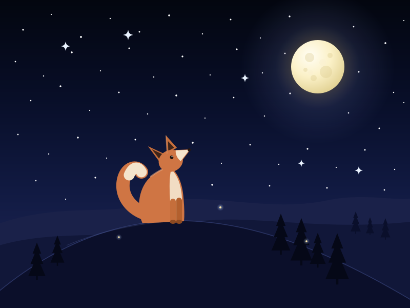
<svg xmlns="http://www.w3.org/2000/svg" viewBox="0 0 800 600" width="100%" height="100%">
  <defs>
    <linearGradient id="sky" x1="0" y1="0" x2="0" y2="1">
      <stop offset="0%" stop-color="#03060f"/>
      <stop offset="32%" stop-color="#080e28"/>
      <stop offset="62%" stop-color="#111a42"/>
      <stop offset="85%" stop-color="#1b2352"/>
      <stop offset="100%" stop-color="#28305f"/>
    </linearGradient>

    <radialGradient id="halo" cx="50%" cy="50%" r="50%">
      <stop offset="0%" stop-color="#fff3c4" stop-opacity="0.55"/>
      <stop offset="26%" stop-color="#ffdd8b" stop-opacity="0.26"/>
      <stop offset="55%" stop-color="#a8b6ff" stop-opacity="0.10"/>
      <stop offset="100%" stop-color="#8fa7ff" stop-opacity="0"/>
    </radialGradient>

    <radialGradient id="moonGrad" cx="36%" cy="30%" r="74%">
      <stop offset="0%" stop-color="#fffdf3"/>
      <stop offset="52%" stop-color="#fbf1c8"/>
      <stop offset="100%" stop-color="#e2d294"/>
    </radialGradient>

    <radialGradient id="sparkGlow" cx="50%" cy="50%" r="50%">
      <stop offset="0%" stop-color="#ffffff" stop-opacity="0.9"/>
      <stop offset="42%" stop-color="#cfe3ff" stop-opacity="0.45"/>
      <stop offset="100%" stop-color="#9fc3ff" stop-opacity="0"/>
    </radialGradient>

    <linearGradient id="trailGrad" gradientUnits="userSpaceOnUse" x1="0" y1="0" x2="130" y2="-37">
      <stop offset="0%" stop-color="#ffffff" stop-opacity="0.95"/>
      <stop offset="30%" stop-color="#d6e6ff" stop-opacity="0.55"/>
      <stop offset="70%" stop-color="#a9c8ff" stop-opacity="0.16"/>
      <stop offset="100%" stop-color="#a9c8ff" stop-opacity="0"/>
    </linearGradient>

    <g id="pine">
      <path d="M0,-52 L-10,-26 L-5,-26 L-15,-2 L-8,-2 L-20,26 L20,26 L8,-2 L15,-2 L5,-26 L10,-26 Z"/>
      <rect x="-2" y="24" width="4" height="11"/>
    </g>

    <style><![CDATA[
      .tw{
        animation-name: tw;
        animation-duration: 3s;
        animation-iteration-count: infinite;
        animation-timing-function: ease-in-out;
      }
      .spark{
        animation-name: spark;
        animation-duration: 4.2s;
        animation-iteration-count: infinite;
        animation-timing-function: ease-in-out;
        transform-box: fill-box;
        transform-origin: center;
      }
      .d1{animation-delay:-.2s;animation-duration:3.2s}
      .d2{animation-delay:-1.1s;animation-duration:2.6s}
      .d3{animation-delay:-2.0s;animation-duration:3.8s}
      .d4{animation-delay:-.7s;animation-duration:4.4s}
      .d5{animation-delay:-1.6s;animation-duration:2.9s}
      .d6{animation-delay:-2.6s;animation-duration:3.6s}
      .d7{animation-delay:-3.2s;animation-duration:4.1s}
      .d8{animation-delay:-.4s;animation-duration:2.4s}

      @keyframes tw{
        0%,100%{opacity:.10}
        50%{opacity:1}
      }
      @keyframes spark{
        0%,100%{transform:scale(.55) rotate(0deg);opacity:.40}
        50%{transform:scale(1.12) rotate(45deg);opacity:1}
      }

      .moon-halo{
        animation: glowPulse 7s ease-in-out infinite;
      }
      @keyframes glowPulse{
        0%,100%{opacity:.82}
        50%{opacity:1}
      }

      .shoot{
        opacity:0;
        animation: shoot 4s linear infinite;
        animation-delay: 1.2s;
      }
      @keyframes shoot{
        0%   {transform: translate(0px,0px);      opacity:0;}
        1.5% {opacity:1;}
        11%  {opacity:1;}
        17%  {transform: translate(-420px,120px); opacity:0;}
        100% {transform: translate(-420px,120px); opacity:0;}
      }

      .ff{animation: float 8s ease-in-out infinite;}
      .ff2{animation-duration:10.5s; animation-delay:-3.4s;}
      .ff3{animation-duration:12s; animation-delay:-6.1s;}
      @keyframes float{
        0%,100%{transform:translate(0px,0px);opacity:.22}
        50%    {transform:translate(9px,-16px);opacity:.9}
      }
    ]]></style>
  </defs>

  <!-- ============ SKY ============ -->
  <rect x="0" y="0" width="800" height="600" fill="url(#sky)"/>

  <!-- ============ STARS ============ -->
  <g fill="#ffffff">
    <circle cx="45"  cy="58"  r="1.6" class="tw d2"/>
    <circle cx="100" cy="28"  r="1.1" class="tw d5"/>
    <circle cx="158" cy="72"  r="1.9" class="tw d1"/>
    <circle cx="215" cy="36"  r="1.2" class="tw d7"/>
    <circle cx="272" cy="62"  r="1.5" class="tw d3"/>
    <circle cx="330" cy="30"  r="1.8" class="tw d6"/>
    <circle cx="395" cy="66"  r="1.2" class="tw d4"/>
    <circle cx="450" cy="38"  r="1.5" class="tw d8"/>
    <circle cx="508" cy="74"  r="1.1" class="tw d2"/>
    <circle cx="565" cy="32"  r="1.7" class="tw d5"/>
    <circle cx="690" cy="52"  r="1.4" class="tw d1"/>
    <circle cx="752" cy="84"  r="1.8" class="tw d6"/>
    <circle cx="788" cy="40"  r="1.1" class="tw d3"/>

    <circle cx="30"  cy="120" r="1.4" class="tw d4"/>
    <circle cx="85"  cy="148" r="1.2" class="tw d7"/>
    <circle cx="140" cy="102" r="1.8" class="tw d2"/>
    <circle cx="196" cy="138" r="1.1" class="tw d8"/>
    <circle cx="252" cy="94"  r="1.5" class="tw d5"/>
    <circle cx="300" cy="150" r="1.2" class="tw d1"/>
    <circle cx="356" cy="110" r="1.7" class="tw d3"/>
    <circle cx="410" cy="146" r="1.1" class="tw d6"/>
    <circle cx="462" cy="96"  r="1.6" class="tw d4"/>
    <circle cx="512" cy="142" r="1.2" class="tw d7"/>
    <circle cx="556" cy="104" r="1.4" class="tw d2"/>
    <circle cx="700" cy="140" r="1.5" class="tw d8"/>
    <circle cx="768" cy="180" r="1.2" class="tw d5"/>

    <circle cx="60"  cy="196" r="1.3" class="tw d1"/>
    <circle cx="118" cy="168" r="1.7" class="tw d6"/>
    <circle cx="175" cy="215" r="1.1" class="tw d4"/>
    <circle cx="232" cy="180" r="1.5" class="tw d2"/>
    <circle cx="288" cy="222" r="1.2" class="tw d8"/>
    <circle cx="344" cy="186" r="1.8" class="tw d3"/>
    <circle cx="400" cy="230" r="1.1" class="tw d7"/>
    <circle cx="456" cy="190" r="1.4" class="tw d5"/>
    <circle cx="516" cy="226" r="1.2" class="tw d1"/>
    <circle cx="566" cy="182" r="1.6" class="tw d6"/>
    <circle cx="680" cy="220" r="1.3" class="tw d4"/>
    <circle cx="740" cy="250" r="1.5" class="tw d2"/>
    <circle cx="788" cy="200" r="1.1" class="tw d7"/>

    <circle cx="35"  cy="262" r="1.4" class="tw d8"/>
    <circle cx="95"  cy="300" r="1.2" class="tw d3"/>
    <circle cx="152" cy="268" r="1.7" class="tw d5"/>
    <circle cx="208" cy="308" r="1.1" class="tw d1"/>
    <circle cx="264" cy="272" r="1.5" class="tw d6"/>
    <circle cx="320" cy="312" r="1.2" class="tw d4"/>
    <circle cx="376" cy="278" r="1.8" class="tw d7"/>
    <circle cx="432" cy="318" r="1.1" class="tw d2"/>
    <circle cx="488" cy="282" r="1.4" class="tw d8"/>
    <circle cx="544" cy="320" r="1.2" class="tw d5"/>
    <circle cx="600" cy="290" r="1.6" class="tw d3"/>
    <circle cx="656" cy="326" r="1.1" class="tw d1"/>
    <circle cx="712" cy="292" r="1.5" class="tw d6"/>
    <circle cx="770" cy="330" r="1.2" class="tw d4"/>

    <circle cx="70"  cy="352" r="1.3" class="tw d7"/>
    <circle cx="128" cy="388" r="1.1" class="tw d2"/>
    <circle cx="186" cy="346" r="1.6" class="tw d5"/>
    <circle cx="244" cy="392" r="1.2" class="tw d8"/>
    <circle cx="300" cy="358" r="1.4" class="tw d3"/>
    <circle cx="358" cy="398" r="1.1" class="tw d6"/>
    <circle cx="414" cy="360" r="1.7" class="tw d1"/>
    <circle cx="470" cy="396" r="1.2" class="tw d4"/>
    <circle cx="526" cy="362" r="1.4" class="tw d7"/>
    <circle cx="582" cy="400" r="1.1" class="tw d2"/>
    <circle cx="638" cy="366" r="1.5" class="tw d8"/>
    <circle cx="694" cy="404" r="1.2" class="tw d5"/>
    <circle cx="750" cy="370" r="1.4" class="tw d3"/>
    <circle cx="786" cy="420" r="1.1" class="tw d6"/>
  </g>

  <!-- sparkle stars -->
  <g fill="#eaf3ff">
    <g transform="translate(128,90)"><path class="spark d2" d="M0,-9 C1.4,-2.8 2.8,-1.4 9,0 C2.8,1.4 1.4,2.8 0,9 C-1.4,2.8 -2.8,1.4 -9,0 C-2.8,-1.4 -1.4,-2.8 0,-9 Z"/></g>
    <g transform="translate(478,152)"><path class="spark d5" d="M0,-8 C1.2,-2.5 2.5,-1.2 8,0 C2.5,1.2 1.2,2.5 0,8 C-1.2,2.5 -2.5,1.2 -8,0 C-2.5,-1.2 -1.2,-2.5 0,-8 Z"/></g>
    <g transform="translate(700,332)"><path class="spark d8" d="M0,-8 C1.2,-2.5 2.5,-1.2 8,0 C2.5,1.2 1.2,2.5 0,8 C-1.2,2.5 -2.5,1.2 -8,0 C-2.5,-1.2 -1.2,-2.5 0,-8 Z"/></g>
    <g transform="translate(250,68)"><path class="spark d4" d="M0,-10 C1.5,-3.1 3.1,-1.5 10,0 C3.1,1.5 1.5,3.1 0,10 C-1.5,3.1 -3.1,1.5 -10,0 C-3.1,-1.5 -1.5,-3.1 0,-10 Z"/></g>
    <g transform="translate(588,318)"><path class="spark d7" d="M0,-7 C1,-2.2 2.2,-1 7,0 C2.2,1 1,2.2 0,7 C-1,2.2 -2.2,1 -7,0 C-2.2,-1 -1,-2.2 0,-7 Z"/></g>
  </g>

  <!-- ============ MOON ============ -->
  <circle class="moon-halo" cx="620" cy="130" r="150" fill="url(#halo)"/>
  <circle cx="620" cy="130" r="52" fill="url(#moonGrad)"/>
  <g fill="#d9c98c" opacity="0.35">
    <circle cx="604" cy="112" r="9"/>
    <circle cx="636" cy="140" r="12"/>
    <circle cx="612" cy="152" r="6"/>
    <circle cx="644" cy="108" r="5"/>
    <circle cx="596" cy="136" r="4"/>
  </g>
  <g fill="#f9f0cf" opacity="0.5">
    <circle cx="630" cy="122" r="7"/>
    <circle cx="606" cy="142" r="5"/>
  </g>

  <!-- ============ SHOOTING STAR ============ -->
  <g transform="translate(724,26)">
    <g class="shoot">
      <line x1="0" y1="0" x2="130" y2="-37" stroke="url(#trailGrad)" stroke-width="3.2" stroke-linecap="round"/>
      <circle cx="0" cy="0" r="11" fill="url(#sparkGlow)"/>
      <circle cx="0" cy="0" r="2.8" fill="#ffffff"/>
    </g>
  </g>

  <!-- ============ DISTANT HILLS ============ -->
  <path d="M -20,442 C 110,392 200,422 300,396 C 400,370 520,416 640,390 C 720,374 780,396 820,384 L 820,620 L -20,620 Z"
        fill="#1a2149"/>
  <path d="M -20,484 C 100,442 220,472 340,440 C 470,406 600,456 820,430 L 820,620 L -20,620 Z"
        fill="#111739"/>

  <!-- small trees on distant hill -->
  <g fill="#0a0f2b">
    <use href="#pine" transform="translate(694,438) scale(0.5)"/>
    <use href="#pine" transform="translate(722,444) scale(0.4)"/>
    <use href="#pine" transform="translate(752,450) scale(0.48)"/>
  </g>

  <!-- ============ MAIN HILL ============ -->
  <path d="M -60,620 C 60,500 200,432 340,430 C 480,428 640,480 860,620 Z" fill="#0b0f2a"/>
  <path d="M -60,620 C 60,500 200,432 340,430 C 480,428 640,480 860,620"
        fill="none" stroke="#4a5a9e" stroke-width="1.6" opacity="0.45"/>
  <path d="M 130,478 C 200,448 270,436 340,430" fill="none" stroke="#6d7fc4" stroke-width="1.2" opacity="0.22"/>

  <!-- trees on main hill -->
  <g fill="#050817">
    <use href="#pine" transform="translate(112,494) scale(0.68)"/>
    <use href="#pine" transform="translate(72,516) scale(0.84)"/>
    <use href="#pine" transform="translate(548,464) scale(0.92)"/>
    <use href="#pine" transform="translate(588,480) scale(1.06)"/>
    <use href="#pine" transform="translate(620,494) scale(0.78)"/>
    <use href="#pine" transform="translate(658,514) scale(1.15)"/>
  </g>

  <!-- ============ THE FOX ============ -->
  <g transform="translate(322,433)">

    <!-- tail (gentle sway) -->
    <g>
      <animateTransform attributeName="transform" type="rotate"
        values="-6 -26 -14; 7 -26 -14; -6 -26 -14"
        keyTimes="0;0.5;1"
        calcMode="spline"
        keySplines="0.45 0 0.55 1; 0.45 0 0.55 1"
        dur="3.6s" repeatCount="indefinite"/>
      <path d="M -26,-14 C -64,-20 -90,-52 -80,-86 C -74,-106 -56,-112 -46,-98"
            fill="none" stroke="#cf7544" stroke-width="26" stroke-linecap="round"/>
      <path d="M -70,-92 C -64,-106 -54,-112 -46,-98"
            fill="none" stroke="#f4e4cc" stroke-width="21" stroke-linecap="round"/>
    </g>

    <!-- body -->
    <path d="M -44,2 C -58,-30 -50,-72 -26,-90 C -14,-99 -2,-106 8,-108
             C 24,-100 34,-76 36,-48 C 38,-26 38,-12 37,-2 Z"
          fill="#cf7544"/>

    <!-- moonlit rim on the back -->
    <path d="M -28,-89 C -16,-98 -4,-105 7,-107" fill="none"
          stroke="#f7b183" stroke-width="3" stroke-linecap="round" opacity="0.55"/>

    <!-- chest / belly cream -->
    <path d="M 12,-103 C 24,-93 32,-72 33,-46 C 33,-30 31,-16 29,-6
             C 24,-3 16,-4 13,-9 C 10,-34 6,-80 12,-103 Z"
          fill="#f4e4cc" opacity="0.93"/>

    <!-- front legs -->
    <rect x="10" y="-46" width="11" height="48" rx="5.5" fill="#c56e3b"/>
    <rect x="22" y="-48" width="11" height="50" rx="5.5" fill="#b3602e"/>
    <ellipse cx="15.5" cy="-1" rx="6" ry="4" fill="#8d4a22"/>
    <ellipse cx="27.5" cy="-1" rx="6" ry="4" fill="#8d4a22"/>

    <!-- head -->
    <g transform="rotate(-20 14 -112)">
      <!-- ears -->
      <path d="M -8,-128 L -18,-162 L 8,-136 Z" fill="#c56e3b"/>
      <path d="M 12,-136 L 22,-170 L 34,-140 Z" fill="#c56e3b"/>
      <path d="M -6,-132 L -13,-154 L 4,-137 Z" fill="#3e2419"/>
      <path d="M 16,-140 L 22,-158 L 29,-142 Z" fill="#3e2419"/>

      <!-- skull -->
      <ellipse cx="14" cy="-120" rx="24" ry="21" fill="#cf7544"/>
      <!-- snout -->
      <path d="M 26,-138 L 58,-128 L 30,-110 Z" fill="#cf7544"/>
      <!-- cream muzzle -->
      <path d="M 30,-136 L 56,-128 L 32,-113 C 27,-121 27,-130 30,-136 Z" fill="#f4e4cc"/>
      <!-- nose -->
      <circle cx="55" cy="-128" r="3" fill="#241610"/>
      <!-- eye -->
      <ellipse cx="18" cy="-126" rx="3.3" ry="3.7" fill="#241610"/>
      <circle cx="19.2" cy="-127.4" r="1.1" fill="#ffffff" opacity="0.85"/>
      <!-- ear highlight -->
      <path d="M 12,-136 L 22,-170" fill="none" stroke="#f5b183" stroke-width="1.6" opacity="0.45"/>
    </g>
  </g>

  <!-- ============ FIREFLIES ============ -->
  <g>
    <g class="ff" transform="translate(430,404)">
      <circle r="7" fill="url(#sparkGlow)" opacity="0.6"/>
      <circle r="1.9" fill="#ffe9a8"/>
    </g>
    <g class="ff ff2" transform="translate(232,462)">
      <circle r="6" fill="url(#sparkGlow)" opacity="0.55"/>
      <circle r="1.6" fill="#ffe9a8"/>
    </g>
    <g class="ff ff3" transform="translate(598,470)">
      <circle r="6.5" fill="url(#sparkGlow)" opacity="0.55"/>
      <circle r="1.7" fill="#ffe9a8"/>
    </g>
  </g>
</svg>
Reasoning trace (20,642 tokens)
Let me create a nice SVG illustration with a viewBox 0 0 800 600.

Key elements:
- Night sky gradient (deep blue to purple)
- Stars many, twinkling with staggered animation delays
- Moon with glow (radial gradient + filter blur)
- Shooting star crossing every ~4s, first within 2s
- Distant hills
- Trees (pine silhouettes)
- Main hill
- Fox sitting on hill, looking up at moon. Pointy ears, snout, bushy tail with white tip.
- Tail swaying gently.

Let me design the fox. Sitting fox, side/three-quarter view looking up-left toward moon (moon in upper left or upper right?). Let's put moon upper right, fox facing right... Actually "looking at the moon" — put moon upper-left and fox facing left? Let's put moon at upper right-ish (x=620, y=130) and fox on hill around x=300, facing right and up.

Fox sitting: body is a rounded triangle/pear shape, head on top tilted up, two pointy ears, snout pointing up-right, tail curling behind to the left, bushy with white tip.

Let me construct the fox with paths.

Fox position: sitting on hill crest around (330, 430). Hill top around y=430.

Let's define fox body: a shape from bottom (x 300-370, y 445) narrowing up to shoulders.

Let me write coordinates:

Body path: M 310,448 C 305,410 315,380 335,368 C 352,358 368,368 372,392 C 376,415 378,435 375,448 Z

Hmm, I'll be more careful. Let's build the fox facing right (toward moon at right).

Fox sitting posture:
- Tail: behind, sweeping to the left and curling up.
- Hind legs / haunch: rounded at the base.
- Body: leaning slightly.
- Chest/front legs: vertical down to ground.
- Head: on top, tilted up-right.
- Ears: two triangles pointing up.
- Snout: pointing right-up.

Coordinates (fox roughly 90 wide, 120 tall), placed with base at y=445, hill crest around y=430-450.

Let me set:
- Haunch center: (330, 410), radius ~38
- Body rises to chest at (365, 380)
- Head center at (372, 350), radius ~26
- Snout tip at (410, 338)
- Ears: left ear base (355,330) tip (348,298); right ear base (378,328) tip (382,296)
- Tail: from (305, 425) sweeping left to (255, 390) and up, with white tip at the end.

Actually let me draw in a slightly cleaner way with a sitting fox silhouette.

Let me define a group with transform translate to position, then draw in local coords.

Local coordinate system: fox origin at base center (0,0), y up negative.

Body outline (single path), facing right:
Start at tail root bottom right... Let's do:

Main body+head path:
M -30,0            (bottom left of haunch)
C -42,-20 -40,-55 -22,-72     (up the back)
C -12,-82 -6,-92 0,-100       (neck/back of head)
...

This is getting complicated. Let me instead compose from overlapping shapes — it's fine since it's a silhouette illustration; overlapping shapes with same fill color merge visually.

Approach: use a single fill color "fox orange" (#e07b39 / #d97a3d) with darker shading and white/cream for chest & tail tip and muzzle.

Shapes:
1. Tail: a thick curved path from back of haunch sweeping left and up, ending in white tip. Use stroke with round cap? A path with stroke-width 22, stroke-linecap round, plus a separate white tip stroke shorter. That's a good trick for a bushy tail. Actually use tapered path for better look: draw path with variable width.

Simplest robust: tail as a filled path shaped like a comma.

Tail path (local coords, fox facing right, tail sweeping back-left and up):
M -20,-10
C -55,-15 -75,-45 -68,-72
C -63,-92 -45,-98 -35,-88
C -28,-80 -34,-70 -42,-66   ...

Hmm. Let's just make it a thick stroked path:
path d="M -20,-8 C -55,-10 -78,-38 -70,-68 C -66,-84 -52,-92 -42,-84"
stroke="#e07b39" stroke-width="26" stroke-linecap="round" fill="none"
Then white tip: overlapping last segment with stroke-width="18" stroke="#f5efe6" — path from (-58,-78) to (-42,-84).

Hmm the white tip should be at the end. Let's do a second path: d="M -60,-78 C -56,-88 -50,-90 -42,-84" with stroke white width 20 round cap.

That gives a nice tapered look-ish.

2. Haunch/body: ellipse-ish path.
3. Chest/breast: lighter cream patch.
4. Front legs: two small rounded rects.
5. Head: rounded shape with snout.
6. Ears: triangles with inner darker.
7. Eye: small dark dot, closed-eye maybe. Little glint.

Let me place the fox sitting, looking up to the right.

Head at around local (10, -95). Snout pointing right-up toward (40, -105).

Let me define head as a path:
M -8,-88  (back of head, lower left)
C -14,-105 -4,-118 12,-116  (top of head)
C 26,-114 36,-106 44,-100   (forehead to snout top)
L 46,-96 (snout tip)
C 38,-92 28,-92 20,-94     (under snout to jaw)
C 12,-86 4,-84 -8,-88 Z

Roughly a wedge head pointing right. Fine.

Ears: left ear triangle: points (-10,-104), (-16,-128), (2,-112). Right ear: (8,-114), (12,-136), (24,-112).

Hmm, need ears above head. Let's compute head top around y=-116. Ears from y=-112 up to y=-140.

Left ear: M -6,-108 L -14,-136 L 6,-116 Z
Right ear: M 10,-114 L 16,-142 L 26,-116 Z

Inner ear (darker): smaller triangles inside.

Eye: at (18,-104) small ellipse, dark #2a1f1a, plus tiny white dot.

Nose: at snout tip (46,-97) small dark circle r=2.5.

Muzzle white: path near snout underside.

Whiskers maybe skip.

Chest cream: path on the front of body.

Let me now write body:

Body path:
M -28,-2
C -34,-24 -30,-56 -14,-74
C -4,-86 6,-92 14,-96
C 22,-90 30,-78 32,-60
C 34,-40 34,-16 34,-2
Z

Hmm this makes the body a blob from x=-28 to 34, base at y=-2. Head sits on top around y=-96 to -140. So body height ~94 plus head 45. Total ~140. Good size for 800x600 with hill.

Wait, but the fox needs to sit on the hill. Base y=0 at hill surface.

Actually simplify: body as a path that includes the rounded back and chest.

Let me just do:
- Haunch: ellipse cx=-10 cy=-30 rx=32 ry=34 (rounded back-end)
- Chest/body: path from shoulders down.

Honestly, overlapping ellipse + path works fine.

Body main path (silhouette):
M -38,-6
C -46,-30 -40,-64 -20,-80
C -6,-92 8,-98 18,-100
C 30,-92 36,-72 38,-50
C 40,-30 40,-12 40,-6
Z

Then legs: front legs rect from x=14..24, y=-30..0 rounded; x=26..36 y=-30..0.

Actually front legs of sitting fox are straight down at the front. Let's add:
path M 16,-34 L 16,-2 Q 16,2 20,2 L 26,2 Q 30,2 30,-2 L 30,-34 Z — that's one leg pair. Simplify: two rounded rects.

Ground contact: fox base at y=0 local.

Tail from haunch back: starts at (-34,-20) sweeping left-down then up.

Tail path: M -30,-14 C -62,-18 -84,-46 -76,-76 C -72,-92 -58,-100 -46,-90
with stroke-width 24, color orange, round cap.
Tip: path M -62,-86 C -58,-96 -52,-98 -46,-90 stroke white width 18.

Hmm the tip is at the end point (-46,-90). Actually the tail curls up so the tip is up at around (-46,-90). But we want the white tip at the end of the tail which is at the top. Good.

Actually maybe make the tail sweep more to the left and up, ending higher. Let's end around (-50,-95).

Let's fine tune with the group transform: translate(310, 442) so the fox base sits at y=442 on the hill.

Hmm, hill: let's design the hill as a large arc. Main hill: path M -50,600 C 100,470 260,430 420,432 C 560,434 700,490 850,600 Z. So the crest is around x=350-420, y~432. Fox at x=310 with base y=442 — sits slightly on the left slope. Maybe put fox at x=340, y=436.

Let me make the hill crest flat-ish around x=250-400 at y≈430.

Hill path: M -60,620 C 60,500 200,432 340,430 C 480,428 640,480 860,620 L 860,620 L -60,620 Z

Fox base at (320, 434).

Hmm, fox local coords: base at y=0, so translate(320, 434). Fox top (ears) at y=-142 → 292. Good, well within.

Moon: place at (620, 130) radius 55. Fox faces right and up toward moon — moon at (620,130) relative to fox head (330, 300)... direction is up-right. Good, head tilted up-right.

Distant hills: two layers behind the main hill, darker/lighter.

Trees: pine silhouettes on distant hills and near edges.

Stars: generate many small circles with twinkle animation using CSS keyframes with different delays. Use a <style> block inside SVG. CSS animations in SVG work fine.

Let me write the CSS:

@keyframes twinkle { 0%,100%{opacity:.15; transform:scale(.7)} 50%{opacity:1; transform:scale(1.15)} }

For circles, transform-origin needs to be set per element... Using scale on circles without transform-box can be tricky. Better: use `transform-box: fill-box; transform-origin: center;`. In Chrome, transform-box: fill-box works on SVG elements. But for a circle of r=1.5, fill-box is the bounding box, center = center. That works.

Alternatively animate opacity only + r via CSS? r isn't animatable via CSS in all cases... Actually r is a CSS property in SVG2 and Chrome supports it. But safer: animate opacity and use scale with transform-box.

Let's just do opacity + transform scale with transform-box: fill-box; transform-origin: center.

For four-point star sparks, I'll use small circles plus a few 4-point star shapes (paths) with glow.

Shooting star: use CSS animation on a group. Period 4s. First one within 2s: set animation-delay to 1.2s and duration 4s, with the visible portion in the first ~15% of the timeline.

Shooting star animation:
@keyframes shoot {
  0% { opacity: 0; transform: translate(-120px, -60px); }
  2% { opacity: 1; }
  12% { opacity: 1; }
  16% { opacity: 0; transform: translate(320px, 160px); }
  100% { opacity: 0; transform: translate(320px,160px); }
}

Hmm, need it to travel. Let's define the shooting star as a group with a line and a head, positioned at start, then translate across.

Actually, simpler: the group is drawn at a base position and animated with translate from (0,0) to (260,130) with opacity fade. Delay so first appearance at ~1.2s... but with delay 1.2s and duration 4s, the next appears at 5.2s, 9.2s... The requirement: "crossing the sky every 4 seconds (the first one within 2 seconds)". Duration 4s with delay 1.2s satisfies roughly. Actually with the keyframes where the motion happens in 0-16% of 4s = 0.64s, then repeats every 4s. First start at 1.2s. Good.

Let me use negative delay? No, use positive delay 1.2s.

Hmm, but with animation-delay, before the delay elapses, the element uses... it's not styled by the animation, so it uses base styles. So set base opacity: 0 on the group. Good.

Let me place the shooting star base position at (520, 60) and it moves to (300, 190)? Typically shooting stars go down-left or down-right. Let's go from upper-right to lower-left: base at (680, 70), translate to (-320, 170)? That would go off the left. Let's base at (660, 80) and translate(-300, 150) → ends at (360, 230). That crosses the sky nicely, passing left of the moon? Moon is at (620,130). Hmm the shooting star would pass near/over the moon. Let's put it higher: base at (700, 50), translate(-360, 160) → ends at (340, 210). Passes below the moon region... moon at (620,130) with r 55, so its bottom is 185. The path from (700,50) to (340,210) — at x=620, t=(700-620)/360=0.222, y=50+0.222*160=85.5. Moon at (620,130) radius 55 → top of moon is 75. So the shooting star at (620,85) would be inside the moon. Hmm. Let's raise the shooting star start higher and move up: base (720, 30), translate(-420, 120) → ends (300,150). At x=620: t=0.238, y=30+28.6=58.6. Moon top at 75. OK, clear. Good.

But we also have stars in that region; fine.

The trail: a line with gradient stroke going from head backwards. Since it translates, orientation must be fixed along the direction of travel (-420, 120) → angle = atan2(120,-420) = 180 - 15.95 = 164 degrees. So the trail extends opposite to travel direction: direction of travel is left-down, so trail extends right-up.

Let's build the shooting star group at origin (0,0) = head, with trail going to the upper-right along the direction (420,-120) normalized: (0.961, -0.275). Trail length 120: endpoint (115, -33).

Use a line from (0,0) to (115,-33) with stroke gradient (linear) from white opacity 0.9 → 0.

Then the group transform: translate(720,30) plus animation adds translate. But CSS transform on an SVG <g> that already has a transform attribute — the CSS transform replaces the attribute? In SVG2/Chrome, CSS transform property overrides the transform attribute. So I should nest: outer <g transform="translate(720,30)"> containing inner <g class="shoot"> with CSS animation translate. That works.

Actually careful: CSS transform on inner g overrides its own attribute (none). Good.

Also add glow filter for the head circle.

Filters: feGaussianBlur for moon glow. Let's define:
<filter id="glow" x="-100%" y="-100%" width="300%" height="300%">
  <feGaussianBlur stdDeviation="14" result="b"/>
  <feMerge><feMergeNode in="b"/><feMergeNode in="SourceGraphic"/></feMerge>
</filter>

For moon: circle with radial gradient fill + a blurred halo circle behind.

Better: halo = circle r=110 fill="url(#moonHalo)" where moonHalo is a radial gradient from rgba(255,240,200,0.55) to transparent. That avoids filters (cheaper, and looks soft).

Also a moon crater texture: a few subtle circles with low opacity.

Stars: I'll generate ~70 stars manually. That's a lot of markup but fine. Maybe I write them with varied positions. Let me generate a list.

Actually, I can't use JS. So I must hand-write. Let me write ~60 circles with delays. To keep it compact, I'll write each as `<circle cx=".." cy=".." r=".." class="s" style="animation-delay:-1.3s"/>`.

Hmm, negative delays offset the phase which is good for variation.

Let me use a few CSS classes for sizes: .s1 (r=1.2), .s2 (r=1.8), .s3 (r=2.4). Actually just set r attribute per circle and use class "star".

Since transform: scale with transform-box fill-box works per element, twinkle will look nice.

Let me write the star field, avoiding the moon area (620,130 r 90).

Stars list (cx, cy, r, delay):

Upper band y 20-200, then middle 200-350.

Let me write out ~55:

(40,60,1.5,-0.4) (95,30,1.1,-1.2) (150,75,1.8,-2.1) (215,40,1.2,-0.8) (270,95,1.4,-3.0)
(330,45,1.9,-1.6) (390,80,1.2,-2.6) (445,35,1.5,-0.2) (505,70,1.1,-1.9) (560,25,1.7,-3.3)
(720,55,1.4,-1.1) (770,95,1.8,-2.8) (700,150,1.2,-0.6) (760,190,1.5,-2.2) (655,215,1.1,-1.4)
(605,265,1.6,-3.1) (555,190,1.3,-0.9) (500,145,1.7,-2.4) (455,205,1.2,-1.7) (410,150,1.4,-0.3)
(355,195,1.8,-2.9) (300,145,1.1,-1.3) (245,190,1.5,-2.0) (190,140,1.3,-0.7) (135,195,1.9,-3.2)
(80,150,1.2,-1.5) (25,205,1.6,-2.5) (110,260,1.4,-0.5) (170,300,1.2,-1.8) (230,255,1.7,-2.7)
(290,300,1.3,-3.4) (350,265,1.1,-1.0) (420,310,1.5,-2.3) (480,270,1.8,-0.4) (540,320,1.2,-1.6)
(600,355,1.4,-2.9) (660,300,1.1,-0.8) (715,340,1.6,-2.1) (770,290,1.3,-3.5) (740,410,1.2,-1.2)
(690,430,1.5,-2.6) (620,400,1.1,-0.1) (560,430,1.3,-1.9) (500,390,1.7,-3.0) (450,420,1.2,-0.6)
(390,380,1.4,-2.2) (330,420,1.1,-1.4) (270,380,1.6,-2.8) (210,410,1.3,-0.9) (150,370,1.5,-3.1)
(90,330,1.2,-1.7) (45,290,1.7,-2.4) (105,110,1.0,-0.3) (610,95,1.2,-2.0) (740,240,1.0,-3.3)
(340,90,1.0,-1.1)

Wait, some of these may be under the hill. The hill crest is y~430 at x=340 and rises. The distant hills: let's have distant hills start around y=430-500. Stars down to y=430 in x range 500-770 would be behind hills? The right side hill goes down to 620 at x=860. Let's just keep stars above y=420 mostly and the hill will cover from ~y=430 downward. Actually the main hill path: at x=800, y is around... Let's compute: cubic from (340,430) with control (480,428) and (640,480) to (860,620). At x=800 it's around y≈570. Hmm, that means at the far right, the hill is low, so stars at y=430 near x=740 would be visible above the hill. Fine, they can be visible in the sky. OK.

But wait — with the sky gradient going from dark blue at top to lighter at horizon, and hills at bottom. Fine.

Let me reconsider the composition:

- Sky: rect 0,0,800,600 with linear gradient #0b1026 → #1b1c47 → #2e2a5e near horizon? Actually night sky usually lighter near horizon due to... no, darker. Let's do top #060a1f, mid #101a3d, bottom #26265c. Hmm, with a moon, the area near the moon is brighter.

- Moon at (620, 130), r 52.
- Halo radial gradient around it.
- Stars.
- Distant hills: two ranges, color #1a2148 and #232a55.
- Trees: dark silhouettes on the hills.
- Main hill: #12142e or a dark blue-black with a subtle rim light on the crest edge (lighter line from the moon glow).
- Fox on the hill.
- Fireflies? Not required. Maybe a few subtle glowing dots near the hill for charm. Keep it minimal.

Palette:
sky top #070b23, mid #10173c, low #1e2352, horizon glow #2b2f63
hills far #1b2350, mid #141a3e, near #0b0f28
moon #fff7d6, halo #ffe9a8
stars #ffffff / #cfe0ff
fox body #e0773a, shading #c25f2a, belly cream #f3e2c8, dark #2a1a13, tail tip #f6efe2.

Actually for a night scene, the fox should be somewhat desaturated/lit by moonlight. Let's use #d97a45 with highlights #f0a06a. It's fine, adds contrast.

Now the trees: pine trees as stacked triangles. Place a few on the far hill and near the edges.

Let me define a pine tree symbol via <g> reused with <use>? <use> with href="#pine" requires an id and it works inline. Or just write paths. I'll use <use> for compactness — but <use> referencing an element defined in <defs> works in Chrome natively. Yes.

Let me define:
<g id="pine">
  <path d="M0,-40 L-12,-14 L-7,-14 L-18,8 L-11,8 L-24,36 L0,36 L24,36 L11,8 L18,8 L7,-14 L12,-14 Z"/>
</g>
Hmm, that's a bit crude. Simpler: three stacked triangles plus trunk.

<g id="pine">
 <path d="M0,-46 L-11,-20 L-5,-20 L-16,4 L-8,4 L-20,30 L20,30 L8,4 L16,4 L5,-20 L11,-20 Z" />
 <rect x="-2.5" y="28" width="5" height="12" />
</g>

That's a decent pine. Total height 46+12 = 58 from y=-46 to 42.

Use it at various scales/positions with fill.

Trees on the far hill (behind main hill), positioned around y=440-470 area, small.

Also maybe a couple of large trees framing the left side? Could be nice but the fox is center-left. Let's put a small cluster of pines on the right side of the hill and left side.

Hmm, careful not to clutter. I'll put:
- A cluster of 3 pines at around x=560-620 on the main hill crest area (behind fox at x=320? no, on the right).
- A couple at x=120-160.

Wait, the fox is at x=320. Trees at right x=520-620 sitting on the main hill. The main hill at x=520 has y ≈ ... from (340,430) to (860,620) with controls (480,428),(640,480): at t=0.35, x ≈ 340*0.274 + 480*3*0.1225*0.65 ... let me just estimate: the curve passes around (560, 480). So trees at (560, 480) base.

And at x=200 on the left: main hill from (-60,620) to (340,430) with controls (60,500),(200,432). At x=200, y≈450? Let's estimate the curve: P0=(-60,620), P1=(60,500), P2=(200,432), P3=(340,430). At t=0.5: x = 0.125*(-60)+0.375*60+0.375*200+0.125*340 = -7.5+22.5+75+42.5 = 132.5; y = 0.125*620+0.375*500+0.375*432+0.125*430 = 77.5+187.5+162+53.75 = 480.75. So at x=132, y=481.
At t=0.7: x = 0.027*(-60)+0.189*60+0.441*200+0.343*340 = -1.62+11.34+88.2+116.62=214.5; y=0.027*620+0.189*500+0.441*432+0.343*430 = 16.74+94.5+190.5+147.5=449.2. So at x=214, y=449.

Fox at x=320: t≈0.95 → y≈432. Good. Let's put fox base at (320, 434) — slightly into the hill so it looks seated.

Actually let's double check t for x=320: t=0.9: x=0.001*(-60)+0.027*60+0.243*200+0.729*340 = -0.06+1.62+48.6+247.9=298. y=0.001*620+0.027*500+0.243*432+0.729*430=0.62+13.5+105+313.5=432.6. t=1: x=340,y=430. So at x=320, y≈431.5. Good — put fox base at y=433.

Trees on the left slope at (150, 478) small, (185, 462).

Trees on the right at (540, 476), (585, 492), (620, 500)? Let's compute the right hill curve for x=540: P0=(340,430),P1=(480,428),P2=(640,480),P3=(860,620). t=0.3: x=0.343*340+0.441*480+0.189*640+0.027*860 = 116.6+211.7+121+23.2=472.5; y=0.343*430+0.441*428+0.189*480+0.027*620=147.5+188.7+90.7+16.7=443.6.
t=0.45: x=0.166*340+0.408*480+0.334*640+0.091*860=56.5+195.9+213.8+78.3=544.5; y=0.166*430+0.408*428+0.334*480+0.091*620=71.4+174.6+160.3+56.4=462.7.
So at x=545, y≈463. Good.

So trees at right: base (545, 462), (590, 478), (630, 490) — need y for x=590: t≈0.55: x=0.091*340+0.334*480+0.408*640+0.166*860=30.9+160.3+261.1+142.8=595; y=0.091*430+0.334*428+0.408*480+0.166*620=39.1+143+195.8+102.9=480.8. So at x=595, y≈481.

OK. And on the far left, x=80: t=0.35: x=0.274*(-60)+0.444*60+0.239*200+0.043*340 = -16.4+26.6+47.8+14.6=72.6; y=0.274*620+0.444*500+0.239*432+0.043*430=169.9+222+103.2+18.5=513.6. So at x=73, y≈514.

Fine, I'll place trees roughly and let them overlap the hill; they'll be filled dark so it looks fine.

Trees must be drawn AFTER the hill (on top) so they sit on it. And they should be dark silhouettes, maybe slightly lighter than the hill to read. Let's use #0a0d20 for near trees and #141a3e for far ones on distant hills.

Distant hills (behind):
Range A: path M -20,470 C 120,400 240,430 360,400 C 480,370 620,420 820,380 L 820,620 L -20,620 Z — fill #1a2148.
Range B: M -20,520 C 140,470 280,500 420,460 C 560,420 700,480 820,450 L 820,620 L -20,620 Z — fill #131838.

Hmm, then main hill (#0b0f28) on top.

Then the horizon near y=400-450. Stars should be above ~y=400 in the visible areas. Some of my stars at y=420 will be hidden behind hills — that's fine, they just won't show. But wait — they're drawn BEFORE the hills, so they'd be covered. Good, that's realistic. But I listed stars up to y=430; those get covered. Fine.

Actually, better to put stars behind everything except sky. Yes.

Now the moon glow lighting on the main hill crest: add a subtle lighter stroke along the crest.

Let's add a path along the top edge of the main hill with stroke #2a3566 opacity 0.7 width 2, blurred slightly? Just a stroke.

Hmm, the hill's top edge path: M -60,620 C 60,500 200,432 340,430 C 480,428 640,480 860,620. I'll draw a stroke-only version of just that top part.

Now the fox details.

Let me finalize fox local coordinates with base at (0,0), facing right, head up-right.

Silhouette pieces:

1. Tail (behind body):
   <path d="M -26,-16 C -64,-22 -88,-52 -78,-84 C -72,-102 -54,-108 -44,-96" fill="none" stroke="#d97a45" stroke-width="26" stroke-linecap="round"/>
   White tip: <path d="M -66,-92 C -60,-104 -52,-108 -44,-96" fill="none" stroke="#f6efe2" stroke-width="19" stroke-linecap="round"/>

Hmm, the stroke-width 26 with a curve that curls — the tail would have uniform thickness. Let's make it taper by using two strokes: main stroke width 26 for the first part and a narrower one? Actually bushy tail = thick. Uniform thickness is acceptable, and the white tip at the end looks right.

But the tail tip should be pointing up. The end point is (-44,-96) with the round cap. Also, the white tip path covers the last bit. Good.

To animate the tail sway, apply a CSS transform rotate around the tail root. Tail root is at (-26,-16). So transform-origin: -26px -16px; with transform-box: view-box? For SVG, `transform-origin` with px values on an SVG element uses the element's user coordinate system if transform-box is view-box... Hmm.

Simpler: use SMIL animateTransform which is well supported.

<g id="tail">
  <animateTransform attributeName="transform" type="rotate" values="-5 -26 -16; 6 -26 -16; -5 -26 -16" dur="4s" repeatCount="indefinite" calcMode="spline" keySplines="0.4 0 0.6 1; 0.4 0 0.6 1" keyTimes="0;0.5;1"/>
  ...paths...
</g>

Yes, SMIL is reliable and seamless. Use SMIL for the tail. And CSS for stars/shooting star. Mixing is fine.

Actually maybe use CSS for everything with proper transform-origin using the syntax `transform-origin: -26px -16px` — in SVG, CSS transform-origin percentages/px resolve against the reference box which by default for SVG elements (without transform-box) is the view-box. So `transform-origin: -26px -16px` refers to the viewBox coordinate... but the tail is inside a nested <g transform="translate(320,433)">, so the origin in the element's local coordinate space... Hmm, CSS transforms on SVG elements apply in the element's local coordinate system, and transform-origin uses the reference box (view-box by default = the nearest viewport's viewBox = 0 0 800 600). That's confusing.

SMIL animateTransform on the group operates in the local coordinate system (parent's coordinate system, which is the translated group). So "rotate(-5 -26 -16)" rotates around local point (-26,-16). That's exactly what I want. Use SMIL.

For stars, CSS opacity animation is simplest, and scale... let's avoid scale and just animate opacity, maybe plus r? Opacity alone gives a nice twinkle. I'll add a subtle scale using CSS `transform: scale()` with `transform-box: fill-box; transform-origin: center`. That works in Chrome. Let's do it — it's supported.

Hmm, but risk. Let me just use opacity for stars plus a few "sparkle" 4-point stars that pulse. Actually opacity-only twinkle is quite subtle and pretty. I'll add scale too since Chrome handles fill-box fine. Let me include it — it's standard. Actually, to be safe and avoid errors, I'll use opacity + a subtle blur? No. Just opacity, but with a wider range (0.1 → 1) so it's noticeable. And different durations/delays for organic feel.

Hmm, "stars twinkling" — opacity animation is the classic. Fine.

But also I want a few big sparkle stars with 4-point shape that rotate/scale. Let's include 5 of them with CSS scale animation using transform-box: fill-box.

Let me just write it.

Now, let's write the fox more carefully.

Fox group: <g transform="translate(320,433)">

Body: I want a sitting fox silhouette.

Path for the body (back + chest):
- Start at bottom-left of the rump: (-40, 0)
- Up the back curve: C (-52,-30) (-44,-70) (-20,-88)
- To the shoulder/neck: C (-8,-98) (2,-104) (12,-106)
- Down the chest front: C (26,-96) (34,-70) (36,-40)
- To bottom right: C (38,-16) (38,-4) (38,0)
- Close along the bottom.

Hmm, the front of the fox (chest) should be vertical-ish. And the head sits at the top around (12,-106) region.

Let me simplify: body from y=0 to y=-100, x from -45 to 38.

Path:
M -44,-6
C -56,-38 -48,-74 -24,-90
C -12,-98 0,-104 10,-106
C 24,-100 34,-76 36,-48
C 38,-26 38,-10 38,-4
C 20,2 -20,2 -44,-6
Z

Hmm the last curve creates the bottom. Let's just do L to close:
... C 38,-26 38,-8 36,-2 L -40,-2 Z

Actually the bottom of the fox should be at y=0 flat-ish. Let's do:
M -44,0
C -56,-32 -48,-72 -24,-90
C -12,-99 0,-105 10,-107
C 25,-100 34,-76 36,-48
C 38,-26 38,-12 37,-2
Z
The Z closes from (37,-2) to (-44,0) with a straight line — a nearly flat bottom. Good.

Hmm but the head placement: head center around (16,-115)? The neck top is at (10,-107). Head should sit above that.

Let me redo: head is an oval tilted, with the snout pointing up-right. Head center at (18,-118), rx 22, ry 18, rotated -20deg.

Then snout extends from head to (52,-124) roughly. Since the fox is looking UP at the moon, the snout should angle upward. Moon at (620,130) - fox head at (338, 315) global → direction (282, -185), angle ≈ -33°. So the snout points up-right at ~33° above horizontal.

So the head is tilted back: snout up at ~30°.

Head design in local coords with snout pointing at ~30° up-right:

Let's build the head as a path:
- Back of head (top-left): (-4,-118)
- Forehead curve to snout top: (30,-136)
- Snout tip: (50,-128)
- Under snout back to chin: (36,-118)
- Jaw/cheek back to the neck: (14,-106)
- Close up to (-4,-118)

Path:
M -4,-116
C 2,-132 16,-140 30,-138
L 50,-129
L 44,-122
C 34,-118 24,-114 14,-108
C 6,-104 -2,-108 -4,-116
Z

Hmm, that's rough. Let me think of the head as a rounded blob with a wedge snout attached.

Head blob: ellipse cx=12 cy=-122 rx=22 ry=20, rotated -25°.
Snout wedge: triangle from (22,-134) to (52,-128) to (26,-112).

That combined shape looks like a fox head pointing up-right. Then ears on top.

Actually with the ellipse rotated -25°, the "top" of the ellipse points up-right, so the snout attaches there.

Let's use a group with transform rotate(-25, 12, -122) applied to the head ellipse... Simpler: just draw the ellipse with a transform attribute.

I'll do:
<g id="head" transform="rotate(-22 14 -120)">
   <ellipse cx="14" cy="-120" rx="23" ry="20"/>  <!-- head -->
   <path d="M 26,-134 L 56,-126 L 30,-112 Z"/>    <!-- snout -->
   ...ears...
   ...eye...
</g>

Hmm, rotating the ears too. Ears should be on top of the head, tilted. That's fine, they'd rotate with it.

Actually with the rotation, the ears appear tilted back which is natural for an upward-looking fox.

Let's not over-engineer. Plan:

<g class="fox" transform="translate(320,433)">
  <!-- tail -->
  <g> animateTransform ... paths </g>
  <!-- body -->
  <path d="..."/>
  <!-- chest cream -->
  <path d="..."/>
  <!-- front legs -->
  <path d="..."/>
  <!-- head group -->
  <g transform="rotate(-20 14 -112)">
     <ellipse cx="14" cy="-120" rx="24" ry="21" fill="#d97a45"/>
     <path d="M 28,-136 L 58,-128 L 30,-114 Z" fill="#d97a45"/>  <!-- snout -->
     <!-- ears -->
     <path d="M -6,-132 L -14,-160 L 10,-138 Z" fill="#d97a45"/>
     <path d="M 12,-140 L 20,-168 L 32,-142 Z" fill="#d97a45"/>
     <!-- inner ears -->
     <path d="M -4,-134 L -10,-152 L 5,-139 Z" fill="#3a2018"/>
     <path d="M 15,-142 L 20,-158 L 27,-143 Z" fill="#3a2018"/>
     <!-- muzzle/cheek cream -->
     <path d="M 30,-112 C 40,-114 52,-122 58,-128 C 50,-130 38,-128 28,-120 Z" fill="#f6efe2"/>  hmm
     <!-- eye -->
     <circle cx="16" cy="-124" r="2.8" fill="#2a1a13"/>
     <!-- nose -->
     <circle cx="56" cy="-127" r="2.6" fill="#2a1a13"/>
  </g>
</g>

Need to check orientation: with rotate(-20) about (14,-112), the ellipse tilts counterclockwise by 20°, so the right side goes up. The snout at (28..58, -128) is to the right and up. Good, pointing up-right.

Ears: at (-6,-132) to (-14,-160) — that's up and left. And (12,-140) to (20,-168). These are above the head at y=-120 with ry=20 (top at -140). Hmm, ear base at y=-132/-140 is inside the head. Good, they'll merge.

Wait, the ears should be positioned on the top of the head. The head ellipse spans x from -10 to 38, y from -140 to -100. Top of head y=-140 at x=14. Ears at x=-6..10 and x=12..32, extending up to y=-160/-168. Good.

But the head "top" in the rotated frame... after rotating -20° about (14,-112), the point (14,-140) maps to... dx=0, dy=-28 → rotated: x' = 0*cos(-20) - (-28)*sin(-20) = -28*0.342... let me compute: cos(-20)=0.9397, sin(-20)=-0.342. x' = dx*cos - dy*sin = 0*0.9397 - (-28)*(-0.342) = -9.58. y' = dx*sin + dy*cos = 0*(-0.342) + (-28)(0.9397) = -26.3. So (14-9.58, -112-26.3) = (4.4, -138.3). OK, the head top moves left. The ears at x=-6..32 will be roughly at the top. Fine.

Hmm, but with everything rotated -20°, the ears point up-left-ish. That reads as a fox looking up-right. Good.

Let's also add a cream cheek marking and the white chest.

Chest cream path (on the body, in un-rotated body coords):
M 10,-104 C 22,-96 30,-72 32,-48 C 26,-44 18,-44 12,-48 C 10,-68 4,-90 10,-104 Z
Something like that — a lighter front panel.

Hmm, careful this doesn't look weird. Let's make the chest a soft cream shape along the front-lower part:
M 20,-96 C 32,-80 37,-52 36,-20 C 30,-14 20,-14 14,-20 C 12,-52 12,-78 18,-92 Z
Eh. I'll simplify: a cream ellipse-ish patch on the chest, partially covered by legs.

Front legs: two rounded rects from y=-40 to y=0 at x≈20-28 and x≈30-36? The fox is sitting, so front legs go straight down from the chest.

Leg 1: <rect x="18" y="-42" width="10" height="44" rx="5" fill="#c96a38"/>
Leg 2: <rect x="29" y="-44" width="10" height="46" rx="5" fill="#b85f30"/>

Hmm, but the body's front edge is at x≈37. The legs at x=18-39 fit inside. And the bottom of legs at y=2 (slightly below body bottom to touch ground). Body bottom is y=0. OK.

Paws: small darker ellipses at the bottom of legs.

OK. Also add a slight darker shading on the fox's back.

Let me also make the fox slightly larger for visibility: scale 1.15? The fox total height ~168 (from y=0 to -168). At scale 1, it's 168px tall in an 800x600 image. That's decent. Let's keep 1.0 but maybe make the hill lower so the fox stands out. Fox at (320,433), top at 433-168 = 265. Good.

Moon at (620,130) r=52 — the fox's gaze direction from head (338,315) to (620,130): yes up-right.

Now hills are dark; the fox is orange — good contrast.

Now let's write the star field with a `class="tw"` and per-element delay.

CSS:
.tw { animation: tw 3s ease-in-out infinite; }
@keyframes tw { 0%,100% { opacity: 0.12 } 50% { opacity: 1 } }

With varying animation-duration via inline style and negative delays.

I'll give each star: style="animation-delay:-1.3s; animation-duration:3.4s"

That's a lot of inline styles but fine.

Alternatively define classes .d1..d8 with different delays+durations. That's more compact. Let's do that:

.d1{animation-delay:-.2s;animation-duration:3.2s}
.d2{animation-delay:-1.1s;animation-duration:2.6s}
.d3{animation-delay:-2.0s;animation-duration:3.8s}
.d4{animation-delay:-.7s;animation-duration:4.4s}
.d5{animation-delay:-1.6s;animation-duration:2.9s}
.d6{animation-delay:-2.6s;animation-duration:3.6s}
.d7{animation-delay:-3.2s;animation-duration:4.1s}
.d8{animation-delay:-.4s;animation-duration:2.4s}

And each star <circle class="tw d3" .../>.

That's clean.

Shooting star CSS:
.shoot { animation: shoot 4s linear infinite; animation-delay: 1.2s; opacity: 0; }
@keyframes shoot {
  0% { transform: translate(0,0); opacity: 0; }
  2% { opacity: 1; }
  10% { opacity: 1; }
  16% { transform: translate(-420px,120px); opacity: 0; }
  100% { transform: translate(-420px,120px); opacity: 0; }
}

Hmm translate in px within SVG user units — in SVG, CSS transform translate with px works as user units. Yes.

But careful: the group has to be inside an outer <g transform="translate(720,30)">. Since CSS transform overrides the transform attribute on the same element, nesting is needed. Good.

Now, also add a slight glow to the shooting star head (small radial gradient circle) and the trail as a linear gradient line.

Trail: <line x1="0" y1="0" x2="120" y2="-34" stroke="url(#trailGrad)" stroke-width="3" stroke-linecap="round"/>
trailGrad: linearGradient from x1=0 to x2=1 in objectBoundingBox... The line's bbox is from (0,-34) to (120,0). Gradient direction: from the head to the tail, so from left-bottom to right-top: x1="0" y1="1" x2="1" y2="0" in objectBoundingBox — hmm bbox y from -34 to 0. Gradient coordinates default to objectBoundingBox with x1=0,y1=0 (top-left = (0,-34)) to x2=1,y2=0 (top-right = (120,-34)). Not aligned.

Use gradientUnits="userSpaceOnUse" with x1="0" y1="0" x2="120" y2="-34". Then stops: 0% white opacity .95, 100% white opacity 0. But wait, the gradient is defined with userSpaceOnUse relative to the element using it — the line element's user space, which is the local space of the group (after the outer translate). Since the line is at (0,0)-(120,-34) in that local space, that works.

OK.

Head of shooting star: <circle cx="0" cy="0" r="3" fill="#fff"/> plus a glow circle r="9" fill="url(#starGlow)".

Now the moon.

<circle cx="620" cy="130" r="120" fill="url(#halo)"/>  — radial gradient, transparent edge
<circle cx="620" cy="130" r="52" fill="url(#moonGrad)"/>
And craters: a few circles with fill #e8dcae opacity .35, plus some subtle darker areas.

moonGrad: radialGradient with focus offset:
<radialGradient id="moonGrad" cx="35%" cy="30%" r="75%">
  <stop offset="0%" stop-color="#fffdf0"/>
  <stop offset="60%" stop-color="#fbf0c4"/>
  <stop offset="100%" stop-color="#e6d79b"/>
</radialGradient>

halo:
<radialGradient id="halo">
  <stop offset="0%" stop-color="#ffeeb8" stop-opacity="0.55"/>
  <stop offset="35%" stop-color="#ffe08a" stop-opacity="0.22"/>
  <stop offset="70%" stop-color="#8fa7ff" stop-opacity="0.07"/>
  <stop offset="100%" stop-color="#8fa7ff" stop-opacity="0"/>
</radialGradient>

Now the sky gradient:
<linearGradient id="sky" x1="0" y1="0" x2="0" y2="1">
  <stop offset="0%" stop-color="#050818"/>
  <stop offset="45%" stop-color="#0d1338"/>
  <stop offset="100%" stop-color="#252a5c"/>
</linearGradient>

Hmm the bottom being lighter conflicts with the dark hills. That's fine — the hills sit on the horizon glow. Actually the horizon glow should be around y=380-430. The gradient's 100% is at y=600 which is behind the hills. So the visible lighter part at y~400 is around 67% → color between #0d1338 and #252a5c ≈ #1a2050. OK, reasonable.

Maybe add a subtle radial glow behind the moon in the sky.

Let's also add a milky way-ish soft band? Optional. Skip for cleanliness. Maybe a very subtle ellipse with radial gradient.

Now distant hills:

Range 1 (farthest, lightest):
<path d="M -20,440 C 110,390 200,420 300,395 C 400,370 520,415 640,390 C 720,375 780,395 820,385 L 820,620 L -20,620 Z" fill="#161d45"/>

Hmm, but stars drawn earlier would be behind them. Good.

Range 2:
<path d="M -20,480 C 100,440 220,470 340,440 C 470,408 600,455 820,430 L 820,620 L -20,620 Z" fill="#0f1435"/>

Main hill:
<path d="M -60,620 C 60,500 200,432 340,430 C 480,428 640,480 860,620 Z" fill="#080b1e"/>

Hmm, main hill at #080b1e is very dark, nearly black — good for the foreground.

Actually let me make the main hill slightly bluish so it reads as a hill: #0a0e24 with a rim highlight.

Rim light on crest:
<path d="M -60,620 C 60,500 200,432 340,430 C 480,428 640,480 860,620" fill="none" stroke="#3b4a86" stroke-width="1.6" opacity="0.55"/>

Hmm that stroke runs along the whole crest which will look like a thin edge light. Good.

Now trees on the main hill: dark, slightly lighter than the hill so they read: #05070f? Darker reads as silhouette. Let's use #05070f (darker than hill) — they'd be silhouettes. Or lighter #12183a. Since the hill is nearly black, trees should be a touch lighter or a touch darker. With a rim light on the crest, silhouetted trees look great in near-black. Let's use #04060d — barely visible. Hmm.

Alternative: place trees on the distant hills where they're more visible (fill #0a0f2a against #161d45 hill). And put a couple of larger trees on the main hill in a slightly lighter tone (#151b3f) to look like they're catching the moonlight — no, they'd be dark.

Let's put tree clusters on the mid hill and a cluster on the right side of the main hill with fill #0a0e26... too close to hill color.

Simplest: make the main hill #0c1130 and the trees on it #060916 (darker). That reads. And make the rim highlight.

Let me set:
- Range1 fill #1a2149
- Range2 fill #111739
- Main hill fill #0b0f2a
- Near trees on the main hill: #05070f
- Far trees on range2: #0a0e26 (darker than range2 #111739) ✓
- Trees on range1: #131a3f

Hmm getting complex. Let's simplify: trees only on the main hill (a cluster on the right, a couple on the left), plus a couple on range 2 (small, dark).

Now the fox colors:
- base #d97b45
- shadow #b85f30
- cream #f4e4cc
- dark #241610

Under a night scene these might be too saturated. Let's tune to #cf7544 / #a85a2e. Slightly muted. Good.

Alright, let's write everything.

Also, add a subtle sway/fade to the tail with SMIL.

Let me also add "grass" tufts on the hill near the fox for detail? A few small strokes. Optional — adds charm. Let's add a few thin curved strokes in a slightly lighter color near the crest.

And maybe a couple of fireflies (small glowing dots) drifting — subtle extra animation. Not required but nice. Let's keep focus; maybe 3 tiny fireflies with CSS animation. Eh, could add noise. I'll add 2-3 tiny glowing dots with slow float near the hill. Actually, let's skip to keep it clean and avoid clutter. Hmm, a little life is nice. I'll add 3 subtle ones.

Actually the requirements say "a few subtle animations": stars twinkling, tail swaying, shooting star. I'll add those plus optionally a slow moon-glow pulse. Let's add the moon glow pulse for the halo (very subtle breathing). That's fine.

Let me now write the code.

```svg
<svg xmlns="http://www.w3.org/2000/svg" viewBox="0 0 800 600" width="800" height="600">
<defs>
  <linearGradient id="sky" x1="0" y1="0" x2="0" y2="1">
    <stop offset="0%" stop-color="#040716"/>
    <stop offset="40%" stop-color="#0b1130"/>
    <stop offset="75%" stop-color="#151b45"/>
    <stop offset="100%" stop-color="#232a5c"/>
  </linearGradient>

  <radialGradient id="halo" cx="50%" cy="50%" r="50%">
    <stop offset="0%" stop-color="#ffeeb8" stop-opacity="0.55"/>
    <stop offset="30%" stop-color="#ffdf8e" stop-opacity="0.25"/>
    <stop offset="62%" stop-color="#8fa7ff" stop-opacity="0.08"/>
    <stop offset="100%" stop-color="#8fa7ff" stop-opacity="0"/>
  </radialGradient>

  <radialGradient id="moonGrad" cx="36%" cy="30%" r="72%">
    <stop offset="0%" stop-color="#fffdf2"/>
    <stop offset="55%" stop-color="#fbf1c6"/>
    <stop offset="100%" stop-color="#e4d596"/>
  </radialGradient>

  <radialGradient id="sparkGlow" cx="50%" cy="50%" r="50%">
    <stop offset="0%" stop-color="#ffffff" stop-opacity="0.95"/>
    <stop offset="40%" stop-color="#cfe3ff" stop-opacity="0.5"/>
    <stop offset="100%" stop-color="#9fc3ff" stop-opacity="0"/>
  </radialGradient>

  <linearGradient id="trailGrad" gradientUnits="userSpaceOnUse" x1="0" y1="0" x2="130" y2="-37">
    <stop offset="0%" stop-color="#ffffff" stop-opacity="0.95"/>
    <stop offset="35%" stop-color="#cfe3ff" stop-opacity="0.5"/>
    <stop offset="100%" stop-color="#a9c8ff" stop-opacity="0"/>
  </linearGradient>

  <g id="pine">...</g>
</defs>
```

Wait, <g id="pine"> in defs and use with <use href="#pine" x=.. y=..> — the fill would need to be set on the use. Since the pine path has no fill specified, it inherits from the <use> element. Yes, `fill` on `<use>` will inherit into the referenced content if the content doesn't set it. Good.

Pine shape (origin at the base center, growing upward):
<g id="pine">
  <path d="M0,-52 L-10,-26 L-5,-26 L-15,-2 L-8,-2 L-20,26 L20,26 L8,-2 L15,-2 L5,-26 L10,-26 Z"/>
  <rect x="-2" y="24" width="4" height="10"/>
</g>

Hmm the trunk rect and the foliage overlap. Fine.

Scale it with transform on the <use>: <use href="#pine" transform="translate(560,470) scale(0.9)"/>. Note `href` works in modern browsers (SVG2). Also `xlink:href` for compat. Chrome supports `href`. I'll use href.

Now let's write it all out.

Star sparkles: a few 4-point stars made from a path like:
M0,-8 C1.2,-2.5 2.5,-1.2 8,0 C2.5,1.2 1.2,2.5 0,8 C-1.2,2.5 -2.5,1.2 -8,0 C-2.5,-1.2 -1.2,-2.5 0,-8 Z

Place with transform translate.

That's a nice sparkle. I'll use 4 of them with a CSS pulse animation (scale + opacity) using transform-box: fill-box.

Hmm, with transform translate on the <g> wrapping the path, and CSS on the path itself... Let me put each sparkle as <g transform="translate(x,y)"><path class="spark" d="..."/></g>, and the CSS animates the path with transform: scale() + transform-box: fill-box; transform-origin: center. Since the path is centered at (0,0) in its own coordinates, fill-box center = (0,0)... fill-box is the bounding box of the path which is from -8 to 8, so center is (0,0).

OK.

Now writing the whole thing.

Let me carefully compose the fox.

```svg
<g id="fox" transform="translate(322,433)">
  <!-- tail -->
  <g>
    <animateTransform attributeName="transform" type="rotate"
      values="-6 -26 -14; 7 -26 -14; -6 -26 -14" dur="3.6s"
      calcMode="spline" keyTimes="0;0.5;1" keySplines="0.45 0 0.55 1; 0.45 0 0.55 1"
      repeatCount="indefinite"/>
    <path d="M -26,-14 C -64,-20 -90,-52 -80,-86 C -74,-106 -56,-112 -46,-98"
          fill="none" stroke="#cf7544" stroke-width="27" stroke-linecap="round"/>
    <path d="M -68,-96 C -62,-108 -53,-112 -46,-98"
          fill="none" stroke="#f4e4cc" stroke-width="20" stroke-linecap="round"/>
  </g>
  ...
```

Hmm, wait: the white tip path with width 20 on top of the orange 27 — the white will be narrower, so a bit of orange shows at the edges. That actually looks like a shaded tip. Fine. Maybe make the white width 22.

Actually the white tip should be the very end. The orange path ends at (-46,-98). The white path ends at the same point. With round caps they'll both end at the same place; the white cap radius 10 vs orange 13.5 will show a ring of orange at the very tip. Slightly odd but acceptable — actually it looks like a subtle outline. Let's make the white width 21 and the orange 26. Meh, it'll look fine.

Alternatively, make the white tip a filled shape. Let's just go with the stroke.

Hmm, actually it might look better if the white tip is bigger than the tail at the end (fox tails have a big white tip). Let's use white stroke-width 22 vs orange 26. Fine.

Continue with body:

```svg
  <!-- body -->
  <path d="M -44,2 C -58,-30 -50,-72 -26,-90 C -14,-99 -2,-106 8,-108
           C 24,-100 34,-76 36,-48 C 38,-26 38,-12 37,-2 Z"
        fill="#cf7544"/>
```

Wait, the last part: from (37,-2) closing with Z back to (-44,2). That's a straight line across the bottom. Good.

Hmm, but that makes the body bottom a straight line from x=-44 to x=37 at y≈0. Since it sits on the hill, fine.

Then shading: a darker path along the back:
```svg
  <path d="M -44,2 C -58,-30 -50,-72 -26,-90 C -14,-99 -2,-106 8,-108 C 0,-96 -6,-80 -8,-58 C -10,-30 -14,-8 -20,2 Z" fill="#b0602f" opacity="0.65"/>
```
Hmm, that's the back-left region shading. It might look odd. Let's instead add a subtle lighter rim on the top of the back (moonlight).

Moonlight rim: a stroke along the back curve in #f0a878 with low opacity:
```svg
  <path d="M -26,-90 C -14,-99 -2,-106 8,-108" fill="none" stroke="#f5b183" stroke-width="3" stroke-linecap="round" opacity="0.55"/>
```
Good, subtle.

Chest cream:
```svg
  <path d="M 12,-104 C 24,-94 32,-72 33,-46 C 33,-30 31,-16 29,-6 C 24,-3 16,-4 13,-9 C 10,-34 6,-80 12,-104 Z" fill="#f4e4cc" opacity="0.95"/>
```
Hmm, this is the front chest area. Let me check it's inside the body: the body's right edge at y=-46 is x≈36. The chest cream goes to x=33. OK. And it's on the front (right) side. Since the fox faces right, the chest should be on the right. Good.

Front legs (drawn over the chest):
```svg
  <path d="M 18,-42 C 18,-24 19,-8 19,-1 C 19,2 16,3 13,3 C 10,3 8,1 8,-2 C 8,-16 9,-30 10,-42 Z" fill="#c06a38"/>
```
Hmm, simpler: two rounded rects.
```svg
  <rect x="10" y="-46" width="11" height="48" rx="5.5" fill="#c56e3b"/>
  <rect x="22" y="-48" width="11" height="50" rx="5.5" fill="#b8642f"/>
  <ellipse cx="15.5" cy="-1" rx="6" ry="4" fill="#8f4b23"/>
  <ellipse cx="27.5" cy="-1" rx="6" ry="4" fill="#8f4b23"/>
```
Bottom at y=-1+4=3, slightly below the body bottom. Fine — the paws touch the ground.

Hmm but the body bottom is at y≈0-2, and the hill surface is at y=0 in local coords. The paws at y=3 would be 3px into the hill. That's fine since the hill is drawn behind... no wait, the hill is drawn behind the fox. So paws extending to y=3 would be visible above the hill. Actually no — the hill is drawn first, then the fox on top. So the fox's paws at y=3 will be visible against the hill. It's fine, they just look like they're standing on the crest. Since the fox base is at the crest y=433 global and the hill at x=322 is at y≈431.8, the paws at +3 = 436 would be below the crest line, appearing to be in front of the hill. That's correct visually (the fox sits on the near slope).

OK good.

Head:

```svg
  <g transform="rotate(-20 14 -112)">
    <!-- ears -->
    <path d="M -8,-128 L -18,-162 L 8,-136 Z" fill="#c56e3b"/>
    <path d="M 12,-136 L 22,-170 L 34,-140 Z" fill="#c56e3b"/>
    <path d="M -6,-132 L -13,-154 L 4,-137 Z" fill="#40241a"/>
    <path d="M 16,-139 L 22,-158 L 29,-142 Z" fill="#40241a"/>
    <!-- head -->
    <ellipse cx="14" cy="-120" rx="24" ry="21" fill="#cf7544"/>
    <!-- snout -->
    <path d="M 26,-138 L 58,-128 L 30,-110 Z" fill="#cf7544"/>
    <!-- cream muzzle -->
    <path d="M 30,-136 L 56,-128 L 32,-114 C 28,-122 28,-130 30,-136 Z" fill="#f4e4cc"/>
    <!-- nose -->
    <circle cx="55" cy="-128" r="3" fill="#241610"/>
    <!-- eye -->
    <ellipse cx="18" cy="-126" rx="3.2" ry="3.6" fill="#241610"/>
    <circle cx="19" cy="-127.2" r="1" fill="#ffffff" opacity="0.85"/>
  </g>
```

Hmm, the eye at (18,-126) is inside the head ellipse (center 14,-120, rx24, ry21). Yes.

The muzzle cream shape from (30,-136) to (56,-128) to (32,-114) — that's a wedge along the snout. And the snout triangle is from (26,-138) to (58,-128) to (30,-110). The cream should be within it. Roughly OK.

Hmm, wait: the nose at (55,-128) is the snout tip at (58,-128). Good.

But the head ellipse right edge is x=38. The snout triangle extends from x=26 to 58. Good overlap.

Ears: the head top is at y=-141 (center -120, ry 21). Left ear base from (-8,-128) to (8,-136), tip at (-18,-162). Right ear base (12,-136)-(34,-140), tip (22,-170). These will read as two pointy ears.

But careful: they're drawn BEFORE the head ellipse, so the ellipse covers their bases. Good.

Hmm, one problem: after rotating -20°, the head+ears rotate counterclockwise, so the right ear (higher up, x=22) goes... rotating around (14,-112): the point (22,-170) is at dx=8, dy=-58. Rotated by -20°: x' = 8*0.9397 - (-58)*(-0.342) = 7.52 - 19.84 = -12.3; y' = 8*(-0.342) + (-58)(0.9397) = -2.74 - 54.5 = -57.2. So (14-12.3, -112-57.2) = (1.7, -169.2). And the left ear tip (-18,-162): dx=-32, dy=-50. x' = -32*0.9397 - (-50)(-0.342) = -30.07 - 17.1 = -47.2; y' = -32*(-0.342) + (-50)(0.9397) = 10.94 - 46.99 = -36.05. So (-33.2, -148).

Hmm, the left ear tip ends up at x=-33, y=-148 — that's far left, pointing up-left. And the right ear at (1.7,-169) pointing up. The head rotated. This might look like the ears are swept back. That's actually natural for a fox looking up. But the left ear at x=-33 might collide with the body's back. The body top-back is around (-26,-90). At y=-148 it's above the body. OK, fine.

Hmm, but the head center after rotation: (14,-120) → dx=0,dy=-8: x'=0*0.9397-(-8)(-0.342) = -2.74; y' = 0 + (-8)(0.9397) = -7.5 → (11.3, -119.5). Roughly the same.

Alright, the whole head will be tilted -20°, i.e., the right side up. That means the snout points up-right at 20° above the ellipse's natural right direction. Combined with the snout triangle already pointing slightly up, the total is ~25-30°. Good.

Hmm, actually a concern: after rotation, the chin/jaw area. Let's just go with it and hope it looks like a fox. Key identifiable features: pointy ears, snout, tail with white tip. Should be fine.

Let me reconsider the head shape for a better fox look. A fox head profile facing right:
- Forehead slopes from between the ears down to the snout.
- Snout is a thin wedge.
- Jaw underneath.

My construction: ellipse + snout triangle. Should read fine.

Let me add a darker "cheek" line and a slight darker top-of-head.

Also add a small ear-tip highlight.

Now, layering order in the fox group: tail, body, back rim, chest, legs, head.

Wait, the tail is at the back-left and the body is drawn over it — good.

Now the whole SVG.

One more: the fox group could have a subtle breathing/bobbing animation. Not required. Skip.

Let me write the complete file now.

Also: the moon glow pulse — animate the halo circle's opacity with CSS:
.moon-halo { animation: glowPulse 6s ease-in-out infinite; }
@keyframes glowPulse { 0%,100%{opacity:.85} 50%{opacity:1} }
Applied to the halo circle with r=130.

Hmm, using opacity on a gradient-filled circle works.

Let me finalize positions and write.

Also, I should double-check the shooting star's trail direction matches motion. Motion direction: translate(-420,120) → moving left and down. Trail should extend opposite: right and up → from (0,0) to (130,-37). Yes, matches (420,-120) normalized scaled by 130 → (129.4, -37).

Now, since the group is translated to (720,30), the trail end is at (850,-7) which is off-canvas top-right. Fine.

The shooting star travels from (720,30) to (300,150). At the start, the head is at (720,30) — visible. Good.

Now let's write it out fully.

One concern: stars drawn with `class="tw d4"` etc. and CSS in a `<style>` inside the SVG. Need `<style>` inside `<defs>` or as a direct child. Direct child of svg works.

Also need to ensure no `type="text/css"` issues. Fine.

Let me write out ~60 stars.

I'll organize them.

Final code:

```svg
<svg xmlns="http://www.w3.org/2000/svg" viewBox="0 0 800 600" width="100%" height="100%" preserveAspectRatio="xMidYMid slice">
```
Hmm, preserveAspectRatio slice could crop. Use default (meet) so the whole thing is visible. Just omit.

Actually width="100%" height="100%" with viewBox and default meet will letterbox. Fine for the iframe. Let's set no width/height attributes so it scales, or set width="800" height="600". I'll set width="100%" height="100%".

Hmm, if it's displayed in an iframe of 1280x800, the SVG at 100%x100% will scale to fit. Good.

Let's write it.

For stars, let me write them in rows to keep it readable.

I'll now produce the final code.

Additional detail: add a few small stars near the moon that are dimmer (moon glow washes them out). Fine.

Also let me add a subtle vignette? Skip.

Writing now.

Let me carefully produce the star list (avoiding the moon disc at 620,130 r 60 and halo):

Row 1 (y 20-70):
(45,58) (100,28) (158,72) (215,36) (272,62) (330,30) (395,66) (450,38) (508,74) (565,32) (690,52) (752,84) (780,40)

Row 2 (y 90-150):
(30,120) (85,148) (140,102) (196,138) (252,94) (300,150) (356,110) (410,146) (462,96) (512,142) (556,104) (700,140) (768,180)

Row 3 (y 160-230):
(60,196) (118,168) (175,215) (232,180) (288,222) (344,186) (400,230) (456,190) (516,226) (566,182) (624,240)? no that's near the moon (620,130) r=60 → distance from (624,240) to (620,130) is 110, ok outside. Fine but let's move on.
(680,220) (740,250) (788,200)

Row 4 (y 240-310):
(35,262) (95,300) (152,268) (208,308) (264,272) (320,312) (376,278) (432,318) (488,282) (544,320) (600,290) (656,326) (712,292) (770,330)

Row 5 (y 320-400):
(70,352) (128,388) (186,346) (244,392) (300,358) (358,398) (414,360) (470,396) (526,362) (582,400) (638,366) (694,404) (750,370) (786,420)

That's about 66 stars. Good. Some in row 5 will be behind the hills (hills start around y=390-440 in places). Fine.

Radii: vary 0.8 to 2.4. I'll assign pseudo-randomly.

Let me assign classes d1..d8 cycling.

I'll write them compactly. Each: `<circle cx="45" cy="58" r="1.6" class="tw d2"/>`

That's 66 lines. Fine.

Actually, to reduce size, I can put multiple circles... no, each needs its own class. OK, write them out.

Let me now write the final answer.

For the sparkle stars (4-point), place ~5 at:
(120,90) scale 1, (480,150) scale 0.8, (700,330) scale 0.9, (250,70) scale 1.1, (560,260)? Hmm (560,260) is fine.
Actually let's put them at: (120,88), (395,62)? no that has a circle. Let's use (128,90), (478,152), (700,332), (250,68), (588,318).

Hmm, (588,318) close to nothing. OK.

Sparkle path: `M 0,-9 C 1.4,-2.8 2.8,-1.4 9,0 C 2.8,1.4 1.4,2.8 0,9 C -1.4,2.8 -2.8,1.4 -9,0 C -2.8,-1.4 -1.4,-2.8 0,-9 Z`

With a fill of #eaf3ff and a drop of glow. Fine.

CSS for sparkle:
.spark{ transform-box: fill-box; transform-origin: center; animation: sparkle 4s ease-in-out infinite; }
@keyframes sparkle{0%,100%{transform:scale(.6) rotate(0deg); opacity:.5} 50%{transform:scale(1.15) rotate(45deg); opacity:1}}

Different delays via classes d1..d8 reused. But those classes only set animation-delay/duration — the animation-name differs. Actually I set `animation: tw 3s ...` in .tw and the delay classes override delay/duration. For .spark, the delay classes would override animation-delay too. But the shorthand in .spark sets animation-delay implicitly to 0, and .d1 sets animation-delay, and since .d1 comes later in the stylesheet with equal specificity, it wins. But it also sets animation-duration which is fine.

Hmm, careful: `.tw { animation: tw 3s ease-in-out infinite; }` — the shorthand resets delay to 0. Then `.d2 { animation-delay: -1.1s; animation-duration: 2.6s; }` later in the sheet overrides. Specificity is equal (0,1,0), so order matters: put the .dN rules after both .tw and .spark. Good.

Same for .spark.

Let me write the CSS:

```css
.tw { animation-name: tw; animation-duration: 3s; animation-iteration-count: infinite; animation-timing-function: ease-in-out; }
.spark { animation-name: spark; animation-duration: 4s; animation-iteration-count: infinite; animation-timing-function: ease-in-out; transform-box: fill-box; transform-origin: center; }
.d1{animation-delay:-.2s;animation-duration:3.2s}
...
@keyframes tw{0%,100%{opacity:.12}50%{opacity:1}}
@keyframes spark{0%,100%{transform:scale(.55) rotate(0deg);opacity:.45}50%{transform:scale(1.1) rotate(45deg);opacity:1}}
```

Good.

Now the final write-up. Let me be careful with the fox group and check everything's consistent.

One more consideration: the tail's SMIL animateTransform on the inner <g> — this replaces any transform attribute on that g. I won't put one.

Alright, writing the final code.

Also add a couple of tiny fireflies? Skip. Actually I'll add 3 small glowing dots near the hill with a slow float — it adds life. Let me add them with CSS animation (translate up/down + opacity). Keep them very subtle.

firefly: <circle cx="..." cy="..." r="2" fill="#ffe9a0"/> inside a <g class="ff"> with CSS:
.ff{animation: float 7s ease-in-out infinite;}
@keyframes float{0%,100%{transform:translate(0,0);opacity:.25}50%{transform:translate(8px,-14px);opacity:.85}}
Plus a glow circle behind. Position them at (420, 400), (250, 455), (520, 470). They'd be on/near the hill. Since they're drawn after the hill, they'll be visible.

Hmm, do fireflies fit a "starry night with a fox"? Sure, adds warmth. I'll add 3.

Order: sky, stars, moon+halo, distant hills, mid hills, main hill, rim, trees, fox, fireflies.

Wait — the moon should be behind the hills? The moon is high in the sky at y=130, so no overlap. Fine either way. Draw the moon after the stars.

Let's write.

Actually one more check on the shooting star and the moon overlap: the trail extends to (850,-7) from (720,30) — that's in the top-right corner, above the moon. Fine.

Final answer below.

Let me write out the tree placements:
- <use href="#pine" transform="translate(560,470) scale(0.85)"/> — hmm the pine's base is at y=36 in local coords (from y=-52 to 36). So translate to the base point: translate(560, 470) puts the local origin at (560,470), and the tree extends from y=470-52*0.85=425.8 to 470+36*0.85=500.6. The hill at x=560 is y≈466. So the tree's foliage base (local y=26*0.85=22 → 492) would be below the crest line, planted into the hill. Good.

Hmm, scale(0.85) applied then translate — order matters: transform="translate(560,470) scale(0.85)" means scale first then translate. Yes, correct.

Trees:
1. translate(548,462) scale(0.9)
2. translate(586,478) scale(1.05)
3. translate(618,492) scale(0.8)
4. translate(660,512) scale(1.15)
5. Left side: translate(120,498) scale(0.75) — hill at x=120: t≈0.45, y ≈ ? P0=(-60,620),P1=(60,500),P2=(200,432),P3=(340,430). t=0.45: x=0.166*(-60)+0.408*60+0.334*200+0.091*340 = -9.96+24.5+66.8+30.9=112.3; y=0.166*620+0.408*500+0.334*432+0.091*430=102.9+204+144.3+39.1=490.3. So at x=112, y≈490. Tree at translate(112,494) scale(0.7).
6. translate(70,520) scale(0.85) — hill at x=70: t≈0.35 → y=513.6 from earlier. So translate(70,516) scale(0.85).

Good.

Also small trees on the mid hill (range 2) for depth:
<use href="#pine" transform="translate(430,452) scale(0.45)" fill="#0c1130"/> — but the mid hill's fill is #111739, so trees darker. Actually range 2 is at y~440-470 around x=340-470. Let me place a couple at (450, 448) scale 0.4 and (480, 452) scale 0.35. Hmm, but they'd be behind the main hill? The main hill crest at x=450 is y≈? P0=(340,430),P1=(480,428),P2=(640,480). At t=0.2: x=0.512*340+0.384*480+0.096*640+0.008*860=174.1+184.3+61.4+6.9=426.7; y=0.512*430+0.384*428+0.096*480+0.008*620=220.2+164.4+46.1+5=435.7. So at x=427, the main hill is at y=436. Trees on the mid hill at y=448 would be BEHIND the main hill (hidden). So place them further right where the main hill drops: at x=700, the main hill y ≈ ? t=0.75: x=0.0156*340+0.1406*480+0.4219*640+0.4219*860 = 5.3+67.5+270+362.8=705.6; y=0.0156*430+0.1406*428+0.4219*480+0.4219*620=6.7+60.2+202.5+261.6=531. So at x=706, main hill y=531. Mid hill (range 2) at x=700 is around y=440ish. So a tree at (700, 435) with the main hill at 531 would be visible.

Let me place distant trees at: translate(700,438) scale(0.5), translate(730,444) scale(0.42), translate(760,450) scale(0.48), all fill #0c1130.

Hmm, the range-2 path: M -20,480 C 100,440 220,470 340,440 C 470,408 600,455 820,430. At x=700, the curve y ≈ ? t=0.8: x=0.008*(-20)+0.096*100+0.384*220+0.512*340... no wait, that's for the first segment. Let me just estimate: the far right end is (820,430). So around x=700-760, y≈440-435. OK, trees at those positions with base near y≈440 will sit on the range-2 hill. Good.

Actually with scale 0.5, the pine extends from local y=-52*0.5=-26 to 36*0.5=18. So translate(700,438) → from 412 to 456. The hill at x=700 is at y≈440. So the trunk goes to 456 which is below the hill line — planted. Good.

Alright. Also there's range 1 (farthest) at y~390-440 for the left part. Trees on it? Skip, or add a couple tiny ones at x=200.

I'll keep it simple: 4 trees on the main hill (right cluster), 2 on the left main hill, 3 small on range 2.

Alright, writing now for real.

Final check on colors for trees on the main hill: main hill #0b0f2a, trees must contrast — use #050817 (darker). And the rim highlight on the crest. Good.

Let me write out everything.

Actually, let me reconsider the main hill fill. A very dark near-black hill (#0b0f2a) with a slightly-lighter rim, fox on top in orange. That reads well.

OK writing.

For the rim stroke I'll use a gradient stroke? Just a solid #46569a at 0.5 opacity, width 1.5. Maybe make it brighter near the fox. Simple solid is fine.

Also add a soft glow under the fox? No.

Writing the final SVG.