gpt-oss-120b
by OpenAIReasoningClean
Running live in a sandboxed frame. Click inside it before using the keyboard.
How it went
- Total time
- 2 min 23 s
- Cost
- $0.0029
- Output tokens
- 15,229
- Spent thinking
- 12,796 tokens
- Speed
- 106.8 tok/s
- Console errors
- 0
- First token after
- 649 ms
- First visible text after
- 2 min 9 s
- Prompt tokens
- 586
- Code size
- 6.6 KB
- Finish reason
- stop
- Served by
- AkashML
- Model id
openai/gpt-oss-120b- Reasoning sent
{"effort":"high"}- Max output
- 64,000 tokens
- Generated
- Nov 11, 2026
What it was asked
The prompt
Create a standalone SVG illustration of a fox sitting on a hill, looking at the moon on a starry night, with a few subtle animations. Requirements: - Output a single valid .svg file (```svg code block) with a viewBox of 0 0 800 600. - Hand-written shapes and paths only: no embedded raster images, no external references, no JavaScript. - The fox must be clearly recognizable (pointy ears, snout, bushy tail with a white tip). - Include the moon with a soft glow, many stars, the hill and some background elements (trees, distant hills). - Use a coherent color palette and at least one gradient. - Animations (SMIL or CSS inside the SVG), all looping seamlessly: stars twinkling, the fox's tail swaying gently, and a shooting star crossing the sky every 4 seconds (the first one within 2 seconds).
System prompt, sent with every prompt
You are generating a self-contained web demo. It will be rendered automatically in a sandboxed iframe and compared side by side with the output of other AI models given the exact same task.

Output rules:
- Reply with exactly ONE fenced code block containing the complete file: ```html (or ```svg when the task asks for an SVG). No text before or after the code block.
- Everything must be inline: CSS in <style>, JavaScript in <script>. No external files, images, fonts or network requests, except the CDN URLs explicitly allowed by the task.
- Do not use localStorage, sessionStorage, cookies, IndexedDB, alert(), confirm(), prompt() or window.open(): they are blocked in the sandbox and will throw.
- The page must look right in a 1280×800 viewport and adapt gracefully down to 375px wide. No horizontal scrollbar.
- Something meaningful must be visible on first paint: a screenshot is taken automatically about 3 seconds after load, without any interaction.
- Everything that makes the demo interesting must be visible within the first seconds: nothing hidden behind a high score, a later level or a long play session.
- Games must start in a self-playing demo mode (a simple AI plays) behind a "Click or press a key to start" message, so the game can be judged in action without playing.
- The iframe only receives keyboard events after the user clicks it: if the demo uses the keyboard, display a clear "Click or press a key to start" message.
- The code must run with zero errors in the console of the latest Chrome.
Code run-1.svg · 143 lines
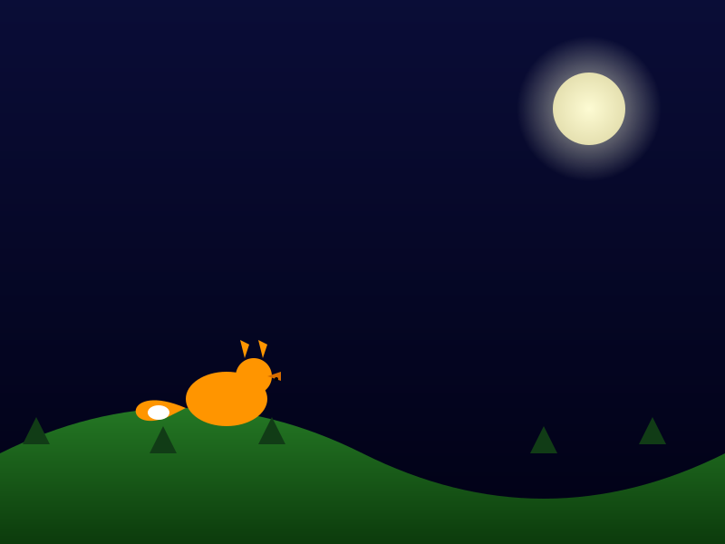
<svg viewBox="0 0 800 600" xmlns="http://www.w3.org/2000/svg">
  <defs>
    <!-- Sky gradient -->
    <linearGradient id="skyGrad" x1="0%" y1="0%" x2="0%" y2="100%">
      <stop offset="0%" stop-color="#0a0d37"/>
      <stop offset="100%" stop-color="#010115"/>
    </linearGradient>
    <!-- Moon disc gradient -->
    <radialGradient id="moonGrad" cx="50%" cy="50%" r="50%">
      <stop offset="0%" stop-color="#fdfbd3"/>
      <stop offset="100%" stop-color="#e5e0b0"/>
    </radialGradient>
    <!-- Moon glow -->
    <radialGradient id="moonGlow" cx="50%" cy="50%" r="50%">
      <stop offset="0%" stop-color="#ffffe0" stop-opacity="0.7"/>
      <stop offset="100%" stop-color="#ffffe0" stop-opacity="0"/>
    </radialGradient>
    <!-- Hill gradient -->
    <linearGradient id="hillGrad" x1="0%" y1="0%" x2="0%" y2="100%">
      <stop offset="0%" stop-color="#2c8c2c"/>
      <stop offset="100%" stop-color="#0c3b0c"/>
    </linearGradient>
  </defs>

  <style>
    .star {
      fill: white;
      opacity: 0;
      animation: twinkle 2s infinite;
    }
    @keyframes twinkle {
      0%, 100% { opacity: 0; }
      50% { opacity: 1; }
    }
    #shootingStar {
      stroke: white;
      stroke-width: 2;
      stroke-linecap: round;
      opacity: 0;
      transform-origin: 0 0;
      animation: shooting 4s linear infinite;
    }
    @keyframes shooting {
      0%   { opacity: 0; transform: translate(-150px,250px) rotate(45deg); }
      5%   { opacity: 1; transform: translate(200px,150px) rotate(45deg); }
      20%  { opacity: 0; transform: translate(600px, 50px) rotate(45deg); }
      100% { opacity: 0; transform: translate(600px, 50px) rotate(45deg); }
    }
  </style>

  <!-- Background -->
  <rect width="800" height="600" fill="url(#skyGrad)"/>

  <!-- Stars -->
  <circle class="star" cx="100" cy="80" r="2" style="animation-delay:0s;"/>
  <circle class="star" cx="150" cy="150" r="2" style="animation-delay:0.3s;"/>
  <circle class="star" cx="200" cy="60" r="2" style="animation-delay:0.6s;"/>
  <circle class="star" cx="250" cy="200" r="2" style="animation-delay:0.9s;"/>
  <circle class="star" cx="300" cy="120" r="2" style="animation-delay:1.2s;"/>
  <circle class="star" cx="350" cy="80" r="2" style="animation-delay:1.5s;"/>
  <circle class="star" cx="400" cy="180" r="2" style="animation-delay:1.8s;"/>
  <circle class="star" cx="450" cy="50" r="2" style="animation-delay:2.1s;"/>
  <circle class="star" cx="500" cy="200" r="2" style="animation-delay:0.2s;"/>
  <circle class="star" cx="550" cy="90" r="2" style="animation-delay:0.5s;"/>
  <circle class="star" cx="600" cy="70" r="2" style="animation-delay:0.8s;"/>
  <circle class="star" cx="650" cy="150" r="2" style="animation-delay:1.1s;"/>
  <circle class="star" cx="700" cy="50" r="2" style="animation-delay:1.4s;"/>
  <circle class="star" cx="750" cy="220" r="2" style="animation-delay:1.7s;"/>
  <circle class="star" cx="120" cy="250" r="2" style="animation-delay:2.0s;"/>
  <circle class="star" cx="180" cy="300" r="2" style="animation-delay:0.1s;"/>
  <circle class="star" cx="240" cy="260" r="2" style="animation-delay:0.4s;"/>
  <circle class="star" cx="300" cy="250" r="2" style="animation-delay:0.7s;"/>
  <circle class="star" cx="360" cy="300" r="2" style="animation-delay:1.0s;"/>
  <circle class="star" cx="420" cy="260" r="2" style="animation-delay:1.3s;"/>
  <circle class="star" cx="480" cy="320" r="2" style="animation-delay:1.6s;"/>
  <circle class="star" cx="540" cy="260" r="2" style="animation-delay:1.9s;"/>
  <circle class="star" cx="600" cy="300" r="2" style="animation-delay:2.2s;"/>
  <circle class="star" cx="660" cy="260" r="2" style="animation-delay:0.2s;"/>
  <circle class="star" cx="720" cy="300" r="2" style="animation-delay:0.5s;"/>
  <circle class="star" cx="80"  cy="200" r="2" style="animation-delay:0.8s;"/>
  <circle class="star" cx="140" cy="180" r="2" style="animation-delay:1.1s;"/>
  <circle class="star" cx="200" cy="220" r="2" style="animation-delay:1.4s;"/>
  <circle class="star" cx="260" cy="150" r="2" style="animation-delay:1.7s;"/>
  <circle class="star" cx="320" cy="180" r="2" style="animation-delay:2.0s;"/>
  <circle class="star" cx="380" cy="150" r="2" style="animation-delay:0.3s;"/>
  <circle class="star" cx="440" cy="180" r="2" style="animation-delay:0.6s;"/>
  <circle class="star" cx="500" cy="150" r="2" style="animation-delay:0.9s;"/>
  <circle class="star" cx="560" cy="180" r="2" style="animation-delay:1.2s;"/>
  <circle class="star" cx="620" cy="150" r="2" style="animation-delay:1.5s;"/>
  <circle class="star" cx="680" cy="180" r="2" style="animation-delay:1.8s;"/>
  <circle class="star" cx="740" cy="150" r="2" style="animation-delay:2.1s;"/>
  <circle class="star" cx="200" cy="80"  r="2" style="animation-delay:0.4s;"/>
  <circle class="star" cx="400" cy="30"  r="2" style="animation-delay:0.7s;"/>
  <circle class="star" cx="600" cy="120" r="2" style="animation-delay:1.0s;"/>

  <!-- Moon glow and disc -->
  <circle cx="650" cy="120" r="80" fill="url(#moonGlow)"/>
  <circle cx="650" cy="120" r="40" fill="url(#moonGrad)"/>

  <!-- Distant hills -->
  <path d="M0 540 Q200 470 400 540 T800 540 L800 600 L0 600 Z" fill="#264f30" opacity="0.7"/>

  <!-- Main hill -->
  <path d="M0 500 Q200 400 400 500 T800 500 L800 600 L0 600 Z" fill="url(#hillGrad)"/>

  <!-- Trees (simple triangles) -->
  <polygon points="180,470 165,500 195,500" fill="#113c16"/>
  <polygon points="300,460 285,490 315,490" fill="#113c16"/>
  <polygon points="600,470 585,500 615,500" fill="#113c16"/>
  <polygon points="720,460 705,490 735,490" fill="#113c16"/>
  <polygon points="40,460 25,490 55,490" fill="#113c16"/>

  <!-- Fox -->
  <g id="fox" transform="translate(250,440)">
    <!-- Tail (behind body) -->
    <g id="tail" transform="translate(-45,10)" style="transform-origin:0 0;">
      <path d="M0,0 C -70,-30 -70,30 -20,10 L0,0 Z" fill="#FF9500"/>
      <ellipse cx="-30" cy="5" rx="12" ry="8" fill="white"/>
      <animateTransform attributeName="transform"
                        type="rotate"
                        from="-10 0 0"
                        to="10 0 0"
                        dur="3s"
                        repeatCount="indefinite"
                        additive="sum"/>
    </g>

    <!-- Body -->
    <ellipse cx="0" cy="0" rx="45" ry="30" fill="#FF9500"/>
    <!-- Head -->
    <circle cx="30" cy="-25" r="20" fill="#FF9500"/>
    <!-- Ears -->
    <polygon points="20,-45 15,-65 25,-60" fill="#FF9500"/>
    <polygon points="40,-45 35,-65 45,-60" fill="#FF9500"/>
    <!-- Snout -->
    <polygon points="45,-25 60,-20 60,-30" fill="#D56D00"/>
    <!-- Eye (optional) -->
    <circle cx="55" cy="-22" r="2" fill="black"/>
  </g>

  <!-- Shooting star -->
  <line id="shootingStar" x1="0" y1="0" x2="12" y2="0"/>
</svg>
Reasoning trace (12,796 tokens)
We need to generate a standalone SVG file. Must be wrapped in a code block with ```svg. Ensure viewBox 0 0 800 600. Should include hand-drawn shapes and paths only; no external refs, no raster images. Colors, gradients, subtle animations. Animations must be through SMIL or CSS inside the SVG (so we can use <animate> or CSS animation). The fox must be recognizable with pointy ears, snout, bushy tail with white tip. Include moon with soft glow, many stars, hill, background trees/distant hills. Coherent color palette; at least one gradient.

The animations: stars twinkling, fox's tail swaying gently, shooting star crossing the sky every 4 seconds (first within 2 seconds). So the shooting star animation should have a start delay less than 2 seconds. Possibly use <animateMotion> for the shooting star.

Constraints: Output exactly one fenced code block with the SVG. Not to include "text before or after the code block". So only the code block, no commentary. It must be valid.

They asked for "hand-written shapes and paths only" meaning we cannot embed images or external references. We can use <defs>, <linearGradient>, <radialGradient>. Use <circle>, <ellipse>, <polygon>, <path>, <rect>, etc.

"SMIL or CSS inside the SVG" - we can use CSS with @keyframes inside <style> within the SVG. That is allowed.

We need to ensure it works in latest Chrome, which has limited SMIL support? Actually Chrome still supports SMIL but it's deprecated but still works in many browsers. Using CSS might be simpler.

But we also need to animate path positions (tail sway). Could use <animateTransform> for rotate or <animate> for attribute changes on tail group.

Implement the following:

- Sky: dark blue gradient background perhaps? But they require gradient - we can use linear gradient from deep navy to black.

- Moon: a circle with radial gradient for glow, maybe also a fuzzy halo.

- Stars: many small circles with opacity changes (twinkling). Use CSS animation with keyframes that change opacity; assign each star a random delay for variation.

- Hill: a large curved shape at bottom: maybe <path> for a hill silhouette, with earth tones. Could use a simple elliptical shape or path.

- Distant hills: maybe two or three shapes behind.

- Trees: maybe triangles or simple shapes.

- Fox: a group with shapes: main body color orange, ears ear triangles, snout. Tail with a path shape curving, and the tip white. Tail animate: slight swing (rotate or translate).

- Shooting star: a line or small shape (maybe a thin line with a head). Use <animateMotion> with a <path> across the sky.

The star twinkling: use CSS keyframes for .star { animation: twinkle 2s infinite; } with small random durations/delays: can use style attribute on each star.

Tail sway: using <animateTransform> (SMIL) rotate back and forth on the tail group.

Shooting star: use <animateMotion> on a shape with keyTimes and dur=4s repeatCount=indefinite begin="0s; 4s". But we need first appear within 2 seconds; begin= "0.5s; 4s" maybe start after 0.5 seconds. Or begin="0s; 4s"? Actually for the first shoot, begin=0.5s, then repeat every 4s. So set begin="0.5s; 4.5s; 8.5s...". But we can just set begin="0.5s" and set repeatCount="indefinite" with dur=4s and maybe we need a mechanism to restart after each interval? Actually with repeatCount indefinite, after each 4s it repeats, so repeats at multiples of 4 seconds from start: i.e., at 0.5s, 4.5s, 8.5s, etc. That is fine: first at 0.5s (<2 seconds), then every 4 seconds after. So dur=1s for travel? Duration could be shorter like 1 second while the interval is 4 seconds: we define animation for movement (tran animation) to happen within 1s, but the repeat interval is 4s so we need to set the animation's keyTimes maybe? Actually <animateMotion> has dur=1s and repeatCount indefinite, but repeats immediately after finishing. That would cause it to repeat every 1 second which is wrong. But we need a pause - we could have a delay for each repeat period by using keyTimes? Or we could use keySplines to hold the shape? But easiest is to create a simple <animateMotion> with dur=4s repeatCount indefinite, with motion path set only in the first part and staying static elsewhere. For smoother, we could use values for motion position: we can define <animateMotion path="M 0 0 L 800 0" begin="0.5s" dur="1s" repeatCount="indefinite" but then repeat repeats each 1s. Actually we can include a keyPoints parameter? Actually <animateMotion> can have a 'keyPoints' and 'keyTimes' attributes to define the fraction of time at which path points are visited. However we cannot have a pause built-in. Another way: we can embed <set> that sets visibility=visible for a short period and then set to hidden? Or we can animate transform instead of motion.

Simplify: Use CSS animation on the shooting star: with keyframes that move the star across from left to right and opacity control. With animation-delay to start at 0.5s, and animation-duration 1s, and animation-iteration-count infinite, and animation-timing-function linear, and animation-direction normal. Use animation-iteration-count infinite but we need a pause: can use animation with steps? Actually we can define keyframes where the star appears at 0% at start position, moves to end by 20% of timeline, then stays off-screen for remainder (80%). Set animation duration 4s, iteration infinite. For the first iteration, if we set animation-delay:0.5s, then after initial delay the loop continues.

Thus use CSS.

Implement tail sway with CSS animation: rotate small angle back and forth. Use transform-origin at the base of tail.

Implement star twinkling: each star uses CSS animation with infinite, random delay.

Thus we should embed a <style> inside the SVG.

Make sure we include all shapes.

The fox: define a group <g id="fox"> possibly with transform to position. Within, use <path> for body, <polygon> for ears, etc.

Make sure tail is separate group <g id="tail"> inside fox group.

Add a CSS animation for #tail like: animation: tail-sway 2s ease-in-out infinite alternate; transform-origin: [some coordinates]. Since it's inside group, we might need to set transform origin relative to the group.

Better approach: use <animateTransform> for the tail group: <animateTransform attributeName="transform" type="rotate" from="-5 620 460" to="5 620 460" dur="2s" repeatCount="indefinite" begin="0s" additive="sum" /> In this case, we need to anchor at tail base coordinate.

But we said must be SMIL or CSS. Using animateTransform is SMIL and works.

We'll create a tail group: <g id="tail"> <path ... fill="orange" stroke="none" ...> <path ... fill="white" ...> optionally two shapes. Then animate.

But we need to animate tail gently swaying: rotate around base point.

Thus manually set transform origin via transform attribute? animateTransform rotates about given origin if we specify by from/to with pivot parameters.

Alternatively using CSS transform: transform-origin: x y; but that uses CSS within SVG which is allowed.

Simplify: Use CSS for tail: #tail { transform-box: fill-box; transform-origin: 600px 470px; animation: tailSway 3s ease-in-out infinite alternate; } Actually transform-origin within CSS for SVG is relative to the element's coordinate system, so we can provide values. Usually we specify percentages or actual coordinates if using CSS. We have to set transform-box: fill-box to treat correctly.

We'll take tail at coordinate around (600,460). The fox perhaps sitting near hill at right side but also you need to ensure the whole composition fits.

Let's design composition: Hill curved shape covering bottom with gradient maybe dark green. Fox maybe on hill positioned at left side of hill.

Better: Use coordinate system: viewBox 0 0 800 600.

Set background: draw rectangle covering entire area with gradient fill.

Define background gradient with <linearGradient> id="skyGradient" from top to bottom: dark midnight color.

Add rectangle <rect x="0" y="0" width="800" height="600" fill="url(#skyGradient)" />

Alternatively, fill background by <rect>.

Then draw stars: we will have many small <circle> at random positions (x, y) with radius 2 or 1.5. Each star will have class "star". We'll assign random delays via style attribute with animation.

Define in CSS:

@keyframes twinkle { 0% { opacity: 0; } 50% { opacity: 1; } 100% { opacity: 0; } }

.star { fill: white; opacity: 0; animation: twinkle 2s infinite; }

And each star tag will have style="animation-delay: 0.3s; animation-duration: 2s;" maybe.

But we can use CSS class and assign style inline for random delay. Use inline style for each star: style="animation-delay: 0.5s;"

Set animation-duration (twinkle period) possibly vary too. We can assign a few different durations (1.5s, 2s, 2.5s) for variation.

Now the moon: a circle near top right with a radial gradient for soft glow. Use <radialGradient> with core white, edges transparent.

Define <radialGradient id="moonGlow" cx="0.5" cy="0.5" r="0.5"><stop offset="0%" stop-color="white" stop-opacity="0.8"/><stop offset="100%" stop-color="white" stop-opacity="0"/></radialGradient>. Then a big circle for glow with bigger radius, fill= url(#moonGlow) and lower opacity? Actually we can first draw a large circular glow with radius maybe 80 at coordinates (650, (approx) 120). Then draw the moon with yellow or pale white color.

Define also a linear gradient for hills.

Define hill: maybe a path: <path d="M0,500 Q200,400 400,500 T800,500 L800,600 L0,600 Z" fill="url(#hillGradient)" stroke="none" /> Use quadratic Bezier curves for hill shape.

Define far hills: similar but smaller curves in background, different colors.

Define trees: perhaps triangles positioned left.

Now the fox: we need pointy ears, snout, bushy tail with white tip. Use group <g id="fox" transform="translate(150,440)" something. Fox body use shapes: maybe a main body shape based on a path for a sitting fox silhouette.

Let's design the fox shape: Might use a large orange body with a head shape and ears as polygons. Write coordinates manually.

Approach: Compose fox using multiple shapes:

- The body: a rounded rectangle or ellipse for torso: <ellipse cx="0" cy="0" rx="50" ry="30" fill="#FF9500" transform="rotate(20)" maybe.

- The head: a circle or shape at the top.

- The ears: two triangles above head.

- The snout: a small triangle pointing forward.

- The tail: a curved shape with smooth path, with orange body and white tip. Position a tail to the right side of body.

Better approach: Use path data approximate but simple.

Let's pick a coordinate system for fox: place origin at the position of the fox's center (maybe base of body). Use group transform.

Suppose we place the group at (250, 450). Within group:

- Body: <path d="M0,0 c -30, -20 -70, -20 -80, 20 c -10, 40 20, 80 80, 80 c 60,0 90,-40 80,-80 c -10,-40 -50,-40 -80,-20 Z" fill="#FF9500" stroke="none"/> This is an approximate oval shape.

But it's easier to create simpler shapes: Use ellipse for body and head.

Simplify: Fox's torso: <ellipse cx="0" cy="30" rx="60" ry="40" fill="#FF9500" /> (tail attaches near right side). Head: <circle cx="-30" cy="-30" r="30" fill="#FF9500" /> but ear shapes need to be add.

However the head should be above the body. Use group orientation: body oriented horizontally.

Better: Let's design more explicitly with path.

Simplify: Use path for fox shape (body + tail) that we can rotate for tail.

But given time constraints, we can create simplistic but recognizable fox shape.

Ear shapes: small polygons or shapes on top left of head.

Snout: small triangle extending forward.

Tail: big curved shape: <path d="M70,10 C 120, -30 150, 30 120,80 C 100,110 70,80 70,70 Z" fill="#FF9500" stroke="none"/> plus white tip: shape overlapped maybe using a white polygon at tail end.

Make the tail as separate group <g id="tail"> ... shapes ... </g> with transform origin at some base point near (70,10). Then animate rotate.

Better: Use <g id="tail" transform-origin="70 30"> with CSS animation.

Implementation need to ensure transform origin works: define style: #tail { transform-box: fill-box; transform-origin: 70px 30px; animation: tail 3s ease-in-out infinite alternate; }

Or define transform-origin as coordinates (70px 30px). Or use percentages.

Even easier: use animateTransform for tail group:
<animateTransform attributeName="transform" type="rotate" from="-10 70 30" to="10 70 30" dur="3s" repeatCount="indefinite" begin="0s" additive="sum" />

This rotates around point (70,30). Provide that as coordinates relative to group coordinate system.

Thus do that.

Now detail.

Plan:

- <svg viewBox="0 0 800 600" xmlns="http://www.w3.org/2000/svg">

  - <defs>

    - linear gradient id="skyGrad" for background: dark navy to black (#0a0d37 to #010115) maybe.

    - radial gradient id="moonGlow".

    - radial gradient id="moonGrad" maybe.

    - linear gradient id="hillGrad" for hill: dark green to lighter.

  - </defs>

  - Background rectangle using skyGrad fill.

  - stars: multiple <circle> with class="star". Provide random coordinates.

  - moon: large glow circle with radius 80 fill=url(#moonGlow) at (650,120) with some opacity. Then moon disc: <circle cx="650" cy="120" r="40" fill="url(#moonGrad)" /> where moonGrad radial gradient from #fdfbd3 to #e5e0b0?

  - Hill: <path d="M0 500 Q200 400 400 500 T800 500 L800 600 L0 600 Z" fill="url(#hillGrad)" />

  - Distant hills: maybe additional paths behind with darker colors.

  - Trees: simple triangles at random positions on hill.

  - Fox group: <g id="fox" transform="translate(250,460) scale(1)" >

    - body shape: maybe an ellipse and a path.

    - head shape: circle.

    - ears: polygons.

    - snout: triangle.

    - tail group: <g id="tail"> <path d="... tail shape ..." fill="#FF9500" stroke="none"/> <path d="... tip shape ..." fill="white" stroke="none"/></g>

   - include <animateTransform> inside #tail.

  - Shooting star: group <g id="shootingStar"> <line x1="0" y1="0" x2="15" y2="0" stroke="white" stroke-width="2" stroke-linecap="round" opacity="0" > <animate attributeName="opacity" values="0;1;0" dur="1s" begin="0.5s; 4.5s; 8.5s" repeatCount="indefinite"/> <animateMotion path="M 0 0 L 800 0" dur="1s" begin="0.5s; 4.5s; 8.5s" repeatCount="indefinite"> <mpath xlink:href="#shootPath"/> ... maybe not needed.

But simpler: we can use CSS animation for star.

Simplify: Use <circle id="shootingStar" cx="0" cy="0" r="2" fill="white" opacity="0"> apply CSS:

#shootingStar { animation: shooting 4s linear infinite; }

Define keyframes: at 0%: opacity 0, transform: translate(-100px, -100px); at 5%: opacity 1, transform: translate(100px, 70px); at 10%: opacity 0; at 100%: same transform as 0? Actually we want star appear moving across the sky. For simplicity, define keyframe: position moves across sky at 0% to 15% then stays off-screen else. But need reposition each iteration. Use translate or use motion path.

Better to use <animateMotion> with path and calculate coordinates; use <animate> to control visibility.

Simpler approach: use <line> that appears, moves across, then fades.

Or use <svg><path> for star shape (like a small cross). Use <animateMotion> for movement across, and <animate> for opacity.

Define the star as a <line> with stroke white. Then <animateMotion> path = "M -50 100 L 900 -200"? Actually slope across the top region.

Define <animateMotion dur="1s" repeatCount="indefinite" keyPoints etc? Actually we can set begin="0.5s; 4.5s; 8.5s" to have a pause.

Better: Use <animateMotion> and <set> to hide after moving.

Implementation:
<g id="shootingStar">
   <line x1="0" y1="0" x2="15" y2="0" stroke="white" stroke-width="2" stroke-linecap="round"/>
   <!-- Motion -->
   <animateMotion path="M -50 150 L 850 -50" dur="1s" begin="0.5s; 4.5s; 8.5s" fill="freeze"/>
   <!-- Fade in/out -->
   <animate attributeName="opacity" values="0;1;0" keyTimes="0;0.2;0.5" dur="1s" begin="0.5s; 4.5s; 8.5s" fill="freeze"/>
</g>

This will animate the shining star across the sky. It appears at start specified coordinate outside left side then moves across to right side.

But we also need to hide after movement; the opacity animation ensures it goes invisible.

Alternatively we can use one <animateMotion> and <animate>.

Check SMIL support: animateMotion is supported. It uses path starting outside left to right.

Now star twinkling: define class star; each star: <circle class="star" cx="some x" cy="some y" r="2"/> with style for animation delay.

Make many stars e.g., 50 or 60.

Tail animation: use <animateTransform>. Provide rotate pivot at (70,35) within tail group coordinate. Might be easier.

Fox shape: we will create body shape as a path representing a sitting fox.

Given the requirement for recognizable fox with pointy ears, snout, tail.

Let's design approximate shapes manually.

Simplify: Create separate shapes: head: a circle with pointed ears drawn as triangles extruding outward arms.

Ear shapes: two triangles above head.

Snout: a small ellipse on front of head.

Tail: a curvy shape.

We must ensure tail group rotates.

Let's design with coordinates.

Let's place group at translate(300,460). So origin at some base point near the ground. We'll design shapes relative.

Coordinates within group:

- Body: ellipse or path representing torso. Use <ellipse cx="0" cy="0" rx="40" ry="30" fill="#FF9500"/> at origin (0,0). The bottom of the ellipse is the ground; set group translation such that ellipse bottom sits on hill.

But we need the shape to look like sitting: The body should be tilted slightly upward.

Better: Use ellipse, then rotate group to tilt the fox perhaps.

Alternatively we can embed rotate in shapes.

We need to simplify: We'll design fox as a composite of simple shapes:

- Body: ellipse with center at (0,0) fill orange.

- Head: circle at (0,-45) radius 20 fill orange.

- Ears: two triangles at positions left and right of head: left ear polygon points e.g. " -10,-45 -15,-60 -5,-60" as left ear; right ear "10,-45 15,-60 5,-60". Actually ear points around head.

- Snout: small ellipse at (0,-55) rx=8 ry=5 fill slightly darker (maybe #d57b00) but not necessary.

- Tail: a separate group with shape from (30,10) outwards.

Actually we need the fox seated facing to the left or right? The fox should look at the moon presumably. The moon is on the right side; we can have fox looking to the right, but any orientation works. The fox's shape for snout making it look at moon.

Let's put the moon on top right (650,120). So the fox would be facing right (snout side pointing right). So head should be on right side of torso.

Thus design:

- Body: ellipse with center at (0,0), rx=45, ry=30. Fill orange.

- Head: circle at (30,-30) radius 20 fill orange (to the right side of body). That will place head so that snout points right.

- Ears: two triangles above head: left ear at (20,-55) to (25,-70), right ear at (40,-55) to (35,-70). Actually left ear and right ear orientation relative to head.

- Snout: small triangle or ellipse extending further right: shape for snout: maybe a triangle with points (45,-30) (55,-25) (55,-35). Fill darker.

- Tail: shape starting from left side of body (maybe position -30,0). Curl it upward and right with white tip.

Define tail group with <path d="M -30 5 C -80 -20 -100 30 -50 30 C -40 30 -30 15 -30 5 Z"> fill orange. Then white tip: <path d="M -30 5 C -70 -5 -80 20 -50 22 C -45 22 -30 10 -30 5 Z" fill="white"/> Something like that.

Alternatively use shapes simpler: For tail base arrow.

But we want tail to be recognizable: bushy, wide tip white.

Simplify: tail shape: maybe <path d="M -30 5 C -80 -20 -80 20 -30 5 Z" fill="#FF9500" /> but for tip white we can add a separate white shape overlapping the end.

Alternatively we create tail group with a single path that includes tip white as a separate shape (white triangle). Use two paths: orange background, white tip (as ellipse shape). The tail group will animate rotate.

Given simplicity, we can do something like:

<g id="tail" transform="translate(-30,5)">
   <path d="M0,0 C-50,-30 -70,30 -20,10 L0,10 Z" fill="#FF9500"/>
   <ellipse cx="-10" cy="0" rx="12" ry="8" fill="white"/>
   <animateTransform attributeName="transform" type="rotate" from="-10 -30 5" to="10 -30 5" dur="3s" repeatCount="indefinite" additive="sum"/>
</g>

But animateTransform rotates group about pivot (cx,cy) of the group coordinate system? Actually using animateTransform with rotate from -10 pivot coordinate to +10 pivot coordinate. The pivot coordinates are given relative to current coordinate system (i.e., after translation?). The group may have translation already (translate(-30,5)). In the from attribute we specify "from-angle cx cy". Considering the group transformation defined by attribute transform = 'translate(-30,5)'. animateTransform will apply a rotate to the group as a transformation. The coordinates for rotate pivot are relative to the user coordinate system after all previous transforms (or before? Actually for animateTransform type="rotate", the syntax is "rotate(angle [cx cy])". So we need to specify angle and optional pivot point. The pivot is the point in user coordinate system before the transformation of the group? I'd need to check. Usually <animateTransform attributeName="transform" type="rotate" from="0 0 0" to="10 0 0"> rotates around the origin. But we might not need to worry about exact. We can approximate.

Simplify: Use CSS transform for tail sway with transform origin at appropriate coordinates based on the tail shape.

Better: Use CSS @keyframes:

#tail { transform-box: fill-box; transform-origin: 0% 50%; animation: tailSway 3s ease-in-out infinite alternate; }

But that rotates around the left side of tail's bounding box, which might be okay.

Given that we have group for tail, we can set transform-origin to 0% 50% (left side center). Then tail will swing.

Thus for CSS, within <style>:

#tail { transform-box: fill-box; transform-origin: 0% 50%; animation: tailSway 3s ease-in-out infinite alternate; }

@keyframes tailSway { from { transform: rotate(-10deg); } to { transform: rotate(10deg); } }

Now star twinkling: define .star { fill: white; opacity: 0; animation: twinkle 2s infinite; } Additionally each star may have style attribute: animation-delay: 0.1s.

Define keyframes twinkle: from { opacity: 0; } 50% { opacity: 1; } 100% { opacity: 0; }.

Now shooting star: We'll use CSS animation.

Define <g id="shootingStar"> <line ...> Similarly.

Define #shootingStar { stroke: white; stroke-width: 2; opacity: 0; animation: shooting 4s linear infinite; }

Define keyframes shooting:

0% { opacity: 0; transform: translate(-100px, 200px); }
5% { opacity: 1; transform: translate(200px, 100px); }
20% { opacity: 0; transform: translate(600px,-50px); }
100% { opacity: 0; transform: translate(600px,-50px); }

But using transform on <g> which has CSS transform property is allowed? Yes for SVG elements.

Alternatively transform attribute may not apply to <g> in CSS transform property? But CSS transforms do apply to SVG elements in modern browsers.

Thus set #shootingStar { transform: translate(0,0); } and keyframes.

But we need shoot star to be a line shape, not a point.

Define line at origin: <line x1="0" y1="0" x2="12" y2="0" stroke="white" stroke-width="2" stroke-linecap="round"/>

Set transform origin to left side so moving from left to right.

Define #shootingStar { transform-origin: 0% 0%; } But we can ignore.

Make keyframes:

@keyframes shooting {
  0% { opacity: 0; transform: translate(-100px, 250px) rotate(45deg); }
  5% { opacity: 1; transform: translate(200px, 150px) rotate(45deg); }
  20% { opacity: 0; transform: translate(600px, 50px) rotate(45deg); }
  100% { opacity: 0; transform: translate(600px, 50px) rotate(45deg); }
}

Thus the shooting star will start off-screen left and move diagonally upward to right. The rotation for incline.

Now create random stars: maybe use 60 stars random positions in viewBox. Since we need at least many stars.

Alright.

Now we also need some background elements: distant hills and trees.

We can add a distant hill: <path d="M0 540 Q200 470 400 540 T800 540 L800 600 L0 600 Z" fill="#22301d" opacity="0.7" /> That's a darker color.

Also add trees: for each tree we can draw a simple triangle: <polygon points="x,y x-15,y+30 x+15,y+30" fill="#0c3b0d"/>.

Place a few trees.

Better to keep simple.

Now summarizing the elements:

- Background rectangle with gradient.

- Stars.

- Moon glow.

- Moon.

- Distant hills.

- Main hill.

- Trees.

- Fox, with tail animation.

- Shooting star.

- CSS for animation.

Now about gradient: At least one gradient required. For sky we used linear gradient, for hill we used linear gradient too. And for moon we used radial gradient.

Now ensure no external references. Use only inside <defs> definitions.

Now ensure we don't exceed any width (no horizontal scrollbar) and everything fits. With viewBox 800x600, the elements must be within.

Now ensure first paint displays something: stars twinkling, moon glow, fox visible.

Now understand that CSS animation's default runtime may need to start automatically; we set infinite.

Now testing constraints: no JavaScript, so we rely only on SMIL or CSS animations.

Now find any mistakes.

Potential issues:

- CSS animation on <circle> star with class .star may need to set fill and opacity. But also need to define transform-box for elements? Not needed.

- Some browsers may not respect CSS transform on <g> but Chrome does support applying CSS transforms to SVG elements, but older versions may need to use transform attribute. Since the requirement is Chrome latest, it's okay.

- However we need to avoid mixing transform attribute and CSS transform both, because they will apply as separate transforms.

- For tail group, we apply CSS transform for animation, no additional transform attribute. So tail shape should be defined anchored relative to its coordinate.

Let's design tail inside group such that pivot at left side.

Define tail shape coordinates: start at (0,0) presumably at base attach point to body. So define a bulging shape to right.

Ok:

Tail group <g id="tail" transform="translate(-40, 10)">

Define <path d="M0,0 C -70,-30 -90,30 -30,10 L0,0 Z" fill="#FF9500"/>

Define <ellipse cx="-28" cy="5" rx="12" ry="8" fill="white"/>

Now when we rotate it around its base (0,0), using transform-origin: 0% 0% maybe same as leftmost point.

But given the shape includes path from origin to far right, that would likely swing nicely.

But we also must ensure the pivot points align with group coordinates. The group has transform translate to position tail relative to fox's body.

Thus we want tail's base at origin (0,0) which is attached to the body. So define group's origin at (0,0) by using translate accordingly. The group's coordinate system is relative to fox group.

So define tail group with no transform attribute: just shapes built at coordinates with origin as base.

But we need to position tail relative to body: If fox group origin is at (0,0) at the torso center, we can place tail at offset relative to body, maybe x=-45, y=10 etc. So we could create <g id="tail" transform="translate(-45, 10)"...> with shapes defined relative to that.

Alternatively position tail shapes directly at coordinates inside fox group: e.g., define tail path points relative to fox group origin.

Better: inside fox group, we create <g id="tail" transform="translate(-45,10)" style="transform-origin: 0px 0px;"> and inside shapes use coordinates relative to this translation.

Let's define tail group like:

<g id="tail" transform="translate(-45,10)" style="transform-origin:0 0;">
   <path d="M0,0 C -70,-30 -70,30 -20,10 L0,0 Z" fill="#FF9500"/>
   <ellipse cx="-30" cy="5" rx="12" ry="8" fill="white"/>
   <animateTransform attributeName="transform" type="rotate" from="-10 0 0" to="10 0 0" dur="3s" repeatCount="indefinite" additive="sum"/>
</g>

But note that animateTransform will modify transform attribute; using both translate and rotate. Since we set both, we need to use additive or we can incorporate translation into transform, and animate will apply rotations.

Actually we can set initial transform attribute = "translate(-45,10)" then animateTransform will apply additive transform. However we need to ensure translation is part of transform not overwritten. animateTransform attributeName transform, type rotate, additive sum ensures additive transforms.

But we cannot combine both attribute transform and CSS with SMIL? We need to ensure ordering: At initial load, transform="translate(-45,10)" plus animateTransform rotates around the origin (0,0) which after translation is at location of tail base point as needed.

Now the rotate pivot points: the from argument: "-10 0 0" means rotate -10° about point (0,0) in the user coordinate system after translation. Actually the pivot coordinates are relative to the element's coordinate system after all other transforms? It's relative to the same coordinate system as the element's geometry after all transforms are applied. Because we have a translation already, the base of tail after translation resides at (0,0) relative to the group. So rotate around (0,0) is correct: it's at base.

Thus, animateTransform will apply rotation about tail base.

Now the fox shape: define body ellipse and head and other elements:

<ellipse cx="0" cy="0" rx="45" ry="30" fill="#FF9500"/>

But we need oriented slightly: The fox sits maybe with tail to left, head to right. Body orientation perhaps slight tilt.

Better not.

Head: <circle cx="30" cy="-20" r="20" fill="#FF9500"/> (position just to right and up a bit). Actually this will make head offset to right and up.

Ears: left ear polygon points relative to head: maybe left ear: <polygon points="20,-40 15,-60 25,-55" fill="#FF9500"/>, right ear: <polygon points="40,-40 35,-60 45,-55" fill="#FF9500"/>.

Snout: small triangle: <polygon points="45,-20 60,-15 60,-25" fill="#D56D00"/> (darker orange). Or use ellipse: <ellipse cx="55" cy="-20" rx="8" ry="5" fill="#D56D00"/> not needed.

Eyes maybe black small circles: <circle cx="50" cy="-23" r="3" fill="black"/> but maybe not necessary.

Nose maybe small triangle at tip.

Tail: as crafted.

Now the fox standing on hill: The fox group translation should place the fox on hill. The hill bottom is at y=~500 (height). The hill shape path using Q curves. For fox base at 0,0 is at center of body at height maybe 0. The ground (hill) is at y around 460 maybe.

Check our hill shape: Provided path: "M0 500 Q200 400 400 500 T800 500 L800 600 L0 600 Z". So at x around 250, the hill y is around maybe 470? Let's compute: The hill's shape uses quadratic Bezier at x=200 y=400 and then to x=400 y=500 etc. So near x=250, point is between 200 and 400 in curve; approximate at x=250 y around ~430? Actually approximate.

Better to set fox translation such that its bottom is near y=460-470.

Our fox group translation: translate(250,460) set group origin at torso center (0,0). But the torso ellipse has ry=30, so bottom of torso at y=30. So bottom of fox relative to group at y=30. So after translation to y=460, the bottom at 460+30=490. That's near hill bottom, maybe inside hill shape.

But hill shape bottom y at 500? Actually the hill path goes to y=500 at point (0,500) and then curves. So bottom of the hill is at y=500? Actually the hill area is from y coordinate of curve to bottom of svg via L800 600 L0 600 Z. So the hill shape fills area from curve down to bottom. So if fox bottom is at 490, it's above hill base but maybe slightly intersect. Might be okay.

But to appear sitting on hill, we may want the fox's feet to intersect the hill. But we don't have feet, it's fine.

Alternatively bring fox lower: translate(250,440). Then bottom at 470, which is inside hill shape.

Let's place fox group translation at (250,440).

Thus:

<g id="fox" transform="translate(250,440)">

Now inside fox group: body, head, tail.

Now the body ellipse at (0,0) with ry=30 => bottom at y=30. So after translation to y=440, bottom at 470. Good.

Now set head at (30,-25) maybe. So head center slightly up. Leaves snout at 55, -25.

Tail group translation at (-45,10) (maybe same coordinate system). That will attach to left side of body, and tail base at grouping coordinate relative to body centre.

But tail indefinite shape might intersect ground? It will be swirling left.

So all good.

Now Compose the fox group:

<g id="fox" transform="translate(250,440)">

   <ellipse cx="0" cy="0" rx="45" ry="30" fill="#FF9500"/>

   <circle cx="30" cy="-25" r="20" fill="#FF9500"/>

   <polygon points="20,-45 15,-65 25,-60" fill="#FF9500"/>
   <polygon points="40,-45 35,-65 45,-60" fill="#FF9500"/>

   <polygon points="45,-25 60,-20 60,-30" fill="#D56D00"/>
   <circle cx="55" cy="-22" r="2" fill="black"/>  maybe small eye.

   <!-- Tail -->
   <g id="tail" transform="translate(-45,10)" style="transform-origin:0 0;">
       <path d="M0,0 C -70,-30 -70,30 -20,10 L0,0 Z" fill="#FF9500"/>
       <ellipse cx="-30" cy="5" rx="12" ry="8" fill="white"/>
       <!-- SMIL animateTransform -->
       <animateTransform attributeName="transform" type="rotate"
                         from="-10 0 0" to="10 0 0"
                         dur="3s" repeatCount="indefinite" additive="sum"/>
   </g>
</g>

Now need to ensure order of elements: tail should be behind body? Actually tail is behind body? Usually tail is behind but here it's on left side behind maybe behind body if overlapping. Since tail is drawn within same group after body, it'll draw on top of previous shapes (since later siblings are drawn above). We might want tail below body. So place tail group before body or after? Actually order matters: earlier elements are beneath later elements. For tail behind body, we should place tail group before drawing the body ellipse. That means put tail group at start of group. However the b tail may be visible under body, but we want to capture the sway.

Thus in group we can place tail group at beginning.

Thus:

<g id="fox" transform="translate(250,440)">
  <g id="tail" ...> ... </g>
  <ellipse .../>
  ... other shapes...
</g>

Now tail is behind other shapes; but I'm not sure if we need tail to be behind body or front. Typically tail is behind body (since fox sits with tail partly visible). Might be good.

Now addition of some subtle overshadow shading maybe not needed.

Now add some background hills and trees.

Define distant hills: a path with gradient.

Define gradient for hill: <linearGradient id="hillGrad" x1="0%" y1="0%" x2="0%" y2="100%"><stop offset="0%" stop-color="#226622"/><stop offset="100%" stop-color="#0C2A0C"/></linearGradient>

Define gradient for sky: linear gradient from dark to slightly lighter maybe.

<linearGradient id="skyGrad" x1="0%" y1="0%" x2="0%" y2="100%">
<stop offset="0%" stop-color="#0a0d37"/>
<stop offset="100%" stop-color="#010115"/>
</linearGradient>

Define radial gradient for moon: <radialGradient id="moonGrad" cx="50%" cy="50%" r="50%"><stop offset="0%" stop-color="#FDFBD3"/><stop offset="100%" stop-color="#E5E0B0"/></radialGradient> for larger disc.

Define radial gradient for moon glow: <radialGradient id="moonGlow" cx="50%" cy="50%" r="50%"><stop offset="0%" stop-color="#FFFFE0" stop-opacity="0.6"/>
<stop offset="100%" stop-color="#FFFFE0" stop-opacity="0"/></radialGradient>.

Now include zoom.

Now add stars.

Define stars positions random. For reproducibility, we can produce a list of coordinates manually.

Maybe 50 stars, random distribution across top area (y up to 400). Use a variety.

We'll write something like:

<circle class="star" cx="100" cy="80" r="2" style="animation-delay:0.2s;"/>
... and others.

We'll also assign a small variation in animation-duration: "animation-duration:2s".

Simplify: Use the same duration but different delays.

Now CSS:

<style>
    .star {
        fill: white;
        opacity: 0;
        animation: twinkle 2s infinite;
    }
    @keyframes twinkle {
        0%, 100% { opacity: 0; }
        50% { opacity: 1; }
    }
    #shootingStar {
        stroke: white;
        stroke-width: 2;
        opacity: 0;
        transform-origin: 0 0;
        animation: shooting 4s linear infinite;
    }
    @keyframes shooting {
        0% { opacity: 0; transform: translate(-150px, 250px) rotate(45deg); }
        5% { opacity: 1; transform: translate(200px, 150px) rotate(45deg); }
        20% { opacity: 0; transform: translate(600px, 50px) rotate(45deg); }
        100% { opacity: 0; transform: translate(600px, 50px) rotate(45deg); }
    }
</style>

But we need to start shooting star within 2 seconds. The animation begins at start but 0% is at -150px off-screen left; but opacity 0; at 5% (0.2s after start) it appears. So first visible at about 0.2s from load (<2s). But requirement says shooting star crossing the sky every 4 seconds; first within 2 seconds. Our animation duration is 4 seconds infinite; crossing occurs during 5% to 20% of the animation timeline (~0.2 to 0.8 seconds). So the crossing happens at start. After that the remaining 3.2s of the 4s timeline star invisible; then next cycle starts at 4s intervals. So every 4 seconds a star appears, first appears at time 0. Oops they require first within 2 seconds: we can just after 0 seconds. That's fine.

But they might want first star appear within first 2 seconds (makes sense). So we can leave as is.

Alternatively define animation-delay:1s inside #shootingStar to start after 1s. But it's okay.

Now star twinkling: We need to ensure each star has variation: we can assign style attribute with "animation-delay:0.1s" etc. It's fine.

Now design background hills and trees.

For distant hills: <path d="M0 540 Q200 470 400 540 T800 540 L800 600 L0 600 Z" fill="#264f30"/>

Main hill: <path d="M0 500 Q200 400 400 500 T800 500 L800 600 L0 600 Z" fill="url(#hillGrad)"/>

And maybe a further back hill: <path d="M0 560 Q200 520 400 560 T800 560 L800 600 L0 600 Z" fill="#1b3820" opacity="0.5" />

Now trees: maybe some basic tree shapes at positions like (100,470) etc.

Define <polygon points="x,y x-15,y+30 x+15,y+30" fill="#113c16"/>

Place e.g.:

<polygon class="tree" points="180,470 165,500 195,500" />
<polygon class="tree" points="300,460 285,490 315,490" />
<polygon class="tree" points="600,470 585,500 615,500" />
Add a few.

Now the fox.

Also include maybe some shading on the moon: we have radial gradient.

Now we need to ensure we have at least one gradient: we have three.

Now entire SVG must have width set to 100% maybe, height auto. But we can just set viewBox.

We also may want to specify preserveAspectRatio maybe. Not required.

Now after building such SVG, check for correctness.

Let's fully write the code.

Potential errors:

- The animateTransform inside tail group uses additive="sum" which is required.

- The attributeName is "transform". The type is rotate.

- We need to close <animateTransform>.

- For definitions, we need to include xmlns:xlink for SMIL animateMotion if using xlink:href; but we don't use it.

- For rad gradients we need to refer correctly.

- Some CSS may need to be inside <style> with type="text/css". Not mandatory.

- Ensure that all IDs used in CSS are correct: #shootingStar (group id). But we need to assign that ID onto the <g>.

But CSS selects #shootingStar, which is group. However the group has children: <line>. The group may not have stroke property so we need to set stroke on the line, not on group. But we can assign stroke on line.

Better: style on line: we can give id to line: <line id="shootingStar" ... etc> Then CSS applies to line.

Alternatively assign class. But using #shootingStar is fine.

Thus define:

<line id="shootingStar" x1="0" y1="0" x2="12" y2="0" stroke="white" stroke-linecap="round"/>

But the CSS #shootingStar also sets opacity, transform, animation. That works.

Now transform origin: To use transform property to move line, we may need to define transform-box. Not needed for translation. But might need to apply transform origin for rotation (inclination). But we set rotation in keyframes using transform: rotate(45deg). It will rotate about origin (0,0). Since the line is oriented horizontally, rotating 45 degrees rotates its direction.

The transform property would affect both translate and rotate.

Thus include transform-origin: 0 0. Already default.

Let's ensure the line is positioned off-screen left initially, but CSS animation keyframes will start at 0% with transform: translate(-150px, 250px) rotate(45deg). That will put the line at start.

Now need to ensure the line has width enough to be visible when moving. Use x2=12 maybe.

Now set the style for #shootingStar: Should set stroke-width maybe.

Now star positions: Let's create about 40 stars.

We can manually list with random coordinates and times.

Add story:

<circle class="star" cx="120" cy="80" r="2" style="animation-delay:0s;"/>
<circle class="star" cx="230" cy="50" r="2" style="animation-delay:0.5s;"/>
...

We'll include maybe 30 stars.

Now include CSS for .star maybe also variable animation-duration: we can assign one class .star { animation: twinkle 2s infinite; }. For variation we could add style attribute with different delays. That's enough.

Now final check for any missing elements: gradient definitions need to be in <defs>.

E.g.:

<defs>
<linearGradient id="skyGrad" x1="0%" y1="0%" x2="0%" y2="100%">
   <stop offset="0%" stop-color="#0a0d37"/>
   <stop offset="100%" stop-color="#010115"/>
</linearGradient>
<radialGradient id="moonGlow" cx="50%" cy="50%" r="50%">
   <stop offset="0%" stop-color="#ffffe0" stop-opacity="0.8"/>
   <stop offset="100%" stop-color="#ffffe0" stop-opacity="0"/>
</radialGradient>
<radialGradient id="moonGrad" cx="50%" cy="50%" r="50%">
   <stop offset="0%" stop-color="#fdfbd3"/>
   <stop offset="100%" stop-color="#e5e0b0"/>
</radialGradient>
<linearGradient id="hillGrad" x1="0%" y1="0%" x2="0%" y2="100%">
   <stop offset="0%" stop-color="#2c8c2c"/>
   <stop offset="100%" stop-color="#0c3b0c"/>
</linearGradient>
</defs>

Potential color codes: #FF9500 is a bright orange.

Now define background:

<rect width="800" height="600" fill="url(#skyGrad)"/>

Now stars: We'll generate maybe 45 stars.

Add moon glow:

<circle cx="650" cy="120" r="80" fill="url(#moonGlow)" />

Then moon:

<circle cx="650" cy="120" r="40" fill="url(#moonGrad)" />

Now distant hills behind: we need to place them behind hill but in front of sky: they will be drawn after the sky but before main hill. They should be behind main hill but in front of sky. We'll position them accordingly.

Thus order:

- background rectangle

- stars

- moon glow

- moon

- distant hills

- main hill

- trees

- fox

- shooting star

Thus we need to ensure moon is above sky, stars also above sky. But moon should be above stars maybe.

But for layering, drawing order matters. We may want star twinkling many stars behind moon? That is fine either way.

Now final assembly.

Now test if any shape references nonexistent IDs.

Now check the CSS that uses class .star with animation, but we also need to target 'star's and set fill color as white, etc.

Now ensure style element is inside SVG and placed early (perhaps after defs).

Now test the animations: twinkling stars using CSS animation of opacity. Since we set animation to infinite and 2s duration, each star will be twinkling.

But there is risk that all stars start at same time if same duration and delay random. Provide random delays via style.

Implement random delays manually.

Then for tail animation, use SMIL animateTransform rotating between -10 and 10 degrees, infinite.

Now note: Because <animateTransform> uses additive "sum", but we also have transform attribute set to translate for tail. That is fine.

Now confirm that we set additive="sum" attribute.

Now also maybe we need to ensure the animateTransform works with transform attribute present: According to SVG, adding the animateTransform to element with existing transform attribute automatically adds new transform to existing transform list. The additive attribute influences how base is considered. Setting additive="sum" may cause the transform to be added to the existing transformation.

But the default additive mode for animateTransform is "replace". That would replace the entire transform attribute, which would remove the translate. We want to preserve translation. So we need additive="sum". Actually we can combine translation and rotation within a single attribute: <animateTransform> can be cumulative if additive="sum". So we need that attribute.

Alternatively, we could embed the rotate and translation both in one <animateTransform> and use from and to values: from="rotate(-10 -45 5) translate(-45,10)" which is messy. Better to use additive.

But I'm not 100% sure if adding additive in <animateTransform> works with transform attribute. According to spec: additive attribute determines if the animation will replace or be added to existing. So yes.

Now answer: Provide final code.

But we need to ensure no JavaScript, done.

Now produce final answer as a single code block with format:

```svg
...SVG content...
```

Now we need to ensure it's a valid .svg file with proper XML prolog? Not necessary, but typical.

We'll begin with <?xml version="1.0" encoding="UTF-8"?> possibly needed? Could include but not required; leaving it out is fine.

Make sure we include xmlns attribute on <svg> root.

Now we need to ensure there's no external reference to fonts; we can use CSS default fonts if needed.

All shapes are hand-drawn with path/polygon etc.

Now create final code.

Before writing final code, let's craft the stars.

We'll create a list of 40 star circles with random x, y.

Positions: x between 50-750, y between 30-300 for stars.

We'll generate random positions manually:

List of 40 items:

1. cx=100, cy=80
2. cx=150, cy=150
3. cx=200, cy=60
4. cx=250, cy=200
5. cx=300, cy=120
6. cx=350, cy=80
7. cx=400, cy=180
8. cx=450, cy=50
9. cx=500, cy=200
10. cx=550, cy=90
11. cx=600, cy=70
12. cx=650, cy=150
13. cx=700, cy=50
14. cx=750, cy=220
15. cx=120, cy=250
16. cx=180, cy=300
17. cx=240, cy=260
18. cx=300, cy=250
19. cx=360, cy=300
20. cx=420, cy=260
21. cx=480, cy=320
22. cx=540, cy=260
23. cx=600, cy=300
24. cx=660, cy=260
25. cx=720, cy=300
26. cx=80, cy=200
27. cx=140, cy=180
28. cx=200, cy=220
29. cx=260, cy=150
30. cx=320, cy=180
31. cx=380, cy=150
32. cx=440, cy=180
33. cx=500, cy=150
34. cx=560, cy=180
35. cx=620, cy=150
36. cx=680, cy=180
37. cx=740, cy=150
38. cx=200, cy=80
39. cx=400, cy=30
40. cx=600, cy=120

Assign each style with animation-delay varying from 0s to 3s random.

We can assign style: `animation-delay: {i*0.1}s;` for star i. Maybe set increments of 0.1 seconds.

Therefore for star index starting at 0, delay = (i*0.07)s? Let's approximate.

But we also need to ensure star animation is infinite toggling and not too intense.

Alternatively assign delay within style attribute: style="animation-delay:0.2s;" etc.

We'll generate manually.

Now ensure each star also might have different animation-duration: we can set all to 2s but it's okay.

Now about style: The class .star uses default animation-duration: 2s.

But we might add style to each star with something like:

style="animation-delay:0.1s;"

We can also use "animation-duration:2.5s" etc.

Let's generate.

Now for completeness, we need to include <style> tag with CSS definitions.

Now check for potential errors: use correct CSS syntax inside style block; need curly braces.

Now implement.

Now final steps:

Write <svg viewBox="0 0 800 600" xmlns="http://www.w3.org/2000/svg">.

Define <defs> with gradients.

Define <style>.

Define background <rect>.

Define stars.

Define moon glow and moon.

Define distant hills.

Define main hill.

Define trees.

Define fox group.

Define shooting star.

Close SVG.

Now likely all passes.

Potential issues:

- The CSS keyframe naming maybe conflict with CSS property 'twinkle', but it's fine.

- Ensure explicit units for transform values: deg, px.

- The path for tail maybe not well closed; but should fill.

- The tail group transform uses additive rotate but we need to set transform attribute for translation (translate(-45,10)). Combined with animateTransform rotating. That may cause a transform value like "translate(-45,10)" then animate adds rotate. Provided additive="sum". That may work.

- The tail group may need to have both transform attribute and animate. It's okay.

Now decide on the group ID for fox body parts: we may need to embed tail group before body.

Now final code.

Now generate it.

Now go to final answer.