Nemotron 3 Ultra (free)
by NVIDIAReasoningClean
Running live in a sandboxed frame. Click inside it before using the keyboard.
How it went
- Total time
- 2 min 11 s
- Cost
- $0
- Output tokens
- 10,207
- Spent thinking
- 7,259 tokens
- Speed
- 78.5 tok/s
- Console errors
- 0
- First token after
- 1.0 s
- First visible text after
- 1 min 45 s
- Prompt tokens
- 548
- Code size
- 6.4 KB
- Finish reason
- stop
- Served by
- Nvidia
- Model id
nvidia/nemotron-3-ultra-550b-a55b:free- Reasoning sent
{"effort":"high"}- Max output
- 32,000 tokens
- Generated
- Nov 9, 2026
What it was asked
The prompt
Create a standalone SVG illustration of a fox sitting on a hill, looking at the moon on a starry night, with a few subtle animations. Requirements: - Output a single valid .svg file (```svg code block) with a viewBox of 0 0 800 600. - Hand-written shapes and paths only: no embedded raster images, no external references, no JavaScript. - The fox must be clearly recognizable (pointy ears, snout, bushy tail with a white tip). - Include the moon with a soft glow, many stars, the hill and some background elements (trees, distant hills). - Use a coherent color palette and at least one gradient. - Animations (SMIL or CSS inside the SVG), all looping seamlessly: stars twinkling, the fox's tail swaying gently, and a shooting star crossing the sky every 4 seconds (the first one within 2 seconds).
System prompt, sent with every prompt
You are generating a self-contained web demo. It will be rendered automatically in a sandboxed iframe and compared side by side with the output of other AI models given the exact same task.

Output rules:
- Reply with exactly ONE fenced code block containing the complete file: ```html (or ```svg when the task asks for an SVG). No text before or after the code block.
- Everything must be inline: CSS in <style>, JavaScript in <script>. No external files, images, fonts or network requests, except the CDN URLs explicitly allowed by the task.
- Do not use localStorage, sessionStorage, cookies, IndexedDB, alert(), confirm(), prompt() or window.open(): they are blocked in the sandbox and will throw.
- The page must look right in a 1280×800 viewport and adapt gracefully down to 375px wide. No horizontal scrollbar.
- Something meaningful must be visible on first paint: a screenshot is taken automatically about 3 seconds after load, without any interaction.
- Everything that makes the demo interesting must be visible within the first seconds: nothing hidden behind a high score, a later level or a long play session.
- Games must start in a self-playing demo mode (a simple AI plays) behind a "Click or press a key to start" message, so the game can be judged in action without playing.
- The iframe only receives keyboard events after the user clicks it: if the demo uses the keyboard, display a clear "Click or press a key to start" message.
- The code must run with zero errors in the console of the latest Chrome.
Code run-1.svg · 132 lines
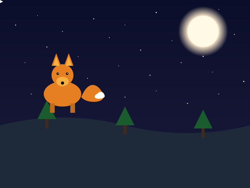
<svg viewBox="0 0 800 600" xmlns="http://www.w3.org/2000/svg">
  <defs>
    <linearGradient id="skyGradient" x1="0%" y1="0%" x2="0%" y2="100%">
      <stop offset="0%" stop-color="#0b0e2a"/>
      <stop offset="100%" stop-color="#1a1a3a"/>
    </linearGradient>
    <radialGradient id="moonGlow" cx="50%" cy="50%" r="50%">
      <stop offset="0%" stop-color="#fff9e6"/>
      <stop offset="60%" stop-color="#ffebcc"/>
      <stop offset="100%" stop-color="rgba(255,235,204,0)"/>
    </radialGradient>
  </defs>

  <style><![CDATA[
    @keyframes twinkle {
      0%, 100% { opacity: 0.2; }
      50% { opacity: 1; }
    }
    .star {
      animation: twinkle 2s infinite ease-in-out;
    }
    @keyframes tailSway {
      0%, 100% { transform: rotate(-5deg); }
      50% { transform: rotate(5deg); }
    }
    #tail {
      transform-origin: 0 0;
      animation: tailSway 3s infinite ease-in-out;
    }
  ]]></style>

  <!-- Sky -->
  <rect width="800" height="600" fill="url(#skyGradient)"/>

  <!-- Distant hills -->
  <path d="M0,600 L0,450 Q200,400 400,450 Q600,500 800,450 L800,600 Z" fill="#151a3a" opacity="0.8"/>
  <path d="M0,600 L0,500 Q300,450 600,500 L800,500 L800,600 Z" fill="#101530" opacity="0.6"/>

  <!-- Stars -->
  <circle class="star" cx="50"  cy="80"  r="1.5" fill="white" style="animation-delay: 0.1s;"/>
  <circle class="star" cx="120" cy="50"  r="1"   fill="white" style="animation-delay: 0.5s;"/>
  <circle class="star" cx="200" cy="100" r="1.2" fill="white" style="animation-delay: 1.0s;"/>
  <circle class="star" cx="300" cy="60"  r="1.5" fill="white" style="animation-delay: 1.5s;"/>
  <circle class="star" cx="400" cy="80"  r="1"   fill="white" style="animation-delay: 0.3s;"/>
  <circle class="star" cx="500" cy="40"  r="1.8" fill="white" style="animation-delay: 0.8s;"/>
  <circle class="star" cx="600" cy="90"  r="1.3" fill="white" style="animation-delay: 1.2s;"/>
  <circle class="star" cx="700" cy="30"  r="1"   fill="white" style="animation-delay: 1.8s;"/>
  <circle class="star" cx="150" cy="150" r="1.5" fill="white" style="animation-delay: 0.2s;"/>
  <circle class="star" cx="250" cy="180" r="1"   fill="white" style="animation-delay: 0.7s;"/>
  <circle class="star" cx="350" cy="120" r="1.2" fill="white" style="animation-delay: 1.3s;"/>
  <circle class="star" cx="450" cy="160" r="1.5" fill="white" style="animation-delay: 0.4s;"/>
  <circle class="star" cx="550" cy="130" r="1"   fill="white" style="animation-delay: 0.9s;"/>
  <circle class="star" cx="650" cy="180" r="1.8" fill="white" style="animation-delay: 1.6s;"/>
  <circle class="star" cx="750" cy="110" r="1.3" fill="white" style="animation-delay: 1.1s;"/>
  <circle class="star" cx="80"  cy="200" r="1"   fill="white" style="animation-delay: 0.6s;"/>
  <circle class="star" cx="180" cy="220" r="1.5" fill="white" style="animation-delay: 1.4s;"/>
  <circle class="star" cx="280" cy="250" r="1.2" fill="white" style="animation-delay: 0.0s;"/>
  <circle class="star" cx="380" cy="210" r="1"   fill="white" style="animation-delay: 0.5s;"/>
  <circle class="star" cx="480" cy="240" r="1.5" fill="white" style="animation-delay: 1.0s;"/>
  <circle class="star" cx="580" cy="200" r="1.3" fill="white" style="animation-delay: 1.5s;"/>
  <circle class="star" cx="680" cy="230" r="1"   fill="white" style="animation-delay: 0.3s;"/>
  <circle class="star" cx="780" cy="260" r="1.8" fill="white" style="animation-delay: 0.8s;"/>
  <circle class="star" cx="100" cy="300" r="1.2" fill="white" style="animation-delay: 1.2s;"/>
  <circle class="star" cx="200" cy="320" r="1"   fill="white" style="animation-delay: 1.7s;"/>
  <circle class="star" cx="300" cy="280" r="1.5" fill="white" style="animation-delay: 0.2s;"/>
  <circle class="star" cx="400" cy="310" r="1.3" fill="white" style="animation-delay: 0.7s;"/>
  <circle class="star" cx="500" cy="290" r="1"   fill="white" style="animation-delay: 1.1s;"/>
  <circle class="star" cx="600" cy="330" r="1.5" fill="white" style="animation-delay: 1.6s;"/>
  <circle class="star" cx="700" cy="300" r="1.2" fill="white" style="animation-delay: 0.4s;"/>

  <!-- Moon with glow -->
  <circle cx="650" cy="100" r="80" fill="url(#moonGlow)"/>
  <circle cx="650" cy="100" r="50" fill="#fff9e6"/>

  <!-- Main hill -->
  <path d="M0,600 L0,400 Q200,350 400,400 Q600,450 800,400 L800,600 Z" fill="#1e2a3a"/>

  <!-- Trees on hill -->
  <g transform="translate(150, 380)">
    <rect x="-5" y="0" width="10" height="30" fill="#3d2b1f"/>
    <path d="M-30,0 L0,-60 L30,0 Z" fill="#1a5c2e"/>
  </g>
  <g transform="translate(400, 400)">
    <rect x="-5" y="0" width="10" height="30" fill="#3d2b1f"/>
    <path d="M-30,0 L0,-60 L30,0 Z" fill="#1a5c2e"/>
  </g>
  <g transform="translate(650, 410)">
    <rect x="-5" y="0" width="10" height="30" fill="#3d2b1f"/>
    <path d="M-30,0 L0,-60 L30,0 Z" fill="#1a5c2e"/>
  </g>

  <!-- Fox -->
  <g id="fox" transform="translate(200, 350)">
    <!-- Body -->
    <ellipse cx="0" cy="-50" rx="60" ry="40" fill="#e67e22"/>
    <!-- Head -->
    <circle cx="0" cy="-110" r="35" fill="#e67e22"/>
    <!-- Ears -->
    <path d="M-35,-140 L-20,-180 L-5,-140 Z" fill="#e67e22"/>
    <path d="M35,-140 L20,-180 L5,-140 Z" fill="#e67e22"/>
    <!-- Inner ears -->
    <path d="M-30,-140 L-20,-170 L-10,-140 Z" fill="#f5b041"/>
    <path d="M30,-140 L20,-170 L10,-140 Z" fill="#f5b041"/>
    <!-- Snout -->
    <ellipse cx="0" cy="-90" rx="20" ry="15" fill="#f5b041"/>
    <!-- Nose -->
    <circle cx="0" cy="-85" r="5" fill="black"/>
    <!-- Eyes -->
    <circle cx="-15" cy="-115" r="4" fill="black"/>
    <circle cx="15" cy="-115" r="4" fill="black"/>
    <circle cx="-14" cy="-116" r="1.5" fill="white"/>
    <circle cx="16" cy="-116" r="1.5" fill="white"/>
    <!-- Front legs -->
    <rect x="-40" y="-20" width="15" height="30" fill="#c06c1e"/>
    <rect x="25" y="-20" width="15" height="30" fill="#c06c1e"/>
    <!-- Tail -->
    <g id="tail" transform="translate(60, -40)">
      <path d="M0,0 C 20,-50 50,-50 70,-10 C 75,0 70,15 40,15 C 10,15 0,0 0,0 Z" fill="#e67e22"/>
      <path d="M50,-10 C 60,-20 70,-20 75,-5 C 76,0 72,5 55,5 C 40,5 40,-5 50,-10 Z" fill="white"/>
    </g>
  </g>

  <!-- Shooting star -->
  <path id="shootingPath" d="M800,0 L0,600" fill="none"/>
  <g>
    <animateMotion dur="4s" repeatCount="indefinite" begin="1s">
      <mpath href="#shootingPath"/>
    </animateMotion>
    <animate attributeName="opacity" values="0;1;0" keyTimes="0;0.1;0.5" dur="4s" repeatCount="indefinite" begin="1s"/>
    <polygon points="0,0 10,5 0,10 -10,5" fill="white"/>
  </g>
</svg>
Reasoning trace (7,259 tokens)
We need to create an SVG file with viewBox 0 0 800 600. Must be hand-written shapes, no external references, no JS. Must include fox, moon with glow, stars, hill, background elements (trees, distant hills). Use coherent color palette and at least one gradient. Animations: stars twinkling, fox tail swaying gently, shooting star crossing sky every 4 seconds (first within 2 seconds). Use SMIL or CSS inside SVG. Must be a single SVG file.

We'll create an SVG with CSS animations for stars twinkling (opacity), tail swaying (transform), shooting star (animate along path). Use SMIL <animate> or <animateTransform>. Simpler: CSS keyframes for tail sway, star twinkle, shooting star.

But CSS inside SVG: we can include <style> with @keyframes and apply classes.

We need to ensure the shooting star appears every 4 seconds, first within 2 seconds. Could use animation-delay: 0s for first, then repeat every 4s. But "first one within 2 seconds" means the first shooting star should appear at a random time <=2s? But we can set animation-delay: 0s and duration 4s, but that would start immediately. Could set delay 1s. That's within 2 seconds. We'll set delay 1s.

Shooting star: a small line or polygon moving across sky. Use <animateMotion> along a path. Simpler: use CSS animation translating from top right to bottom left.

We'll create a shooting star element (a polygon) and animate its transform: translate and rotate.

Stars twinkling: many small circles with animation opacity.

Fox tail swaying: group for tail, animate rotation around base.

We'll need to define gradient for sky (night gradient) and maybe moon glow.

Let's design coordinates: viewBox 0 0 800 600.

Sky: rectangle 800x600 with gradient from dark blue to black.

Moon: circle at (650,100) radius 50, with radial gradient for glow.

Stars: many small circles randomly placed. We'll create maybe 30 stars with different animation delays.

Hill: a path covering bottom part.

Distant hills: paths behind.

Trees: simple triangles.

Fox: sitting on hill. We'll create shapes: body, head, ears, snout, eyes, tail.

Tail: group with path, animate rotation.

We'll need to ensure the fox is recognizable.

Let's start writing SVG.

We'll define CSS styles for animations.

We'll use <defs> for gradients.

We'll create star elements with class "star" and apply animation twinkle.

Twinkle animation: @keyframes twinkle { 0%,100% { opacity: 0.3; } 50% { opacity: 1; } } duration 2s infinite.

Each star can have different delay.

Shooting star: create a <g class="shooting-star"> with a polygon (a small triangle) and animate with CSS: @keyframes shoot { 0% { transform: translate(0,0) rotate(45deg); opacity: 1; } 100% { transform: translate(-800px, 600px) rotate(45deg); opacity: 0; } } duration 2s, delay 1s, infinite.

But the shooting star should cross the sky every 4 seconds. So animation duration 4s? Actually the star moves across in 2s, then wait 2s? Better: animation duration 4s, with keyframes: 0% start offscreen, 50% cross, 100% offscreen. But simpler: animate from start to end in 2s, then repeat every 4s (so 2s idle). Use animation: shoot 4s infinite, with keyframes: 0% { transform: translate(800, -200) rotate(45deg); opacity:0; } 10% { opacity:1; } 50% { transform: translate(-200, 600) rotate(45deg); opacity:1; } 60% { opacity:0; } 100% { opacity:0; }. That will show for about half the cycle.

We'll implement.

Tail sway: @keyframes tailSway { 0%,100% { transform: rotate(-5deg); } 50% { transform: rotate(5deg); } } duration 3s infinite ease-in-out. Transform origin at base of tail.

We'll set transform-origin on tail group.

Now, let's write the SVG.

We'll need to be careful with coordinates.

We'll create a group for fox at position (maybe x=200, y=350). Hill shape: a path from (0,450) to (800,450) with curve up to (400,350) etc.

Let's design hill: <path d="M0,600 L0,400 Q400,300 800,400 L800,600 Z" fill="#2d3a4a"/>.

Distant hills: behind, lower opacity.

Trees: a few triangles on hill.

Moon: radial gradient for glow: <radialGradient id="moonGlow" cx="50%" cy="50%" r="50%"> <stop offset="0%" stop-color="#fff9e6"/> <stop offset="70%" stop-color="#ffebcc"/> <stop offset="100%" stop-color="rgba(255,235,204,0)"/> </radialGradient>. Then a circle with that fill, larger radius for glow, then a smaller circle for moon surface.

Stars: create many <circle> with class "star". We'll generate maybe 30 stars with random positions. Since we can't use JS, we'll manually write a bunch.

We'll write about 30 star elements with different cx, cy, r (1-2), and animation-delay random values (0s to 2s). We'll set style="animation-delay: Xs;".

Shooting star: create a group with class "shooting-star". We'll define a polygon for a star shape: <polygon points="0,0 5,10 0,20 -5,10" fill="white"/> but we need a trail? Simpler: a line with gradient? We'll do a small polygon and animate.

But CSS transform on SVG elements works in modern browsers. We'll apply animation to the group.

We'll set the group initially at top right (translate(800, -100))? Actually we can set initial position via transform in the animation.

We'll define the shooting star group with transform="translate(800, -100) rotate(45)" and then animate transform? But CSS animation will override transform. Better to animate using @keyframes transform.

We'll set the group with no initial transform, and in keyframes we set transform.

But the group's coordinate origin is at (0,0). We'll position the star shape at (0,0) and animate translation.

Let's define shooting star group with a polygon centered at (0,0). Then animation will translate it.

We'll add <g class="shooting-star"> <polygon points="0,0 10,5 0,10 -10,5" fill="white"/> </g>

But that's a diamond shape. For a star shape, maybe a triangle: points="0,0 10,20 -10,20". But we want a streak. Could use a line with stroke and gradient. Simpler: a line with stroke-width 2 and length 100, but animation of stroke-dashoffset? That's more complex.

We'll do a simple polygon that looks like a star: a 4-point star.

We'll just use a small circle with a trail? But CSS can't animate trail easily.

Given time, we'll create a shooting star as a small circle with a long tail using a path with stroke and animate stroke-dashoffset. But that requires SMIL maybe easier.

But we can use SMIL <animate> for shooting star path. Since SMIL is allowed. Let's use SMIL for shooting star: define a path for the star's trajectory, and animate a group along it with <animateMotion>. That is more reliable.

We'll create a path for shooting star: from (800, 0) to (0, 600) diagonal. Then a group with a star shape (polygon) and <animateMotion dur="4s" repeatCount="indefinite" begin="1s"> <mpath href="#shootingPath"/> </animateMotion>. Also animate opacity to fade in/out.

But SMIL <animateMotion> moves the element along the path. We'll also add <animate attributeName="opacity" values="0;1;0" keyTimes="0;0.1;0.5" dur="4s" repeatCount="indefinite" begin="1s"/>.

That satisfies: first within 2 seconds (begin="1s"), every 4 seconds.

We'll do that.

Now, stars twinkling: we can use SMIL <animate> on opacity for each star. But many stars would be verbose. CSS is simpler. We'll use CSS.

We'll include <style> with keyframes.

Now, tail sway: use CSS animation on tail group with transform-origin.

We'll need to set transform-origin in CSS: transform-origin: 200px 350px (the base of tail). But we can set it via attribute transform-origin in CSS.

We'll define tail group with id="tail". In CSS: #tail { transform-origin: 150px 300px; animation: tailSway 3s ease-in-out infinite; } But the coordinates depend on the group's position. We'll set the tail group's transform-origin to the base point relative to the group's coordinate system. If the tail group is positioned such that its base is at (0,0), then transform-origin: 0 0. We'll design tail group with base at origin.

Better: create tail as a path, and wrap in a group with transform="translate(baseX, baseY)" and then animate rotation on that group. The group's origin is at base. So we can set transform-origin: 0 0.

We'll do: <g id="tail" transform="translate(300, 300)"> <path d="..." fill="orange"/> </g> Then CSS: #tail { transform-origin: 0 0; animation: tailSway 3s ease-in-out infinite; }

Now, we need to design fox.

Let's outline fox components:

- Body: an ellipse or path.
- Head: circle.
- Ears: two triangles.
- Snout: ellipse.
- Eyes: two circles.
- Legs: simple shapes.
- Tail: path.

We'll place fox sitting on hill. Hill top around y=350 at x=200? Let's set hill peak at (200, 350). Fox sitting there.

We'll define a group for fox at transform="translate(200, 350)"? But then the fox's bottom should be on hill. We'll design fox in local coordinates with feet at y=0.

Let's design fox shapes in a local coordinate system where the sitting position has the bottom of body at y=0.

We'll create a group <g id="fox" transform="translate(200, 350)"> and then draw fox parts relative to that.

But the hill is not flat; it's curved. We'll just place fox at a point where hill is roughly flat.

We'll set hill path: M0,600 Q200,350 400,400 Q600,450 800,400 L800,600 L0,600 Z. So at x=200, y=350 is a peak. Fox can sit there.

We'll set fox group transform="translate(200, 350)". Then draw fox with body above that point? Actually the fox's bottom should be at y=0 (the hill). So we'll draw fox with its feet at y=0, body extending upward (negative y). So we'll use negative y for body parts.

Let's define fox parts:

- Body: ellipse centered at (0, -50) with rx=60, ry=40, fill="#e67e22" (orange).
- Head: circle at (0, -110) radius 35, fill="#e67e22".
- Ears: two triangles: left ear: points "-35,-140 -20,-180 -5,-140", right ear: "35,-140 20,-180 5,-140", fill="#e67e22", with inner ear lighter.
- Snout: ellipse at (0, -90) rx=20, ry=15, fill="#f5b041".
- Nose: small circle at (0, -85) r=5, fill="black".
- Eyes: two circles at (-15, -115) and (15, -115) radius 4, fill="black", with white highlight.
- Legs: front legs: two rectangles at (-30, -10) width 15 height 30, and (15, -10) width 15 height 30, fill="#c06c1e".
- Tail: a path starting at (50, -30) curving to (100, -80) then to (120, -20) with white tip. We'll create tail group with base at (50, -30) (the attachment point). So tail group transform="translate(50, -30)". Then tail path relative to that.

But we need to ensure the tail base is at the body. Let's set tail attachment at (60, -40) relative to fox group.

We'll create tail group with id="tail" transform="translate(60, -40)". Then tail path: from (0,0) to (40, -50) to (60, 0) with white tip. We'll design a path: M0,0 Q30,-60 60,-20 Q80,10 60,0 Z? That's a shape. But we want a bushy tail with white tip. Could use a path with gradient fill? Simpler: two paths: main tail orange, tip white.

We'll do: main tail path: M0,0 C 20,-40 40,-40 50,-10 C 55,0 50,10 30,10 C 10,10 0,0 0,0 Z. Fill orange. Tip: a smaller path at the end with white.

But for animation, we can rotate the whole tail group.

We'll keep tail as a single path with a gradient? But gradient might not animate well. We'll just use a path with fill orange and a separate white tip path inside the tail group. Both will rotate together.

Now, we need to define the tail group's transform-origin at (0,0) which is the attachment point. So CSS: #tail { transform-origin: 0 0; animation: tailSway 3s ease-in-out infinite; }

Now, stars: we'll create many <circle class="star" cx="..." cy="..." r="1.5" fill="white"/>. We'll assign each a style with animation-delay.

We'll write maybe 30 stars with random positions. Since we can't compute random, we'll manually list coordinates.

We'll also add a few larger stars.

Now, moon: We'll create a radial gradient for glow, then a circle for glow (radius 80) with fill="url(#moonGlow)", then a circle for moon (radius 50) with fill="#fff9e6" and maybe a subtle texture.

We'll place moon at (650, 100).

Background hills: a couple of paths behind the main hill, with darker colors.

Trees: simple triangles on the hill.

Now, gradients: sky gradient: linearGradient from top to bottom: #0b0e2a to #1a1a3a.

We'll define in <defs>.

Now, animations:

- Stars twinkle: CSS keyframes twinkle, applied to .star.

- Tail sway: CSS keyframes tailSway, applied to #tail.

- Shooting star: SMIL animateMotion along path.

We'll define shooting star path: <path id="shootingPath" d="M800,0 L0,600" fill="none"/>.

Shooting star group: <g class="shooting-star"> <polygon points="0,0 10,5 0,10 -10,5" fill="white"/> </g> with <animateMotion dur="4s" repeatCount="indefinite" begin="1s"> <mpath href="#shootingPath"/> </animateMotion> and <animate attributeName="opacity" values="0;1;0" keyTimes="0;0.1;0.5" dur="4s" repeatCount="indefinite" begin="1s"/>.

But the polygon is centered at (0,0). As it moves along path, it will be oriented along path? animateMotion by default rotates to follow path. That's good.

We'll also maybe add a tail to the shooting star? Not needed.

Now, we need to ensure the shooting star is visible only during the animation. The opacity animation will handle.

Now, we must ensure the SVG is valid and self-contained.

Let's write the SVG code.

We'll start with <svg viewBox="0 0 800 600" xmlns="http://www.w3.org/2000/svg">.

Inside, <defs> with gradients.

Then <style> for CSS animations.

Then background sky rectangle.

Then distant hills.

Then stars.

Then moon.

Then main hill.

Then trees.

Then fox group.

Then shooting star path and group.

We'll order layers: sky, distant hills, stars, moon, main hill, trees, fox, shooting star (on top).

Now, write the code.

We'll need to be careful with coordinates and ensure no errors.

Let's draft the SVG.

We'll create a list of stars manually. We'll write about 25 stars.

We'll assign each a unique animation-delay via style attribute: style="animation-delay: 0.5s;" etc.

We'll use class="star" and in CSS define animation: twinkle 2s infinite ease-in-out.

But each star should have different delay. We'll set inline style.

Now, CSS:

@keyframes twinkle { 0%,100% { opacity: 0.2; } 50% { opacity: 1; } }
.star { animation: twinkle 2s infinite ease-in-out; }

@keyframes tailSway { 0%,100% { transform: rotate(-5deg); } 50% { transform: rotate(5deg); } }
#tail { transform-origin: 0 0; animation: tailSway 3s infinite ease-in-out; }

But note: the tail group is inside fox group which has transform. The transform-origin in CSS is relative to the element's own coordinate system. Since we set tail group's transform="translate(60, -40)", its origin (0,0) is at that point. So transform-origin: 0 0 is correct.

Now, we need to ensure the tail group has id="tail".

Now, shooting star SMIL.

We'll define path id="shootingPath" d="M800,0 L0,600".

Then group with id="shootingStar" maybe.

We'll add animateMotion and animate.

Now, let's write the fox in detail.

Fox group: <g id="fox" transform="translate(200, 350)">

Inside:

- Body: <ellipse cx="0" cy="-50" rx="60" ry="40" fill="#e67e22"/>
- Head: <circle cx="0" cy="-110" r="35" fill="#e67e22"/>
- Ears: left ear: <path d="M-35,-140 L-20,-180 L-5,-140 Z" fill="#e67e22"/> right ear: <path d="M35,-140 L20,-180 L5,-140 Z" fill="#e67e22"/>
- Inner ears: lighter color: <path d="M-30,-140 L-20,-170 L-10,-140 Z" fill="#f5b041"/> similarly right.
- Snout: <ellipse cx="0" cy="-90" rx="20" ry="15" fill="#f5b041"/>
- Nose: <circle cx="0" cy="-85" r="5" fill="black"/>
- Eyes: left eye: <circle cx="-15" cy="-115" r="4" fill="black"/> right eye: <circle cx="15" cy="-115" r="4" fill="black"/> Highlights: small white circles.
- Legs: front legs: <rect x="-40" y="-20" width="15" height="30" fill="#c06c1e"/> <rect x="25" y="-20" width="15" height="30" fill="#c06c1e"/> (maybe back legs not visible).
- Tail group: <g id="tail" transform="translate(60, -40)"> <path d="M0,0 C 20,-50 50,-50 70,-10 C 75,0 70,15 40,15 C 10,15 0,0 0,0 Z" fill="#e67e22"/> <path d="M50,-10 C 60,-20 70,-20 75,-5 C 76,0 72,5 55,5 C 40,5 40,-5 50,-10 Z" fill="white"/> </g>

But the tail shape might be too complex. We'll simplify.

We'll create a tail as a single path with a gradient? But we can't animate gradient. We'll just use two paths.

We'll adjust coordinates.

Now, we need to ensure the fox is recognizable. The above should work.

Now, trees: on the hill, we can place a few triangles. For example, at x=100, y=350 (hill surface). But the hill is curved. We'll place trees at various x positions with their base on the hill. Since we don't have the hill function, we'll approximate by placing trees at y=400 (the hill line at those x). We'll draw simple pine trees: a triangle for foliage and a rectangle for trunk.

We'll create a few tree groups.

Distant hills: two paths behind main hill, with lower opacity.

Now, stars: we'll generate coordinates manually. Let's pick 30 stars.

We'll write them as:

<circle class="star" cx="50" cy="80" r="1.5" fill="white" style="animation-delay: 0.1s;"/>
... etc.

We'll vary delays from 0 to 2s.

Now, moon glow gradient:

<radialGradient id="moonGlow" cx="50%" cy="50%" r="50%">
  <stop offset="0%" stop-color="#fff9e6"/>
  <stop offset="60%" stop-color="#ffebcc"/>
  <stop offset="100%" stop-color="rgba(255,235,204,0)"/>
</radialGradient>

Then moon: <circle cx="650" cy="100" r="80" fill="url(#moonGlow)"/> (glow)
<circle cx="650" cy="100" r="50" fill="#fff9e6"/> (moon)

But the glow circle should be behind the moon? Actually the glow is larger, so draw glow first, then moon on top.

Now, sky gradient:

<linearGradient id="skyGradient" x1="0%" y1="0%" x2="0%" y2="100%">
  <stop offset="0%" stop-color="#0b0e2a"/>
  <stop offset="100%" stop-color="#1a1a3a"/>
</linearGradient>

Background rectangle: <rect width="800" height="600" fill="url(#skyGradient)"/>

Now, distant hills: first hill: <path d="M0,600 L0,450 Q200,400 400,450 Q600,500 800,450 L800,600 Z" fill="#151a3a" opacity="0.8"/> second hill: <path d="M0,600 L0,500 Q300,450 600,500 L800,500 L800,600 Z" fill="#101530" opacity="0.6"/>.

Main hill: <path d="M0,600 L0,400 Q200,350 400,400 Q600,450 800,400 L800,600 Z" fill="#1e2a3a"/>.

Trees: we'll create a few. For each tree, we need to place on main hill. We'll approximate y coordinate for given x using the hill curve. But we can just place them at y=400 (the hill line at x=100, 300, 500, 700). We'll draw a tree group with transform="translate(x, y)".

Tree: trunk: <rect x="-5" y="0" width="10" height="30" fill="#3d2b1f"/> foliage: triangle: <path d="M-30,0 L0,-60 L30,0 Z" fill="#1a5c2e"/>.

We'll place at x=150, y=380; x=400, y=400; x=650, y=410.

Now, fox group at (200, 350). But note the hill at x=200 is y=350 (peak). So fox sits there.

Now, shooting star: path id="shootingPath" d="M800,0 L0,600". Then group:

<g>
  <animateMotion dur="4s" repeatCount="indefinite" begin="1s">
    <mpath href="#shootingPath"/>
  </animateMotion>
  <animate attributeName="opacity" values="0;1;0" keyTimes="0;0.1;0.5" dur="4s" repeatCount="indefinite" begin="1s"/>
  <polygon points="0,0 10,5 0,10 -10,5" fill="white"/>
</g>

But the animateMotion and animate should be inside the group. The group will be moved along path. The polygon is centered at (0,0). The animateMotion will translate the group. The animate will change opacity of the group.

We'll wrap in a group with the animations.

Now, we need to ensure the shooting star is on top of everything.

Now, CSS: we'll include <style><![CDATA[ ... ]]></style>.

We'll define the keyframes.

Now, let's write the full SVG.

We'll need to be careful with the order of elements: sky, distant hills, stars, moon, main hill, trees, fox, shooting star.

Now, let's write the code.

We'll produce a single SVG block.

We'll manually write star positions. Let's generate about 30 stars with random-ish coordinates.

We'll list them:

1. cx="50" cy="80" r="1.5" delay="0.1"
2. cx="120" cy="50" r="1" delay="0.5"
3. cx="200" cy="100" r="1.2" delay="1.0"
4. cx="300" cy="60" r="1.5" delay="1.5"
5. cx="400" cy="80" r="1" delay="0.3"
6. cx="500" cy="40" r="1.8" delay="0.8"
7. cx="600" cy="90" r="1.3" delay="1.2"
8. cx="700" cy="30" r="1" delay="1.8"
9. cx="150" cy="150" r="1.5" delay="0.2"
10. cx="250" cy="180" r="1" delay="0.7"
11. cx="350" cy="120" r="1.2" delay="1.3"
12. cx="450" cy="160" r="1.5" delay="0.4"
13. cx="550" cy="130" r="1" delay="0.9"
14. cx="650" cy="180" r="1.8" delay="1.6"
15. cx="750" cy="110" r="1.3" delay="1.1"
16. cx="80" cy="200" r="1" delay="0.6"
17. cx="180" cy="220" r="1.5" delay="1.4"
18. cx="280" cy="250" r="1.2" delay="0.0"
19. cx="380" cy="210" r="1" delay="0.5"
20. cx="480" cy="240" r="1.5" delay="1.0"
21. cx="580" cy="200" r="1.3" delay="1.5"
22. cx="680" cy="230" r="1" delay="0.3"
23. cx="780" cy="260" r="1.8" delay="0.8"
24. cx="100" cy="300" r="1.2" delay="1.2"
25. cx="200" cy="320" r="1" delay="1.7"
26. cx="300" cy="280" r="1.5" delay="0.2"
27. cx="400" cy="310" r="1.3" delay="0.7"
28. cx="500" cy="290" r="1" delay="1.1"
29. cx="600" cy="330" r="1.5" delay="1.6"
30. cx="700" cy="300" r="1.2" delay="0.4"

We'll add them.

Now, we need to ensure the stars are above the sky but below the moon? Actually stars should be behind the moon? Usually stars are behind the moon. But moon is at (650,100) radius 50, so stars near there might overlap. We'll just put stars everywhere; the moon is drawn after stars, so moon will cover stars. That's fine.

Now, let's write the SVG.

We'll also add a subtle gradient for the fox body? Not needed.

Now, code.

We'll write the SVG with proper indentation.

Let's start.