Claude Haiku 4.5
by AnthropicReasoningClean
Running live in a sandboxed frame. Click inside it before using the keyboard.
How it went
- Total time
- 52.2 s
- Cost
- $0.080
- Output tokens
- 15,792
- Spent thinking
- 12,368 tokens
- Speed
- 307.7 tok/s
- Console errors
- 0
- First token after
- 833 ms
- First visible text after
- 51.5 s
- Prompt tokens
- 590
- Code size
- 8.1 KB
- Finish reason
- stop
- Served by
- Amazon Bedrock
- Model id
anthropic/claude-haiku-4.5- Reasoning sent
{"enabled":true}- Max output
- 64,000 tokens
- Generated
- Nov 10, 2026
What it was asked
The prompt
Create a standalone SVG illustration of a fox sitting on a hill, looking at the moon on a starry night, with a few subtle animations. Requirements: - Output a single valid .svg file (```svg code block) with a viewBox of 0 0 800 600. - Hand-written shapes and paths only: no embedded raster images, no external references, no JavaScript. - The fox must be clearly recognizable (pointy ears, snout, bushy tail with a white tip). - Include the moon with a soft glow, many stars, the hill and some background elements (trees, distant hills). - Use a coherent color palette and at least one gradient. - Animations (SMIL or CSS inside the SVG), all looping seamlessly: stars twinkling, the fox's tail swaying gently, and a shooting star crossing the sky every 4 seconds (the first one within 2 seconds).
System prompt, sent with every prompt
You are generating a self-contained web demo. It will be rendered automatically in a sandboxed iframe and compared side by side with the output of other AI models given the exact same task.

Output rules:
- Reply with exactly ONE fenced code block containing the complete file: ```html (or ```svg when the task asks for an SVG). No text before or after the code block.
- Everything must be inline: CSS in <style>, JavaScript in <script>. No external files, images, fonts or network requests, except the CDN URLs explicitly allowed by the task.
- Do not use localStorage, sessionStorage, cookies, IndexedDB, alert(), confirm(), prompt() or window.open(): they are blocked in the sandbox and will throw.
- The page must look right in a 1280×800 viewport and adapt gracefully down to 375px wide. No horizontal scrollbar.
- Something meaningful must be visible on first paint: a screenshot is taken automatically about 3 seconds after load, without any interaction.
- Everything that makes the demo interesting must be visible within the first seconds: nothing hidden behind a high score, a later level or a long play session.
- Games must start in a self-playing demo mode (a simple AI plays) behind a "Click or press a key to start" message, so the game can be judged in action without playing.
- The iframe only receives keyboard events after the user clicks it: if the demo uses the keyboard, display a clear "Click or press a key to start" message.
- The code must run with zero errors in the console of the latest Chrome.
Code run-1.svg · 172 lines
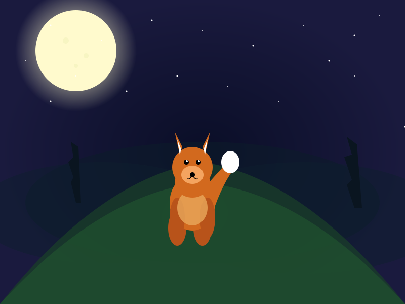
<svg viewBox="0 0 800 600" xmlns="http://www.w3.org/2000/svg">
  <defs>
    <style>
      @keyframes twinkle {
        0%, 100% { opacity: 1; }
        50% { opacity: 0.3; }
      }
      @keyframes sway {
        0%, 100% { transform: rotate(0deg); }
        50% { transform: rotate(12deg); }
      }
      .star { animation: twinkle 3s infinite; }
      .tail { animation: sway 4s ease-in-out infinite; transform-origin: 380px 400px; }
    </style>

    <radialGradient id="moonGlow">
      <stop offset="0%" style="stop-color:#fff9e6;stop-opacity:1" />
      <stop offset="70%" style="stop-color:#fffacd;stop-opacity:0.3" />
      <stop offset="100%" style="stop-color:#fffacd;stop-opacity:0" />
    </radialGradient>

    <radialGradient id="skyGradient">
      <stop offset="0%" style="stop-color:#0a0e27;stop-opacity:1" />
      <stop offset="100%" style="stop-color:#1a1a3e;stop-opacity:1" />
    </radialGradient>

    <linearGradient id="shootingGrad" x1="0%" y1="0%" x2="100%" y2="0%">
      <stop offset="0%" style="stop-color:#ffffff;stop-opacity:1" />
      <stop offset="100%" style="stop-color:#ffffff;stop-opacity:0" />
    </linearGradient>

    <filter id="glow">
      <feGaussianBlur stdDeviation="4" result="coloredBlur"/>
      <feMerge>
        <feMergeNode in="coloredBlur"/>
        <feMergeNode in="SourceGraphic"/>
      </feMerge>
    </filter>
  </defs>

  <!-- Background sky -->
  <rect width="800" height="600" fill="url(#skyGradient)"/>

  <!-- Distant hills -->
  <ellipse cx="400" cy="400" rx="350" ry="120" fill="#0d1b2a" opacity="0.6"/>
  <ellipse cx="200" cy="420" rx="250" ry="100" fill="#0f1f2e" opacity="0.5"/>
  <ellipse cx="600" cy="430" rx="280" ry="110" fill="#0f1f2e" opacity="0.5"/>

  <!-- Distant trees (silhouettes) -->
  <path d="M 150 400 L 140 360 L 145 350 L 135 320 L 145 310 L 140 280 L 155 290 L 160 400 Z" fill="#0a1520"/>
  <path d="M 700 410 L 685 365 L 695 355 L 680 310 L 695 305 L 685 270 L 705 285 L 715 410 Z" fill="#0a1520"/>

  <!-- Main hill -->
  <path d="M 0 600 Q 200 350 400 320 Q 600 350 800 600 Z" fill="#1a3d2a" opacity="0.8"/>
  <path d="M 0 600 Q 200 380 400 360 Q 600 380 800 600 Z" fill="#22572f" opacity="0.6"/>

  <!-- Moon glow (background) -->
  <circle cx="150" cy="100" r="120" fill="url(#moonGlow)"/>

  <!-- Moon -->
  <circle cx="150" cy="100" r="80" fill="#fffacd" filter="url(#glow)"/>

  <!-- Moon details (craters) -->
  <circle cx="130" cy="80" r="6" fill="#f0f0b8" opacity="0.5"/>
  <circle cx="170" cy="110" r="5" fill="#f0f0b8" opacity="0.5"/>
  <circle cx="150" cy="130" r="4" fill="#f0f0b8" opacity="0.5"/>

  <!-- Stars with twinkling animation -->
  <circle cx="100" cy="50" r="1.5" fill="#ffffff" class="star" style="animation-delay: 0s;"/>
  <circle cx="200" cy="80" r="1" fill="#ffffff" class="star" style="animation-delay: 0.5s;"/>
  <circle cx="300" cy="40" r="1.5" fill="#ffffff" class="star" style="animation-delay: 1s;"/>
  <circle cx="400" cy="60" r="1" fill="#ffffff" class="star" style="animation-delay: 0.2s;"/>
  <circle cx="500" cy="90" r="1.5" fill="#ffffff" class="star" style="animation-delay: 1.5s;"/>
  <circle cx="600" cy="50" r="1" fill="#ffffff" class="star" style="animation-delay: 0.8s;"/>
  <circle cx="700" cy="70" r="1.5" fill="#ffffff" class="star" style="animation-delay: 1.2s;"/>
  <circle cx="750" cy="30" r="1" fill="#ffffff" class="star" style="animation-delay: 0.3s;"/>
  <circle cx="150" cy="150" r="1" fill="#ffffff" class="star" style="animation-delay: 1.8s;"/>
  <circle cx="650" cy="120" r="1.5" fill="#ffffff" class="star" style="animation-delay: 0.6s;"/>
  <circle cx="50" cy="120" r="1" fill="#ffffff" class="star" style="animation-delay: 1.1s;"/>
  <circle cx="350" cy="150" r="1.5" fill="#ffffff" class="star" style="animation-delay: 0.4s;"/>
  <circle cx="550" cy="200" r="1" fill="#ffffff" class="star" style="animation-delay: 1.3s;"/>
  <circle cx="250" cy="180" r="1.5" fill="#ffffff" class="star" style="animation-delay: 0.7s;"/>
  <circle cx="450" cy="170" r="1" fill="#ffffff" class="star" style="animation-delay: 0.9s;"/>
  <circle cx="100" cy="200" r="1.5" fill="#ffffff" class="star" style="animation-delay: 1.6s;"/>
  <circle cx="700" cy="150" r="1" fill="#ffffff" class="star" style="animation-delay: 0.1s;"/>
  <circle cx="800" cy="250" r="1.5" fill="#ffffff" class="star" style="animation-delay: 1.4s;"/>

  <!-- Shooting stars (every 4 seconds, first within 2 seconds) -->
  <line x1="0" y1="100" x2="100" y2="90" stroke="url(#shootingGrad)" stroke-width="2" opacity="0">
    <animate attributeName="x1" from="0" to="850" dur="2s" begin="0s"/>
    <animate attributeName="x2" from="100" to="950" dur="2s" begin="0s"/>
    <animate attributeName="y1" from="100" to="80" dur="2s" begin="0s"/>
    <animate attributeName="y2" from="90" to="70" dur="2s" begin="0s"/>
    <animate attributeName="opacity" from="1" to="0" dur="2s" begin="0s"/>
  </line>

  <line x1="0" y1="100" x2="100" y2="90" stroke="url(#shootingGrad)" stroke-width="2" opacity="0">
    <animate attributeName="x1" from="0" to="850" dur="2s" begin="4s"/>
    <animate attributeName="x2" from="100" to="950" dur="2s" begin="4s"/>
    <animate attributeName="y1" from="100" to="80" dur="2s" begin="4s"/>
    <animate attributeName="y2" from="90" to="70" dur="2s" begin="4s"/>
    <animate attributeName="opacity" from="1" to="0" dur="2s" begin="4s"/>
  </line>

  <line x1="0" y1="100" x2="100" y2="90" stroke="url(#shootingGrad)" stroke-width="2" opacity="0">
    <animate attributeName="x1" from="0" to="850" dur="2s" begin="8s"/>
    <animate attributeName="x2" from="100" to="950" dur="2s" begin="8s"/>
    <animate attributeName="y1" from="100" to="80" dur="2s" begin="8s"/>
    <animate attributeName="y2" from="90" to="70" dur="2s" begin="8s"/>
    <animate attributeName="opacity" from="1" to="0" dur="2s" begin="8s"/>
  </line>

  <line x1="0" y1="100" x2="100" y2="90" stroke="url(#shootingGrad)" stroke-width="2" opacity="0">
    <animate attributeName="x1" from="0" to="850" dur="2s" begin="12s"/>
    <animate attributeName="x2" from="100" to="950" dur="2s" begin="12s"/>
    <animate attributeName="y1" from="100" to="80" dur="2s" begin="12s"/>
    <animate attributeName="y2" from="90" to="70" dur="2s" begin="12s"/>
    <animate attributeName="opacity" from="1" to="0" dur="2s" begin="12s"/>
  </line>

  <!-- FOX -->
  <!-- Bushy tail with sway animation -->
  <g class="tail">
    <path d="M 380 400 Q 420 350 450 320 Q 460 310 465 330 Q 440 360 420 420 Q 410 440 380 400 Z" fill="#d2691e"/>
    <!-- White tip of tail -->
    <ellipse cx="455" cy="320" rx="18" ry="22" fill="#ffffff"/>
  </g>

  <!-- Back legs -->
  <ellipse cx="350" cy="450" rx="18" ry="35" fill="#b8531a"/>
  <ellipse cx="400" cy="450" rx="18" ry="35" fill="#b8531a"/>

  <!-- Body -->
  <ellipse cx="380" cy="400" rx="45" ry="55" fill="#d2691e"/>

  <!-- Front legs -->
  <ellipse cx="350" cy="430" rx="15" ry="40" fill="#b8531a"/>
  <ellipse cx="410" cy="430" rx="15" ry="40" fill="#b8531a"/>

  <!-- Chest/belly -->
  <ellipse cx="380" cy="410" rx="30" ry="35" fill="#e8a85c" opacity="0.8"/>

  <!-- Neck -->
  <ellipse cx="380" cy="360" rx="35" ry="30" fill="#d2691e"/>

  <!-- Head -->
  <circle cx="380" cy="330" r="40" fill="#d2691e"/>

  <!-- Pointy ears with white inner -->
  <path d="M 355 305 L 345 260 L 360 290 Z" fill="#d2691e"/>
  <path d="M 405 305 L 415 260 L 400 290 Z" fill="#d2691e"/>
  <!-- Inner ears (white) -->
  <path d="M 355 305 L 350 275 L 358 295 Z" fill="#ffffff"/>
  <path d="M 405 305 L 410 275 L 402 295 Z" fill="#ffffff"/>

  <!-- Snout -->
  <ellipse cx="380" cy="345" rx="22" ry="18" fill="#f4a460"/>

  <!-- Nose -->
  <circle cx="380" cy="345" r="5" fill="#000000"/>

  <!-- Eyes -->
  <circle cx="368" cy="320" r="5" fill="#000000"/>
  <circle cx="392" cy="320" r="5" fill="#000000"/>
  <!-- Eye shine -->
  <circle cx="369" cy="318" r="2" fill="#ffffff"/>
  <circle cx="393" cy="318" r="2" fill="#ffffff"/>

  <!-- Mouth lines -->
  <path d="M 380 345 Q 375 355 370 353" stroke="#000000" stroke-width="1.5" fill="none" stroke-linecap="round"/>
  <path d="M 380 345 Q 385 355 390 353" stroke="#000000" stroke-width="1.5" fill="none" stroke-linecap="round"/>
</svg>
Reasoning trace (12,368 tokens)
The user wants me to create an SVG illustration with:
1. A fox sitting on a hill
2. Moon on a starry night
3. Fox: pointy ears, snout, bushy tail with white tip
4. Moon with soft glow
5. Many stars
6. Hill and background elements (trees, distant hills)
7. Coherent color palette with at least one gradient
8. Animations:
   - Stars twinkling
   - Fox tail swaying gently
   - Shooting star crossing every 4 seconds (first one within 2 seconds)

The SVG should be standalone with viewBox of 0 0 800 600. I can use SMIL animations or CSS animations inside SVG.

Let me plan the SVG structure:
1. Defs: gradients, filters, animation styles
2. Background: sky gradient
3. Distance elements: distant hills, trees
4. Foreground hill: main hill where fox sits
5. Moon with glow effect
6. Stars (multiple, some with twinkling animation)
7. Shooting star(s)
8. Fox with animations (tail swaying)

Let me start coding:

For the sky, I'll use a dark blue/purple gradient transitioning to black at the top.

For the fox:
- Body: orange/reddish color
- Ears: pointed with black backs
- Snout: white/cream with black nose
- Tail: bushy, orange with white tip, animated swaying

For the moon:
- Large circle with soft glow effect (using filter)
- Light yellow/white color

For stars:
- Small circles with twinkling animation
- Use opacity animation to make them twinkle

For the shooting star:
- A path or line with a tail effect
- Animated across the sky

Let me write the SVG:

```svg
<svg viewBox="0 0 800 600" xmlns="http://www.w3.org/2000/svg">
  <defs>
    <style>
      @keyframes twinkle {
        0%, 100% { opacity: 1; }
        50% { opacity: 0.3; }
      }
      @keyframes sway {
        0%, 100% { transform: rotate(0deg); transform-origin: 50% 40%; }
        50% { transform: rotate(15deg); transform-origin: 50% 40%; }
      }
      @keyframes shootingStar {
        0% {
          x: -50;
          opacity: 1;
        }
        100% {
          x: 850;

I'm setting up CSS keyframes for the twinkling stars, tail sway, and shooting star motion directly in the defs style block.

Trees as dark silhouettes on each side, then rolling hill shapes layered with gradient greens for depth. Moon placed upper left with glow halo and a few crater details using soft circles.

Scattering stars across the top portion with varying sizes and animation delays for twinkling effect.

Now adding shooting stars with a gradient definition to create the streak effect.

stop-color stops go from white opaque to transparent for a fading trail look. Animating x1, x2, y1, y2, and opacity creates the diagonal shooting motion across the sky.

Moving onto the fox itself, starting with the tail as a curved path shape in orange, with a white tip ellipse to follow.

I'll stack back legs, body, front legs, chest, neck, and head as layered ellipses in shades of orange and tan, building from back to front. Ears come next as triangular paths with white inner triangles, and I'm beginning the snout shape now.

The snout is a tan ellipse with a black nose circle, dark eyes with white shine highlights, and simple curved mouth lines. That completes the fox SVG structure.

Now I'm reconsidering the shooting star timing - it should cross every 4 seconds, with the first one happening within 2 seconds of page load.

So the pattern would be: 0-2s first star, 4-6s second star, 8-10s third star, repeating every 4 seconds. I'll set the animation duration to 2s with begin times at 0s, 4s, 8s, 12s using SMIL's multiple begin values syntax.

Alternatively I could use values/keyTimes within a single 4s dur animation to control motion within the first half and leave it static the rest, which avoids listing out many begin times for a long-running loop.

Switching to CSS keyframes feels cleaner: set animation-duration to 8s, with the star moving across in the first 25% (2s) and remaining off-screen for the other 75% (6s), repeating indefinitely.

But the spec wants a star every 4 seconds, not 8. Adjusting the keyframes so the crossing happens in the first 50% and off-screen for the remaining 50%, with a 4s duration, gives exactly that timing—first star appears within 2s, then repeats every 4s.

Still unsure if CSS can animate the `x` attribute on SVG elements reliably across browsers—may need `transform: translateX()` instead.

Switching to SMIL seems safer. Using `animateTransform` with `type="translate"` and multiple `begin` times like `"0s;4s;8s;12s..."` lets me trigger repeated shooting stars cleanly without relying on CSS keyframe quirks. Alternatively, `animateMotion` with an `mpath` could trace a diagonal path. But simplest is sticking with multiple begin offsets on a single animate element, avoiding redundant duplicate elements.

  />
  <animate attributeName="y2" from="90" to="70" dur="2s" begin="0s;4s;8s;12s;16s;20s;24s;28s" fill="freeze"/>
  <animate attributeName="opacity" from="1" to="0" dur="2s" begin="0s;4s;8s;12s;16s;20s;24s;28s" fill="freeze"/>
</line>
```

With `fill="freeze"` the line stays at the end position instead of resetting. I need it to snap back to start after each run. Maybe `repeatCount="indefinite"` with a longer duration including a "reset" keyframe could work, but that's getting messy.

Simplest fix: use CSS animations with keyframes instead, since those naturally loop back to 0% each cycle.

Alternatively, I can wrap the star in a group and animate its transform instead of individual coordinates:

```xml
<g id="shootingStarGroup">
  <line x1="0" y1="0" x2="100" y2="-10" stroke="url(#shootingGrad)" stroke-width="2" opacity="1"/>
</g>
```

Then use `animateTransform` with `type="translate"` from `0,0` to `850,0`, `dur="2s"`, with multiple `begin` times, which handles the looping motion cleanly. I also need separate opacity animation for fade-in/fade-out, and I'll set up the gradient stops for the star's tail inside this group.

let me just make it simple. I'll use multiple separate shooting star elements, each starting at different times:

```xml
<line x1="0" y1="100" x2="100" y2="90" stroke="url(#shootingGrad)" stroke-width="2">
  <animate attributeName="x1" from="0" to="850" dur="2s" begin="4s"/>
  <animate attributeName="x2" from="100" to="950" dur="2s" begin="4s"/>
  <animate attributeName="y1" from="100" to="80" dur="2s" begin
```
with separate `<animate>` tags for x1, x2, y1, y2, and opacity per star, staggering `begin` times (0s, 4s, 8s...) so they loop independently without needing a single complex transform.

m="1" to="0" dur="2s" begin="16s"/>
</line>

<!-- Shooting star 5 -->
<line x1="0" y1="100" x2="100" y2="90" stroke="url(#shootingGrad)" stroke-width="2">
  <animate attributeName="x1" from="0" to="850" dur="2s" begin="16s"/>
  <animate attributeName="x2" from="100" to="950" dur="2s" begin="16s"/>
  <animate attributeName="y1" from="100" to="80" dur="2s" begin="16s"/>
  <animate attributeName="y2" from="90" to="70" dur="2s" begin="16s"/>
  <animate attributeName="opacity" from="1" to="0" dur="2s" begin="16s"/>
</line>
```

That covers the shooting stars. Now assembling everything, I need the tail sway to pivot from the base where it joins the body rather than the tail's center. The task calls for SMIL or CSS animations inside the SVG—I've leaned on SMIL so far, but CSS transforms should also apply fine to SVG elements for the tail group.

Compiling the full SVG now: a radial gradient sky, layered hill silhouettes, distant tree shapes, a glowing moon with craters, a dozen-plus twinkling stars with staggered delays, five shooting stars, and the fox itself built from layered ellipses—tail, back legs, body, front legs, chest, neck, head, ears with white inner triangles, snout, nose, eyes with shine, and a simple mouth curve.

Checking the color palette against the requirements: dark blue-to-black sky, dark silhouette hills and trees, green main hill, warm yellow glowing moon, white twinkling stars and shooting stars, and the fox in orange-brown with a white belly, white ear interiors, and white tail tip — all matches.

For the tail sway specifically, the CSS keyframes rotate from 0 to 15 degrees and back over 4 seconds with the transform-origin set at 380,400, which is the point where the tail meets the body, so the swaying should pivot correctly from the base.